What is Abstraction?
Abstract photography is a lot like abstract art. It focuses on shape, form, colour, pattern and texture. The person looking at the image is often unable to get a full view of what's in the photo or what the photo consists of. Often, the main thing within the photo (Subject) is just a small part of the photo and it doesn't normally explain the image to you. Instead it gives you a sort of essence of the photo and the general feel of what the photo represents or is trying to say. There are many forms of abstract photo's, but a lot consist of there only being colour in certain areas, sections of block colours, covering of what would be the obvious subject in a normal photo. To summarise, it is a form of photography that sends the viewer a certain vibe from the photo and not a clear message. The photo's can look unclear, weird, out of place and just a lot different to everyday photography.
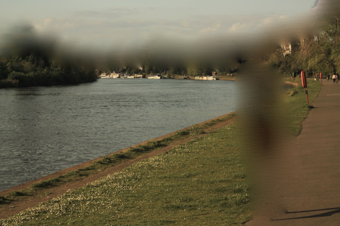
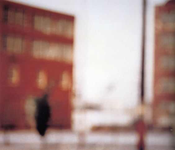
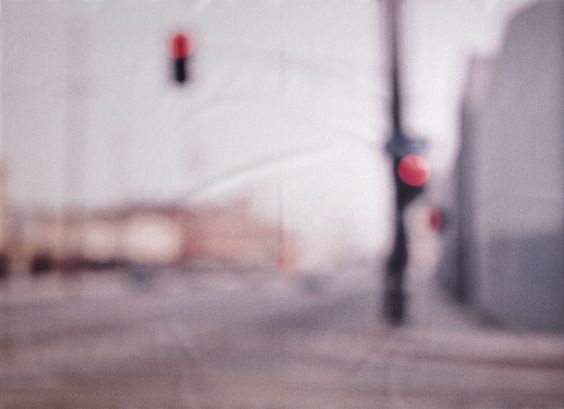
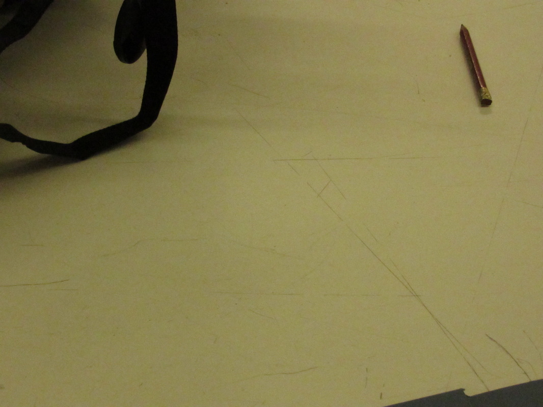
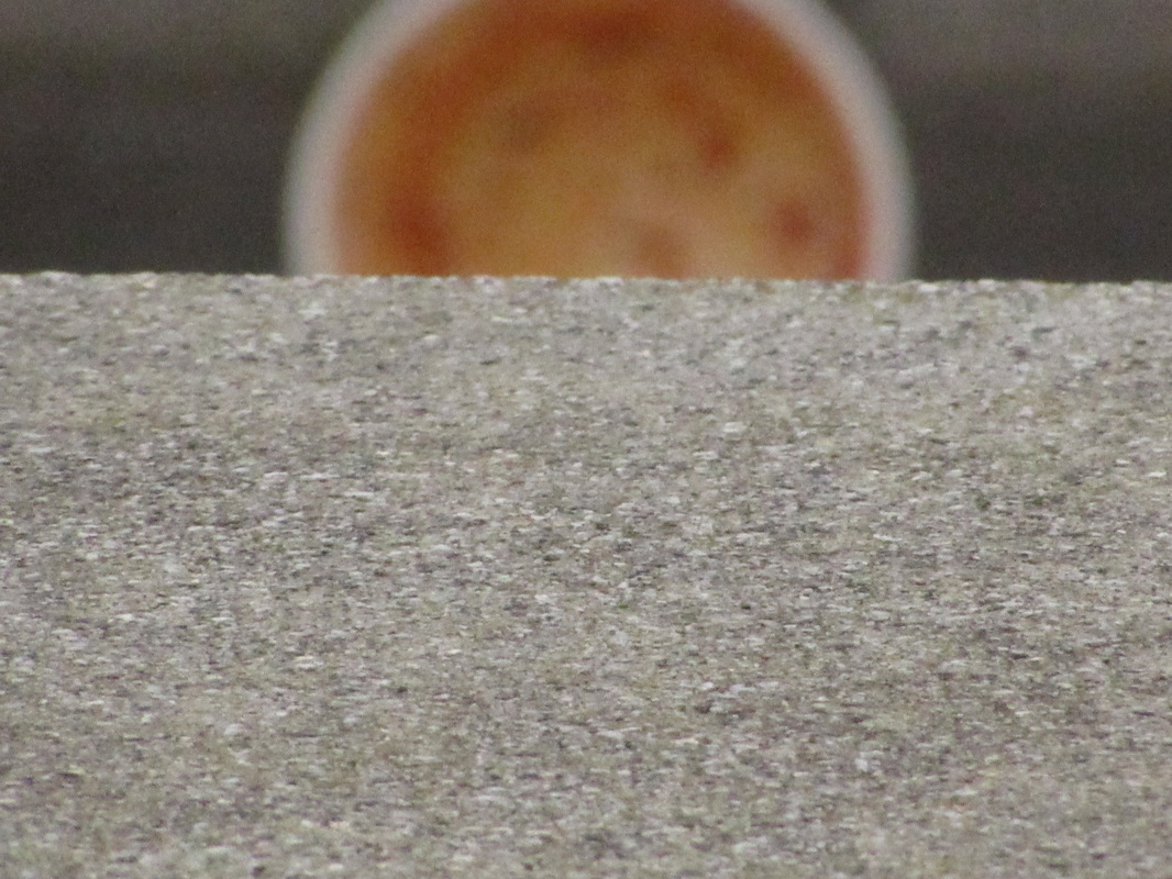
The photo above is a piece of homework. It was taken a few months ago in Kingston. The original photo is of my sister walking across the river side with her back facing me. I went onto the Photo app onto my computer and just used the simple blur tool to make certain things look out of focus. I know I wanted to make the subject of the photo out of focus since I've seen lots of people do things to the main subject. Once I made her out of focus, I wanted to add a little more so I started to blur out where the tree line meets the sky. I quite like the way the final edit came out, but I think it would look a lot better if it was a neater blur because you can clearly see where I have used the tool.
https://uk.pinterest.com/quincycruncher/abstract-photography/
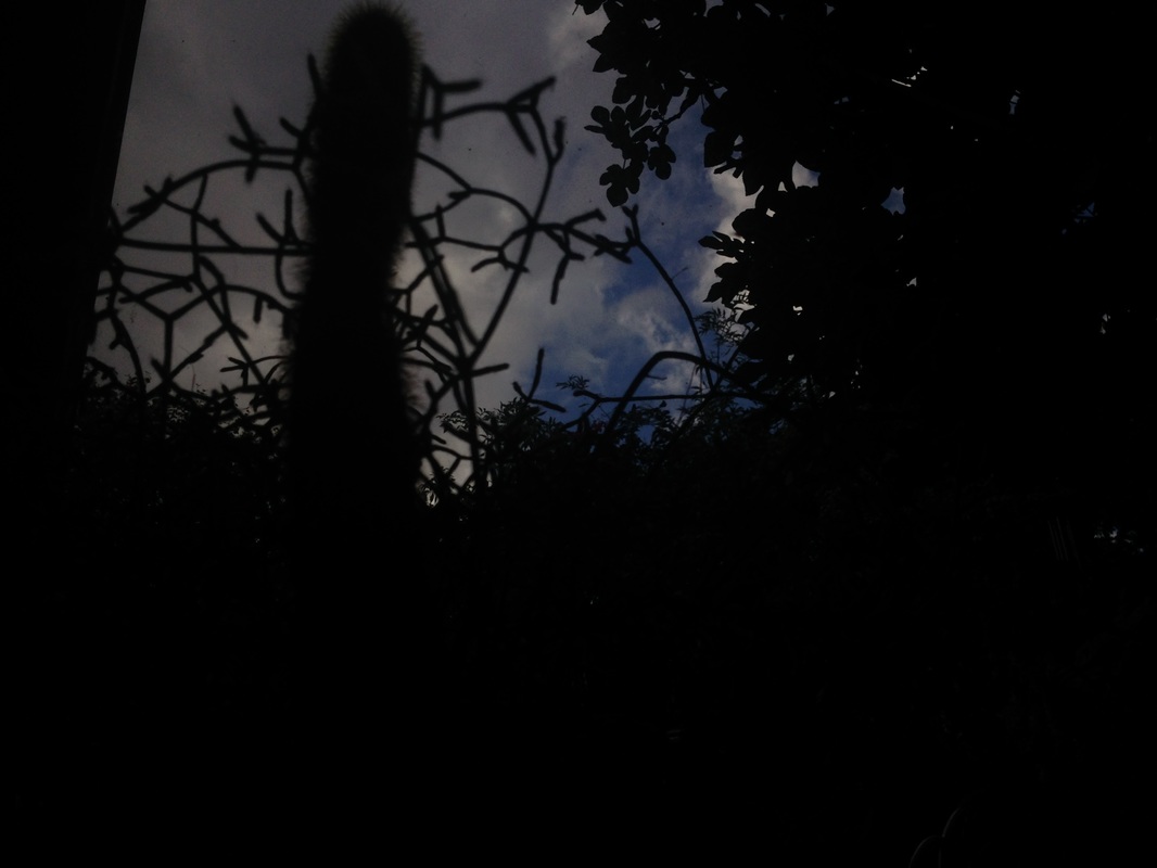
Abstract shadow photos
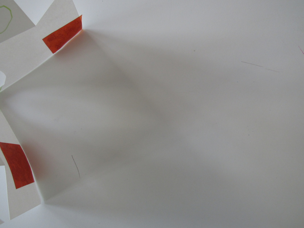
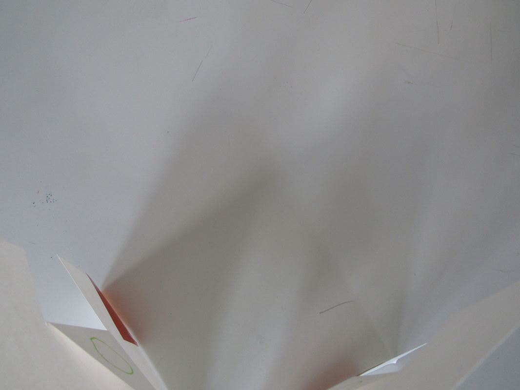
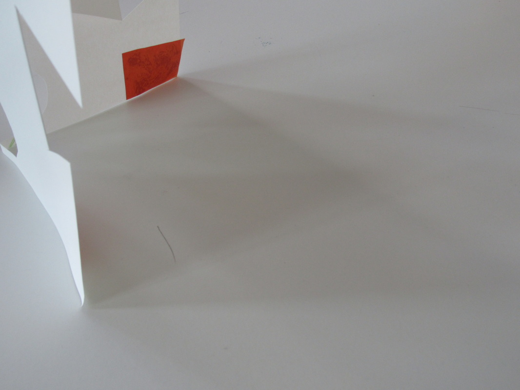
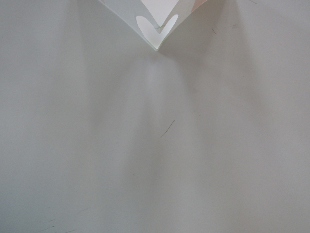
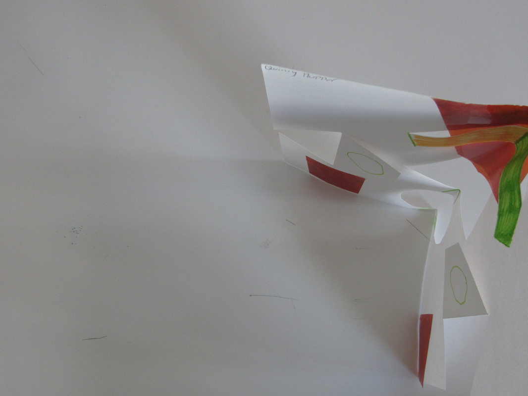
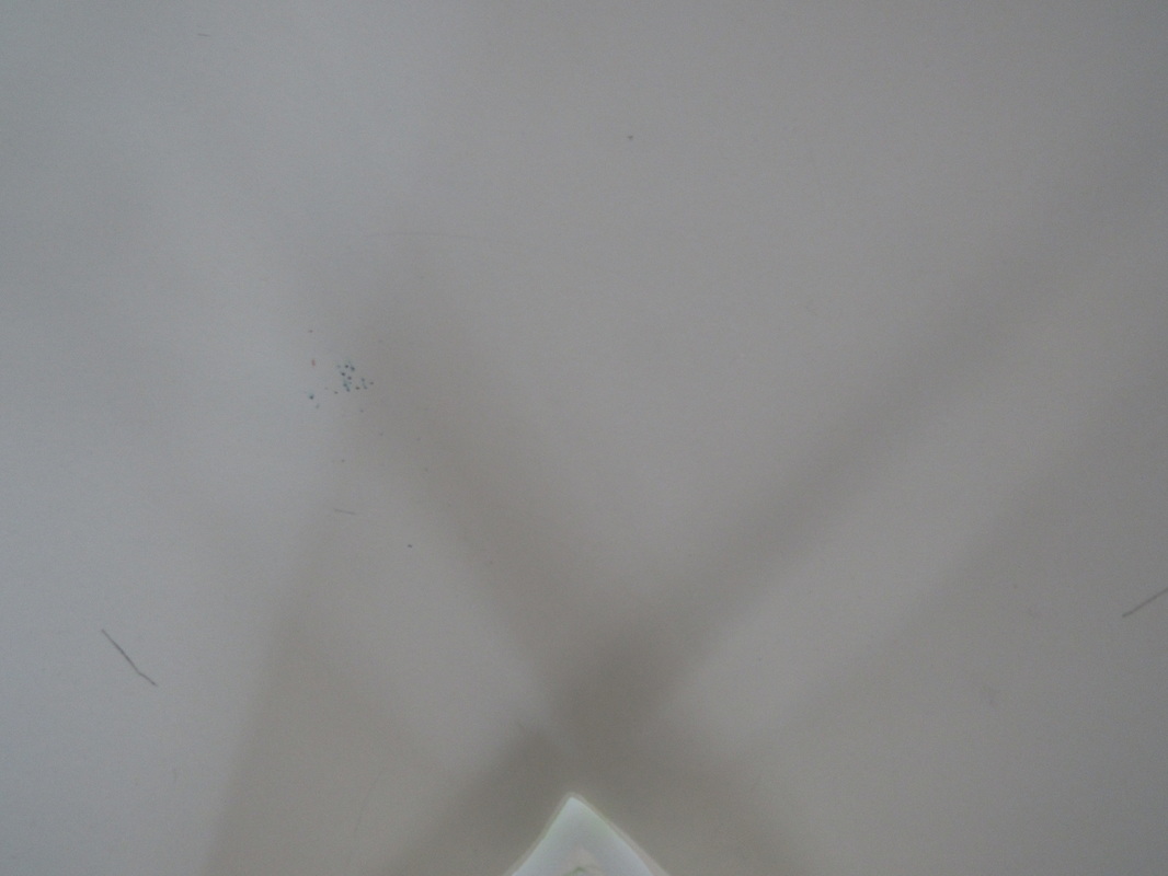
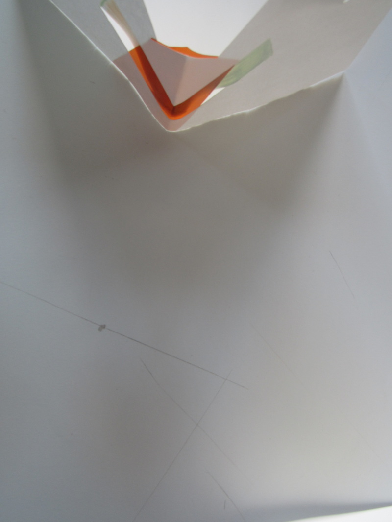
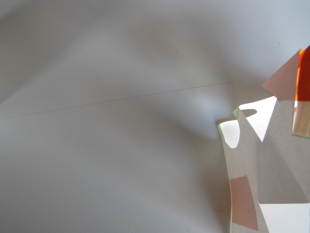
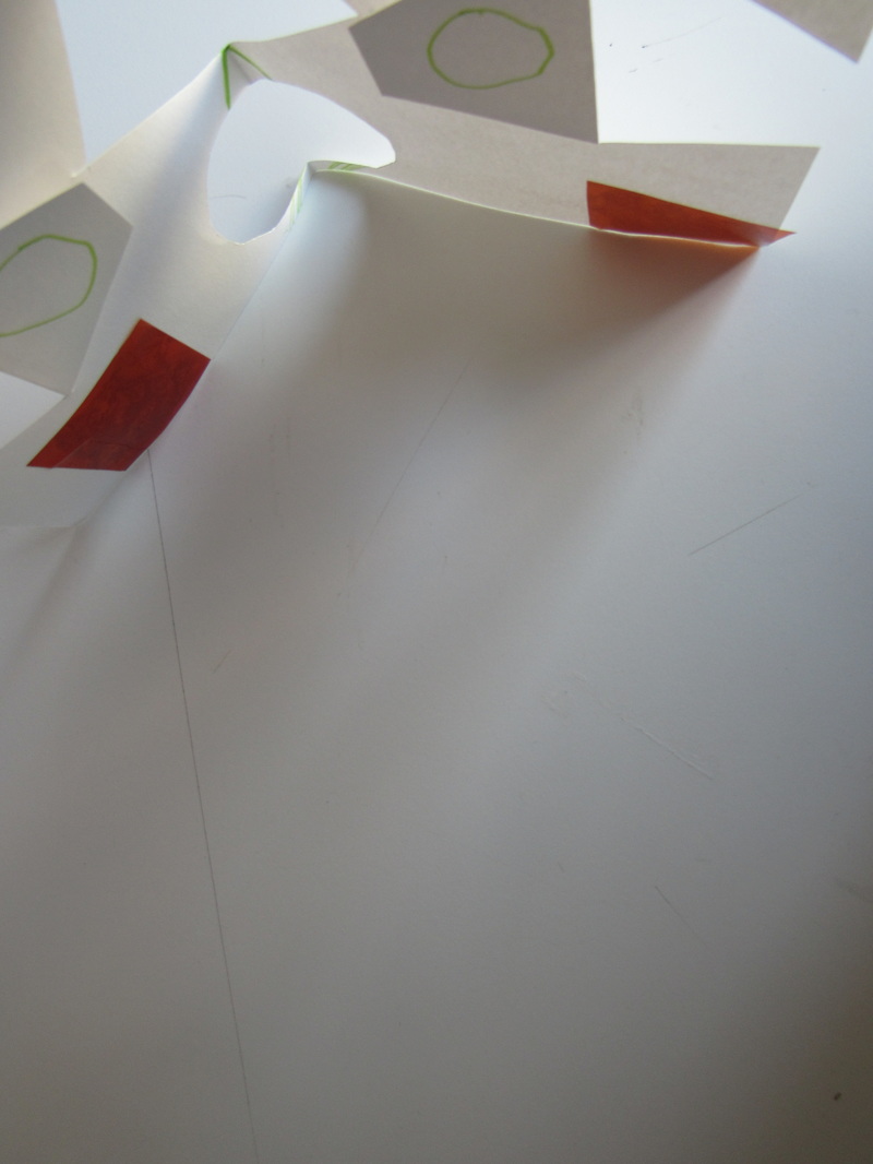
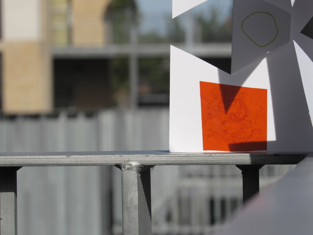
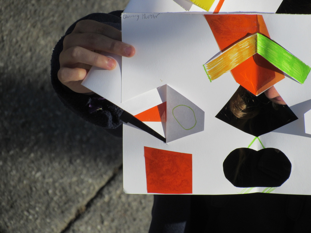
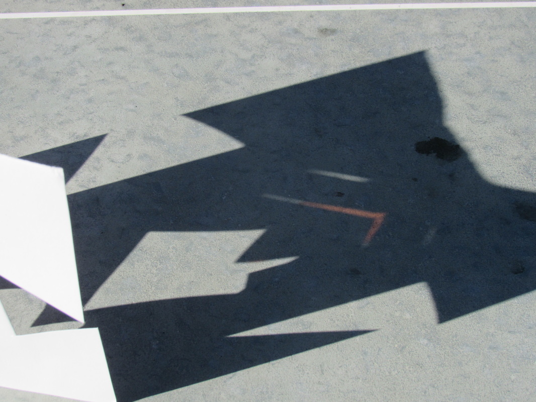
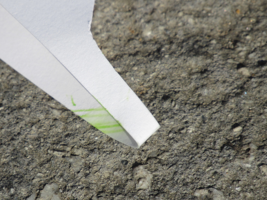
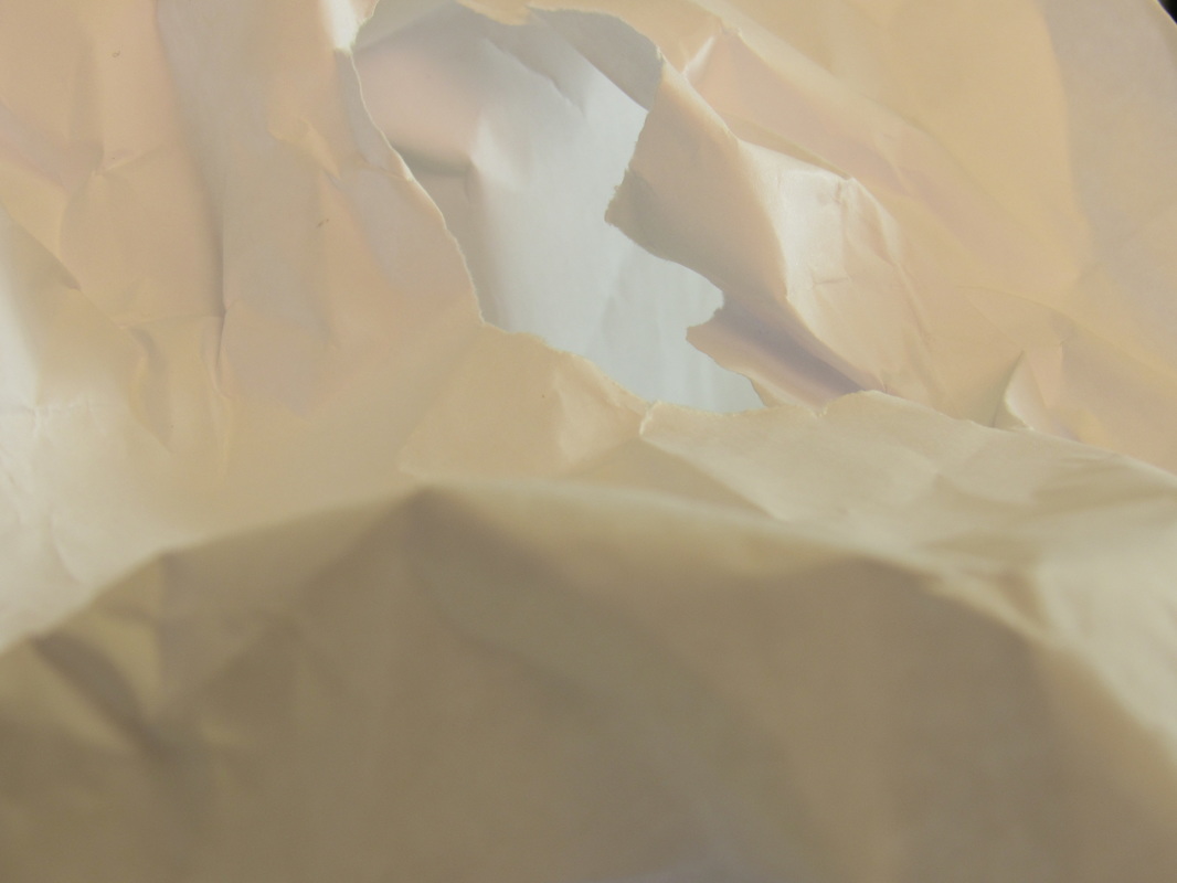
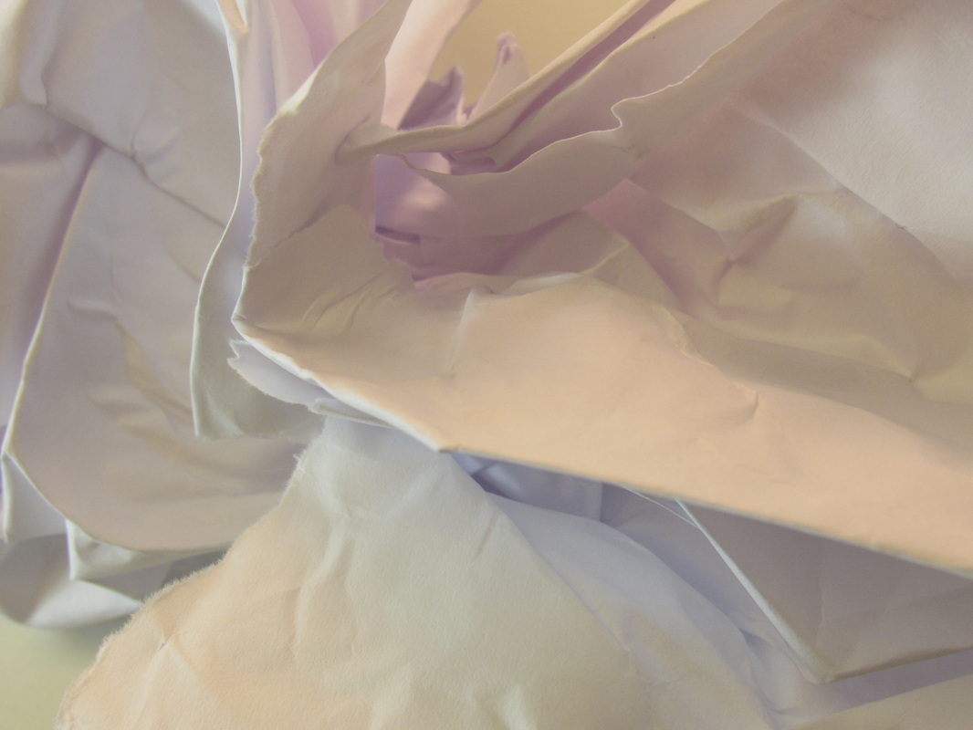
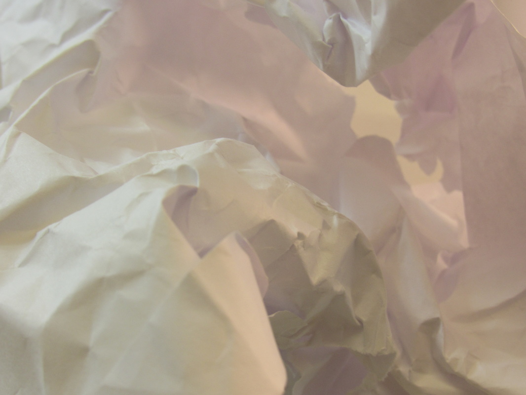
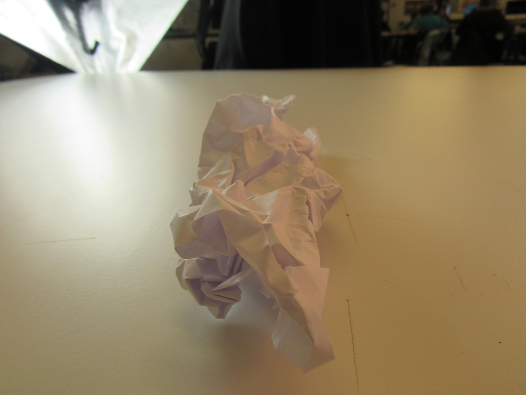
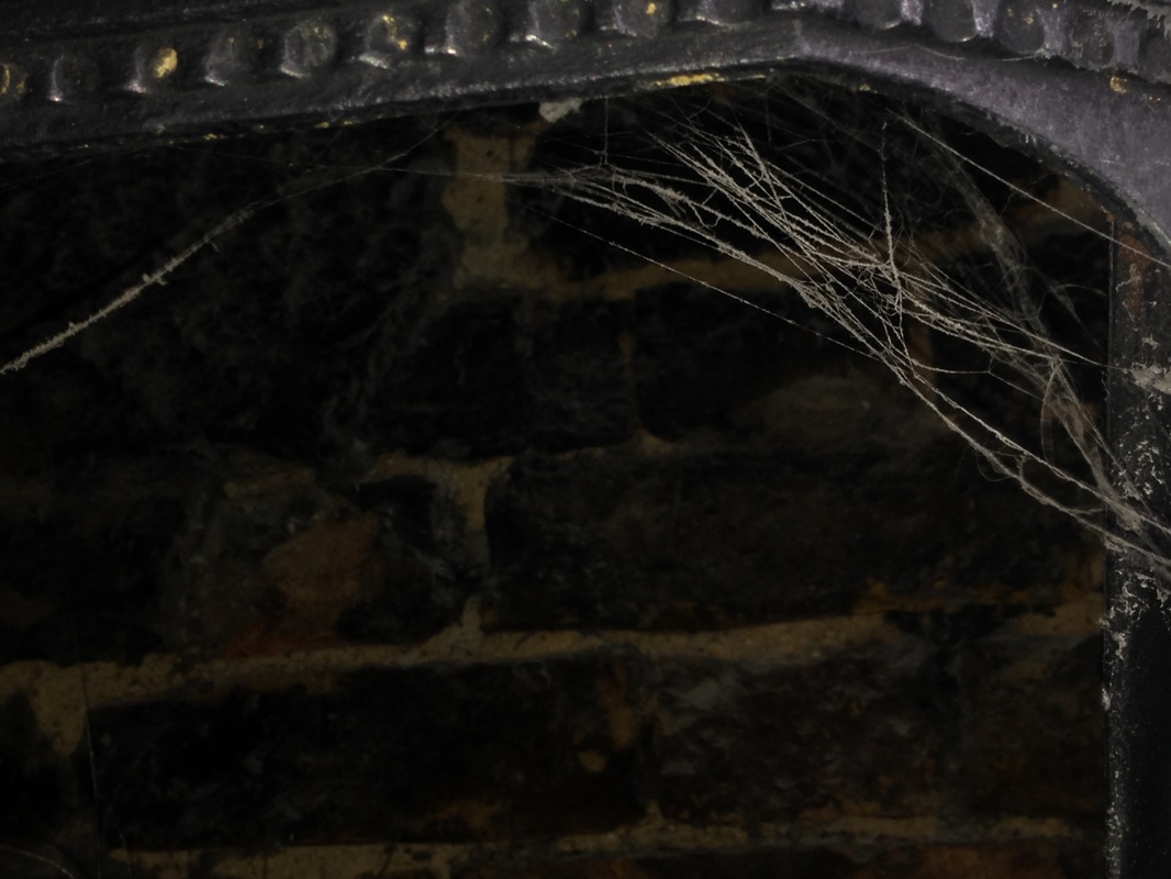
We were introduced to a video about abstraction, and it contained lots of different sculptures and DIY objects. The video was a sort of time lapse of the person putting everything together and photographing it. Our task was to recreate this and do sculptures of our own. In order to make these abstract photos we needed to make some small paper sculptures. We were given different materials and had to make a piece of paper that stood up, and also casted shadows. I started off by cutting my piece of paper through the middle to create interesting shapes for the shadows. Then I got some orange transparent film and put a bit of it in the holes. I was hoping that it would create an orange tinted shadow but it didn't really work. Once the sculptures were done I placed it on the table near the window and started to take photos of it. I changed the angle or the shape of the sculpture on every shot, but most of them were birds eye view. They cast some interesting shadows across the table, and I made sure to keep only the table and the sculpture within the frame. Personally, I don't think the photos are that abstract or interesting. I wouldn't stop and look and them thinking that they're that interesting. This is because the photos mainly contain a dirty sort of white and vey little colour. The shadows are not that defined and the photos would be a lot better if there was a strong outline of the shadows. I think in order to do this I would need a strong direct light coming from one direction, because in the classroom there was a lot of light, meaning the photos didn't come out that well. However, in some photos the shadows came out well. For example, in the second photo that I took, there light coming from different angles made the shadows have different shades to them. I thought this looked quite good and was the best photo out of them all.
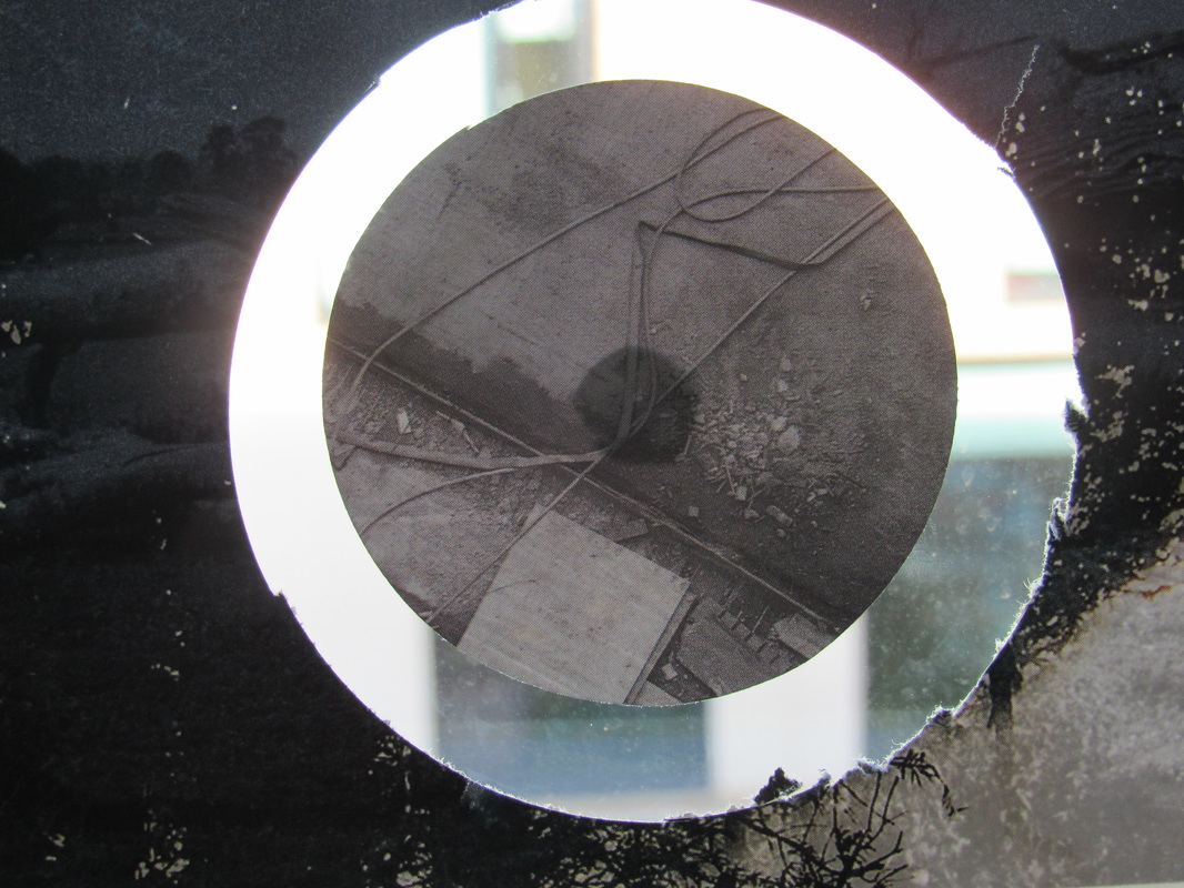
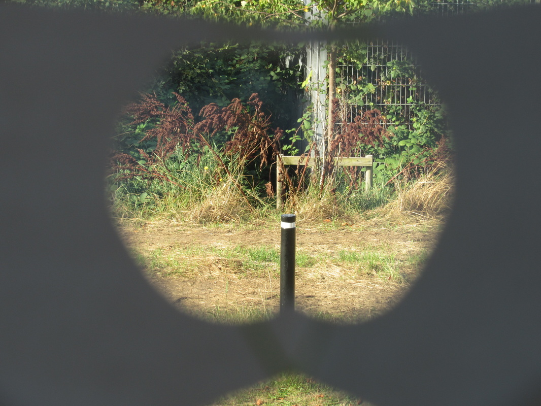
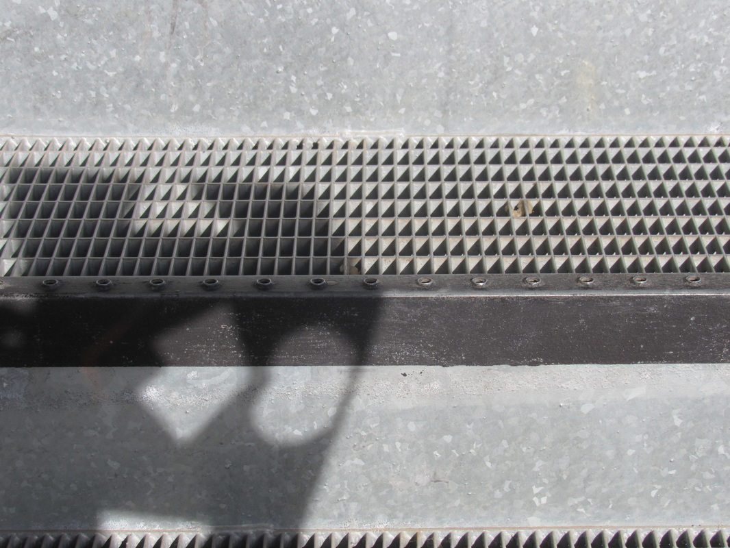
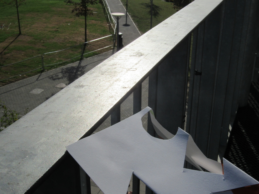
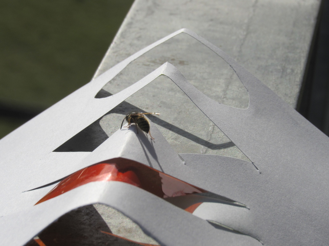
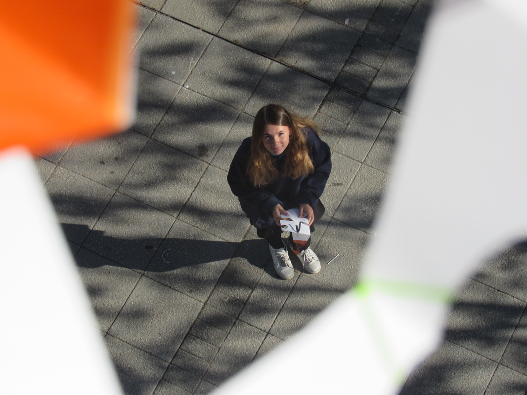
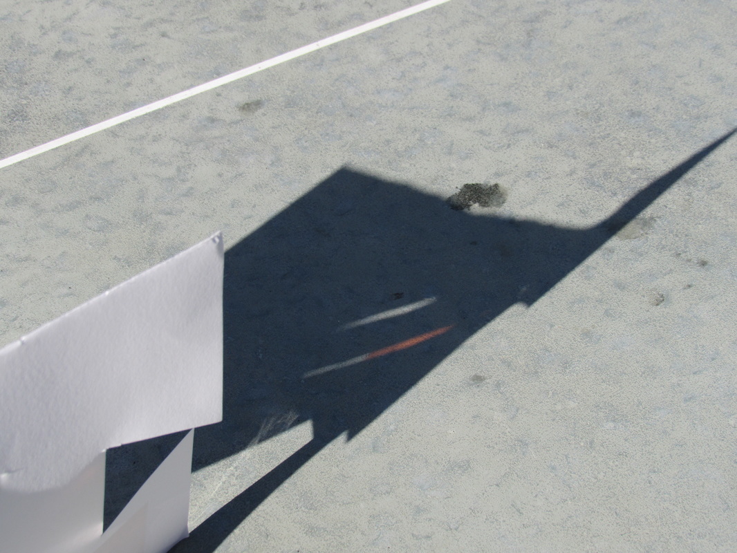
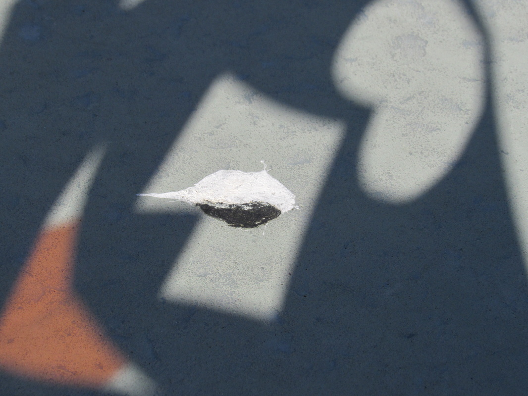
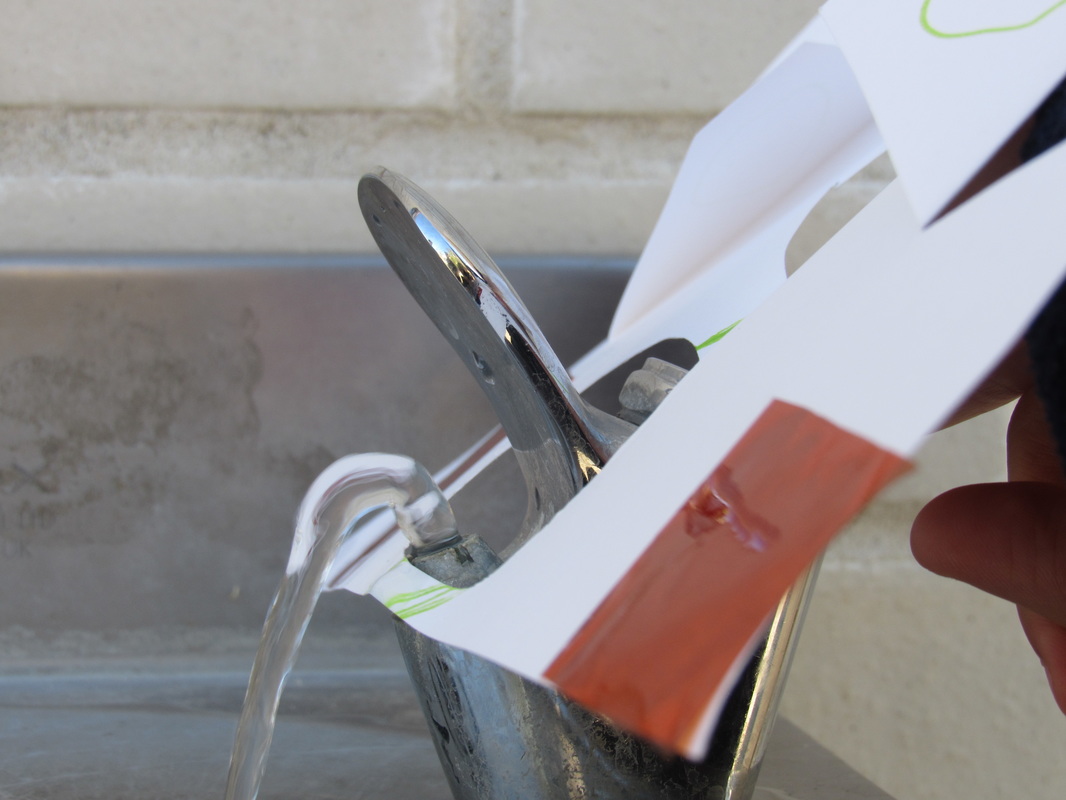
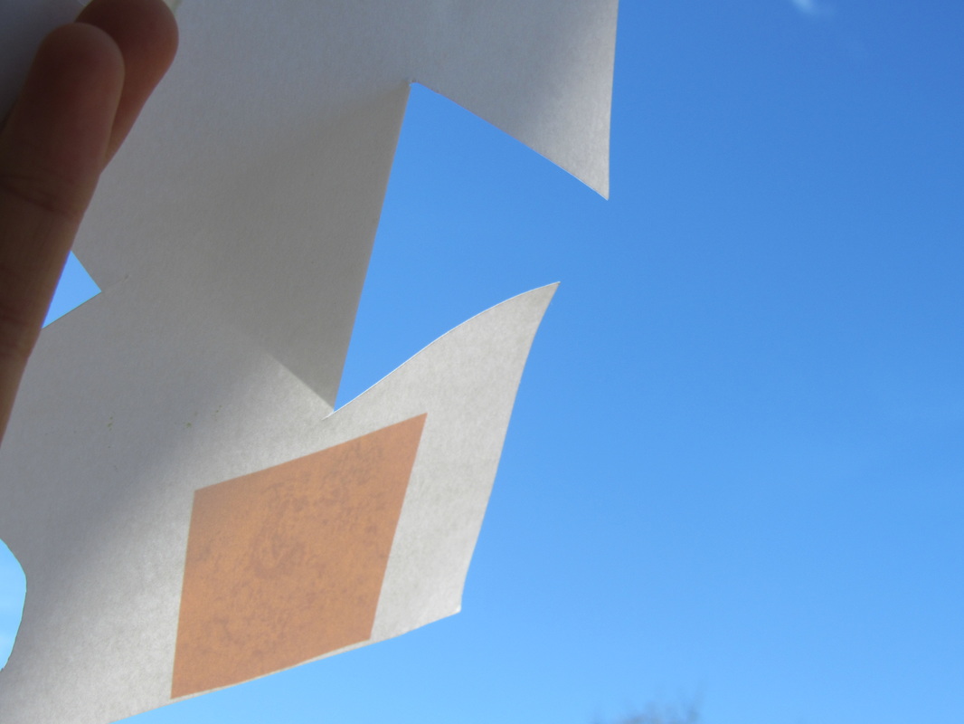
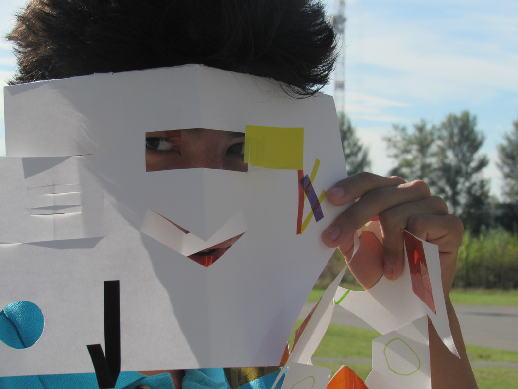
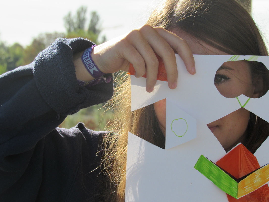
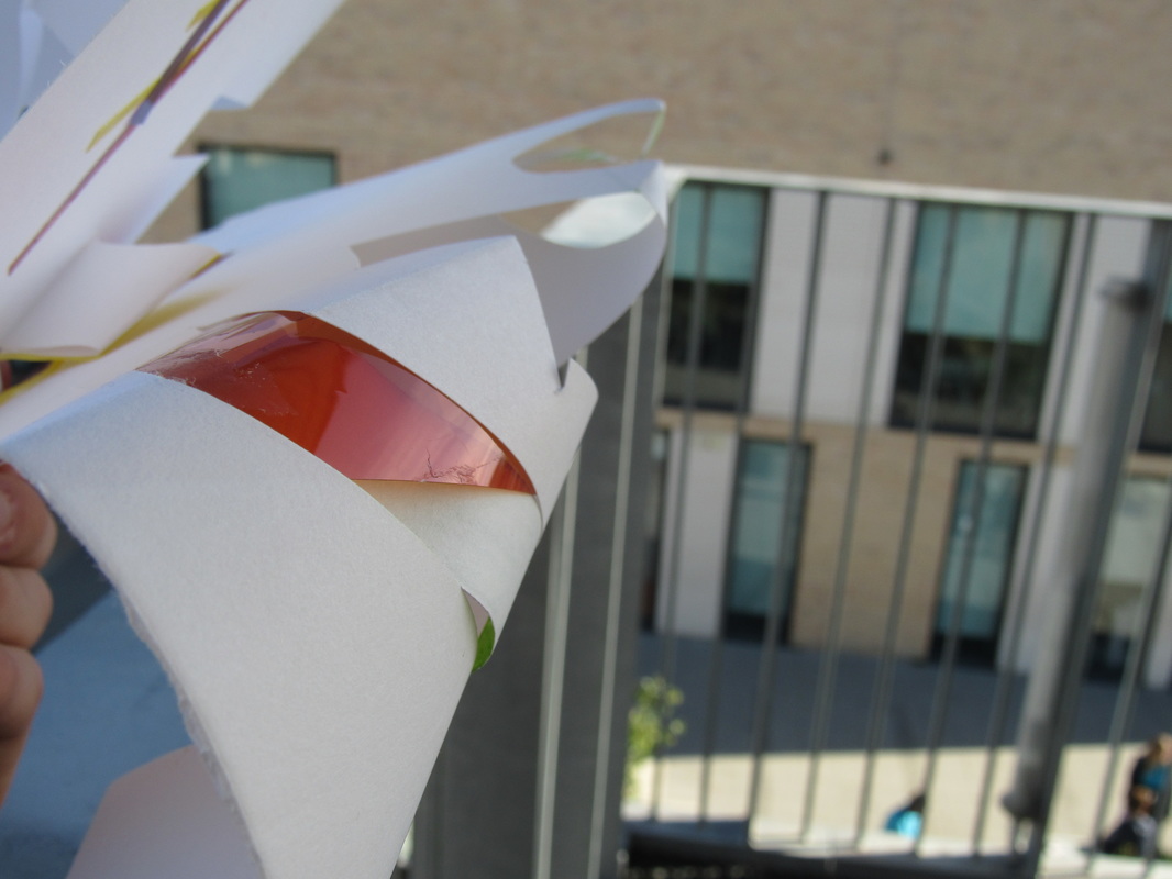
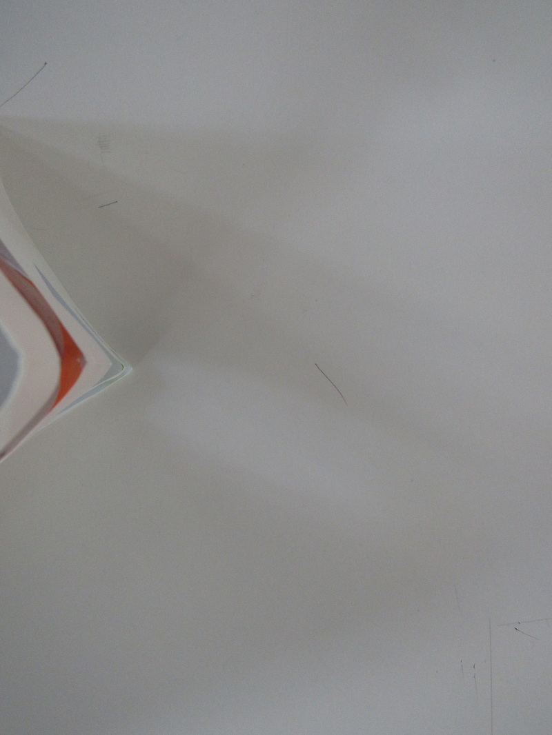
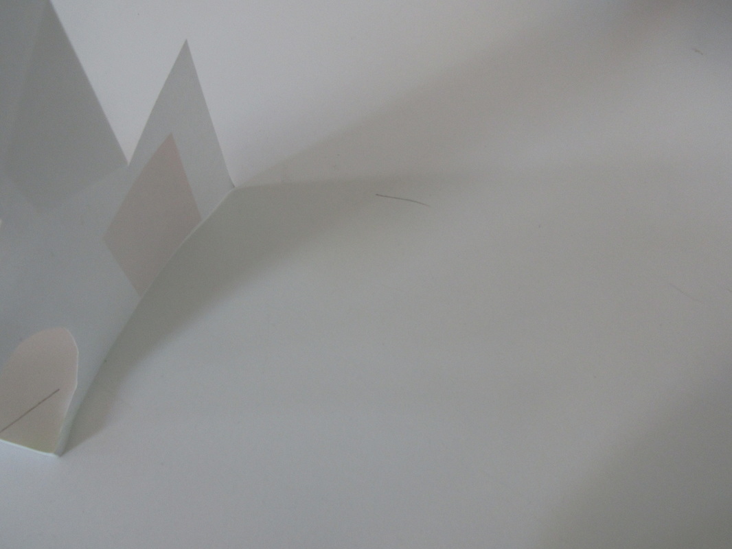
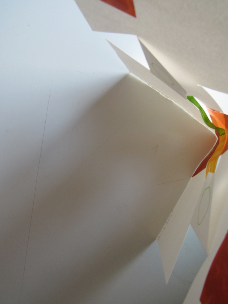
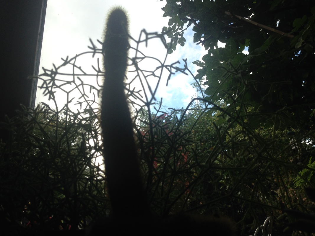
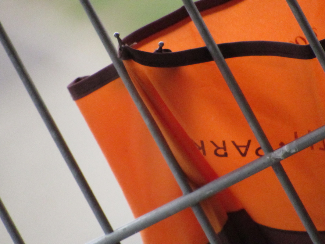
For this task we had to take the sculptures outside the classroom and around the school and take photos of them. At first I tried taking some photos through holes in the paper and tried to get some interesting angles. These came out ok, but I couldn't focus on the paper and the background at the same time so image quality wasn't at its best. After this I went to the top floor and started photographing the sculpture itself, but not all of it. These types of photos are my favourite because the viewer is drawn into the sculpture. On one of these a wasp landed on the sculpture and I managed to capture it. I then experimented with some shadows by placing it on the ping pong table. I think these would have been better if I had some coloured film paper that was exposed. All the bits of it on mine were covered by paper, so it didn't allow the shadows to be coloured. I tried out some photos with peoples faces and I think these came out really well as well. When covering the face, it lead to a very abstract and interesting photo. If I hadn't taken them and I had seen them on the internet, I would have stopped and looked at them.
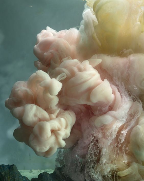
I really really like this photo. It is of a tank of water with paint being squirted into it. The artist has used pastel like colours such creamy pink and yellow and it makes an incredible photo. The focus of the image is very sharp. The paint has very fine and clear definition and you can see all the swirls and different shapes clearly. None of the photo is out of focus except perhaps the background, but it's hard to tell since it's a dull grey colour. The lighting of the photo is very bright, but not particularly hard. I think it's artificial light considering the circumstances in which it was taken. The light it coming from somewhere roughly behind the camera. I know this because the front of the paint cloud is well lit. There are also some very interesting shadows within this image. The different parts of the paint have cast small shadows over other parts, which plays with tone and makes the image look very real and gives it depth. The lines within the photo are all wavy and organic, caused by the way the paint has dispersed throughout the water. They definitely show moment because of the way the curl and wrap around one another. It's hard to tell if theres a pattern going on within the photo because the paint moves so randomly and naturally. Personally, I don't think theres any pattern within in it besides the colour scheme, but I like that because I think it gives it a aesthetic and calming look. The shape is very large, round and curvy and gives a very definite 'soft' feeling towards the viewer. There are some rocks towards the bottom left of the photo that have a much straighter and harder look to them. There is definitely a lot of depth to the photo, indicated by the shadows and shapes, but also because of the scale and texture of the photo. The huge cloud of paint looks soft to touch, and gives it a feeling that it goes on forever further back into the photo. It takes up a lot of the space in the photo too. The contrast between the colours is also very interesting. The pastel colours create a strong line between the soft, dull grey background. The background is obviously a lot darker than the subject. This is a great abstract photo.
Utah Barth - Out Of Focus
Uta Barth is a contemporary photographer from Berlin, Germany, Who currently works and lives in Los Angeles. She is well known for her photos playing with Focus, as seen below.
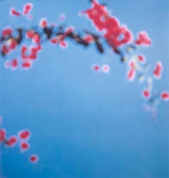
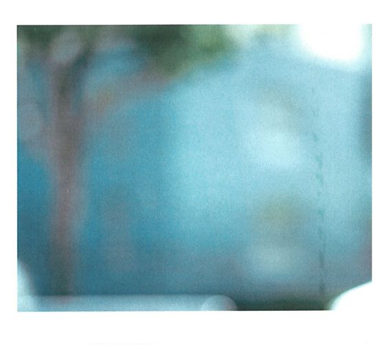
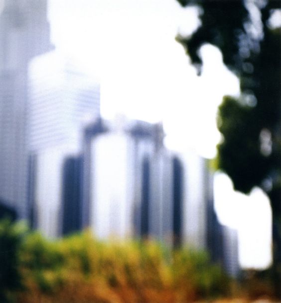

The first thing that you notice about this photo is the focus. The photo is completely out of focus. The picture doesn't contain much, but we can still see that it is ill defined. I like the way that Uta has used this because what would usually be a detailed subject is now slightly more unknown. This particular use of focus makes the viewer focus more on the colour than the definition. I would say that this photo was taken at an upwards angle, facing the sky. The light is natural and quite bright, yet it is soft. The clear light compliments the colours. All the lines in this photo are curvy and fairly thick because they're from the branches. The way that all the petals go across the image is also sort of like a line. The petals on the branches create a repetitive, organic patterns. A thing that I find quite interesting about this photo is the use of space. There is a huge amount of plain blue space taking up most of the photo. I think the photographer has done this to focus the viewer on the tree branch. I would say that the space is positive but Im not too sure.
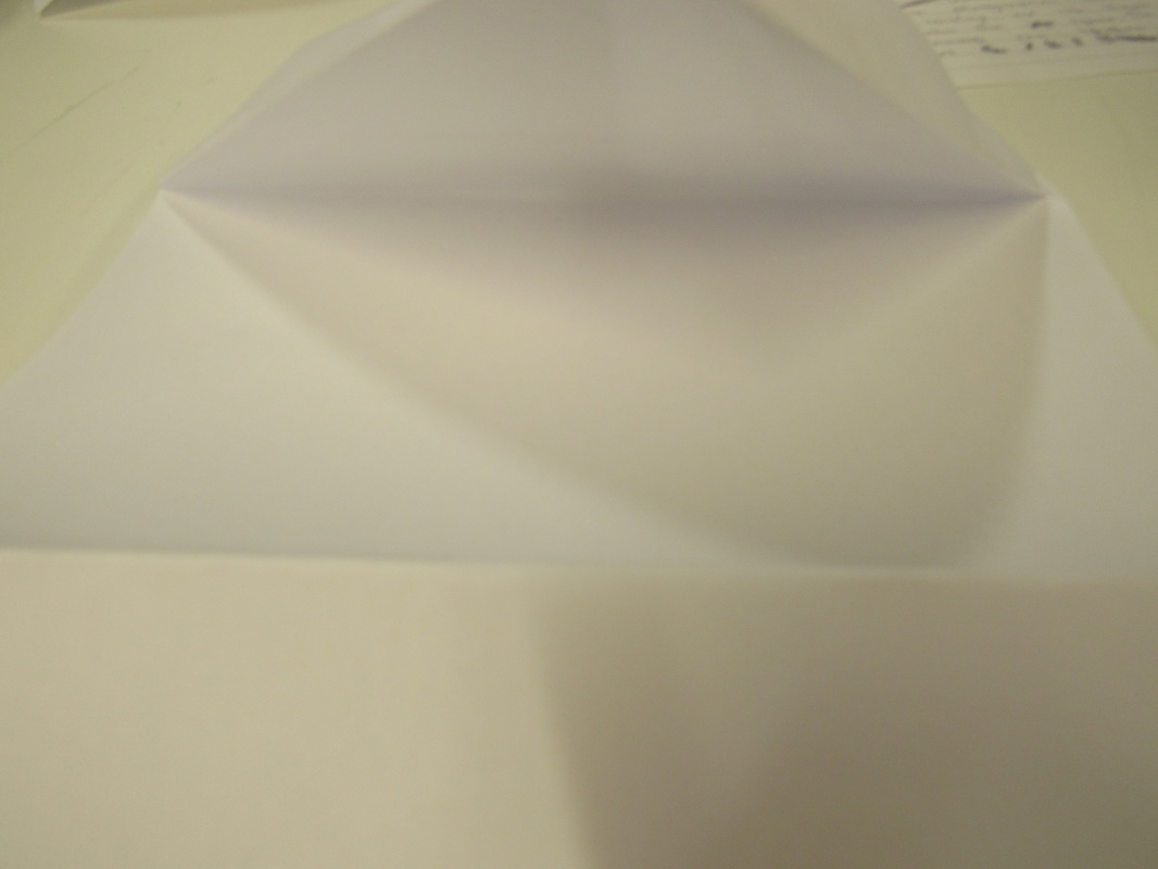
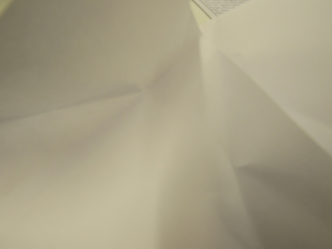
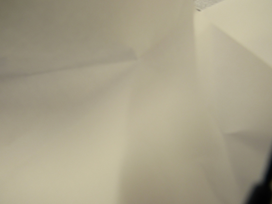
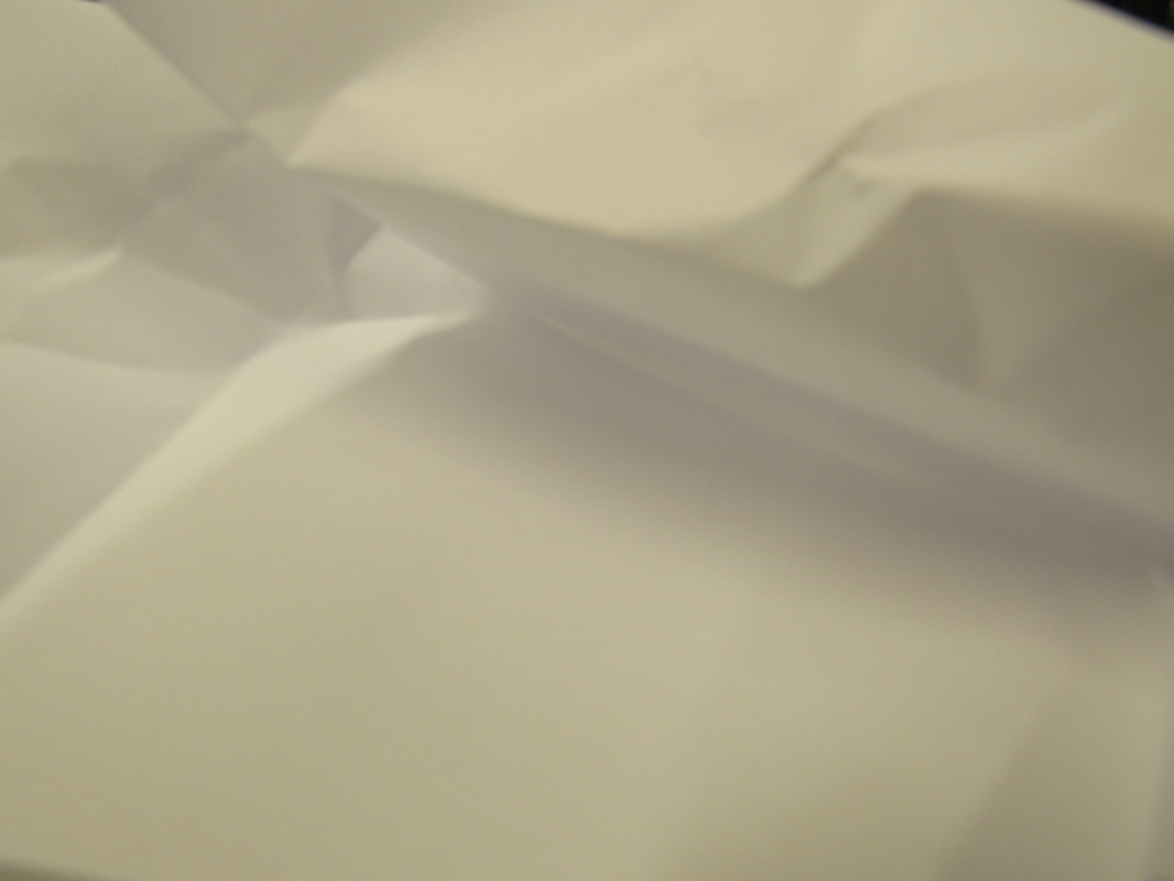
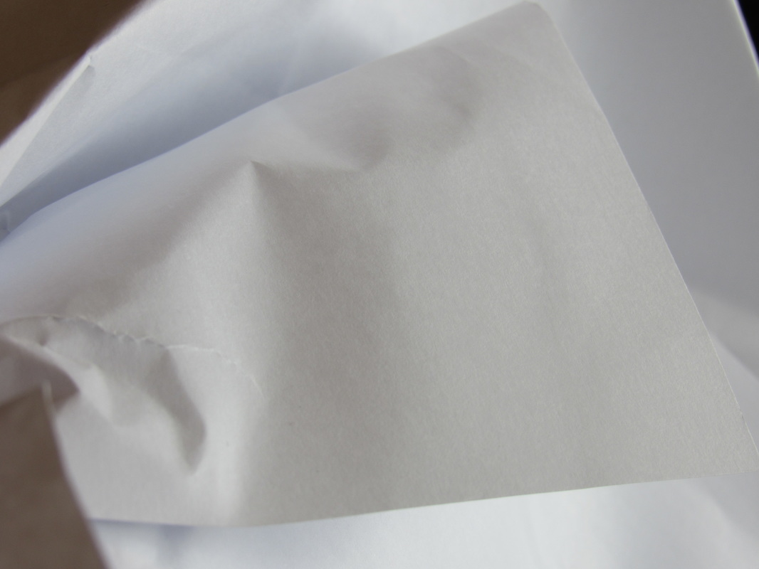
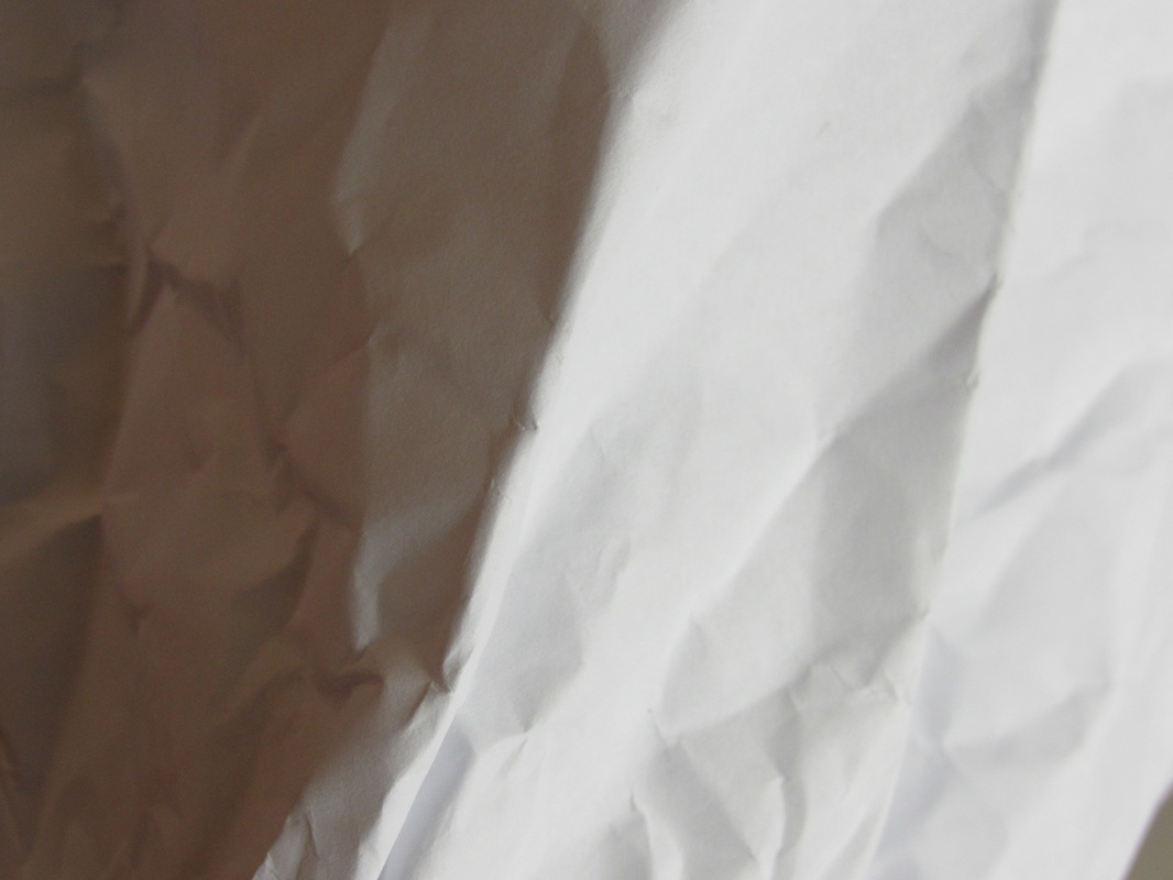
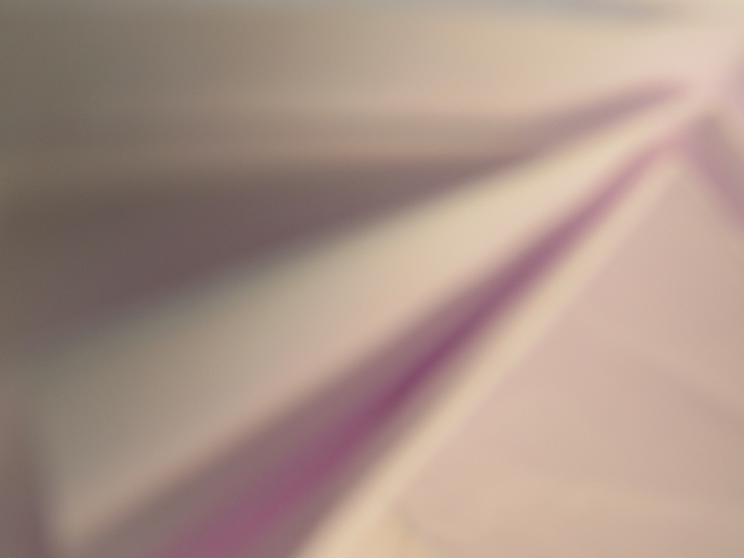
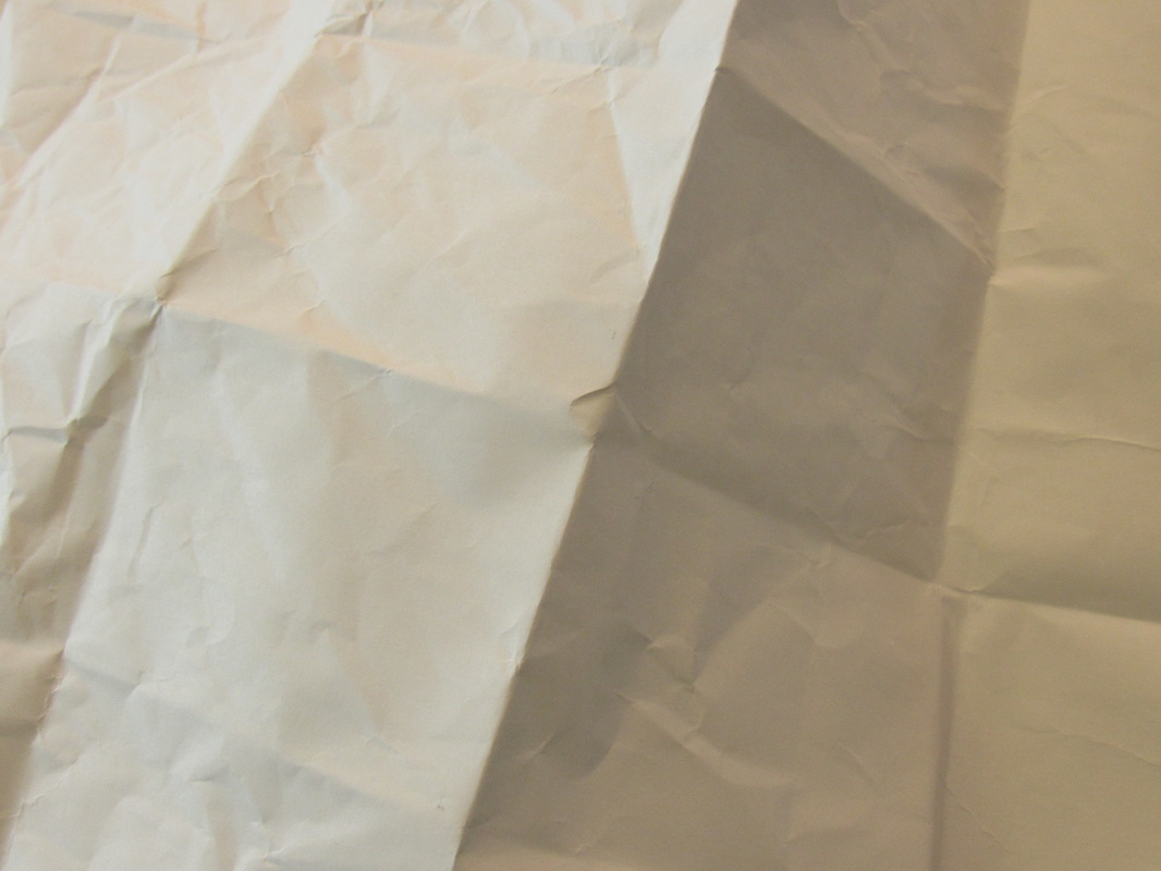
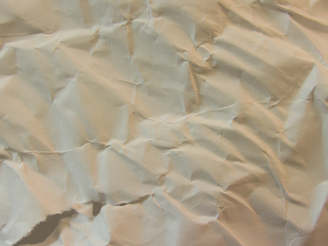
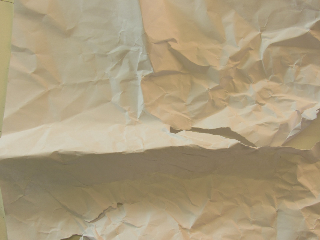
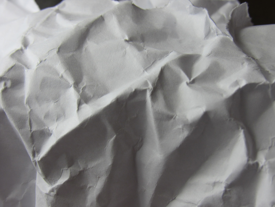
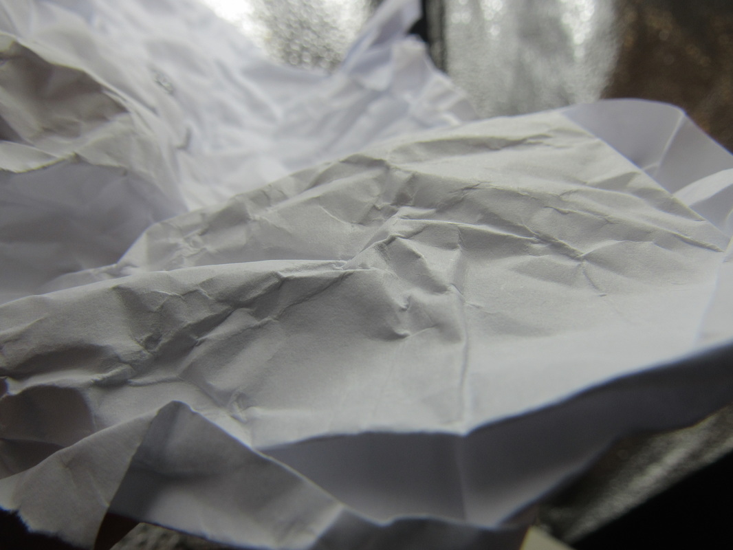
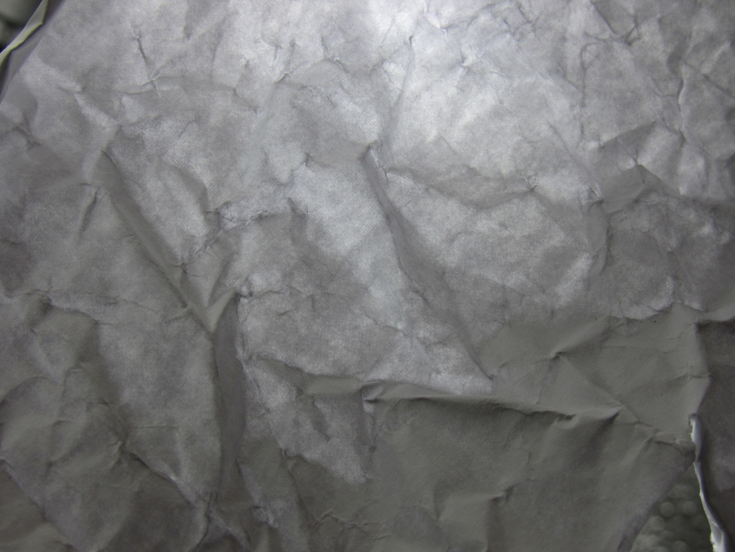
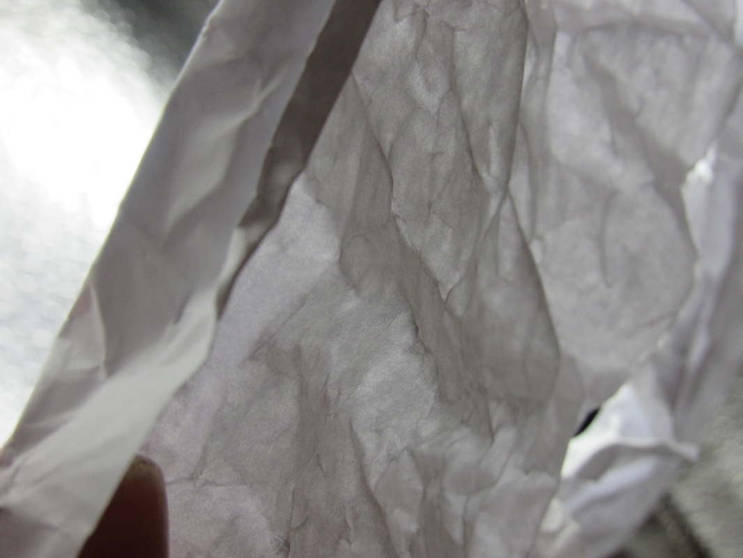
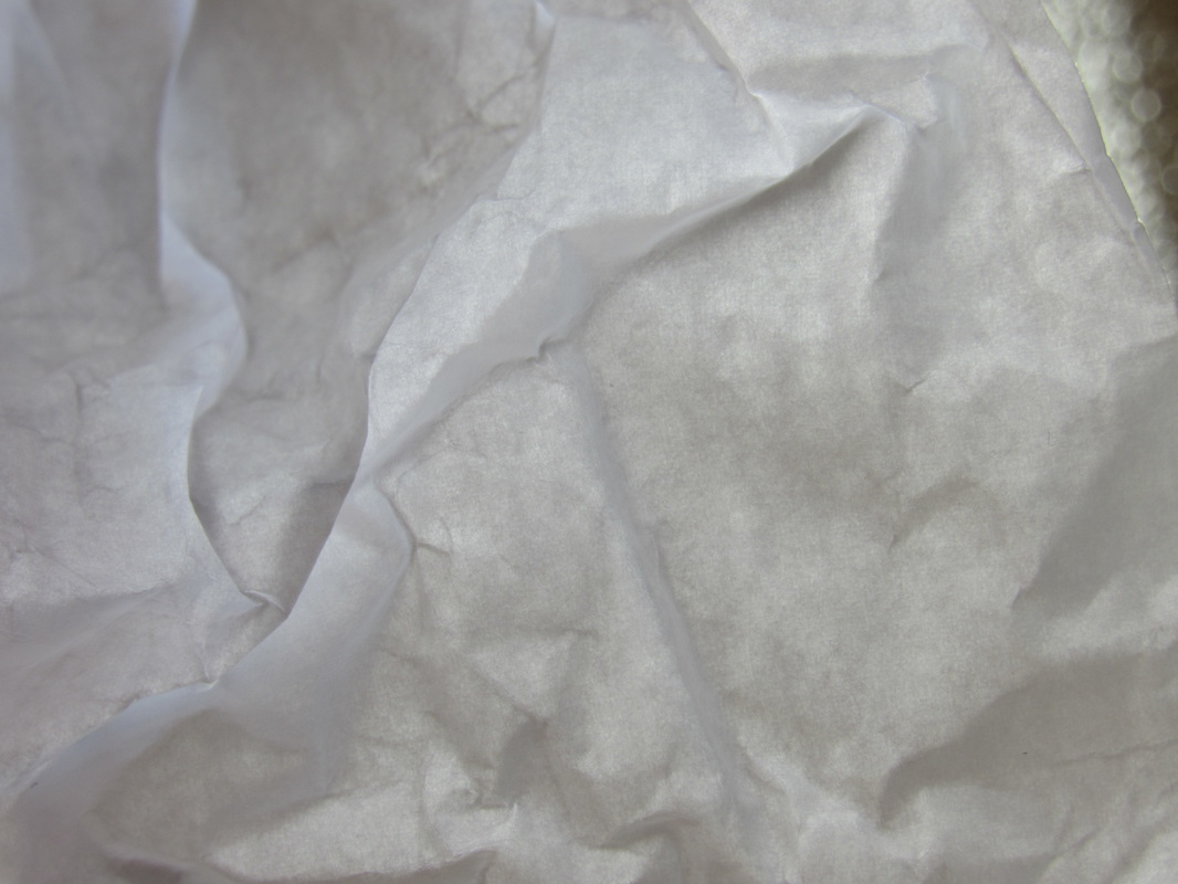
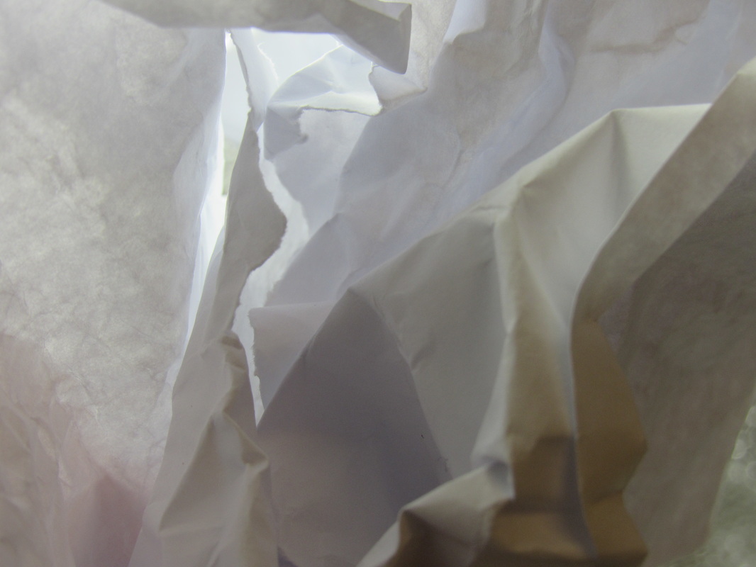
We were given a task to take 16 photos of a piece of paper, using different angles and different lights to change tones and create shadows and lines. We had to include nothing but the paper in the photo. This meant that we had to use a lot of extreme close ups and capture the detail on the paper. I found this task quite hard because when I was zooming in very close, It made it very hard to focus on the small folds and shadows. Quite a few photos had to be redone because they were out of focus. Also, it was surprisingly hard to only have the paper within the frame. I wasn't used to going so close up to the subject and I had to change the shape of the paper and angle of the photo a lot of times for it to work. I tried to get quite close to the light in order to help the focus, and personally I think these photos came out the best : the ones using had, artificial light. They hard very strong and clear lines the cracked throughout the paper. In some of them, you can see the angle in which the light is directed this changed the brightness in different parts of the image. This had quite an interesting outcome because it bought out new shapes. The focus is quite different in the all of the images. For example, in the images with soft natural light, the focus is slightly softer which lead to less defined detail. However, the hard lit photos have a very sharp focus. Texture also played a big part in the outcome of these photos. Theres quite a crisp feel, crunchy feel to the photos that were crumpled, but the fresh paper gives a smoother, swish look. Something quite unusual that I noticed whilst looking through my photos was a slight purple glint upon some of the pieces of paper. I think this may be because of the light catching the lens and reflecting upon something within the camera. I quite enjoyed taking the photos extremely close up because it was something new that I had never done before and I had to try multiple times before the photo that I wanted. The task hasn't really inspired me to do a series of photos of my own, but it has made me understand the concept of abstract photography a little bit more and how hard it is to take an abstract photo.
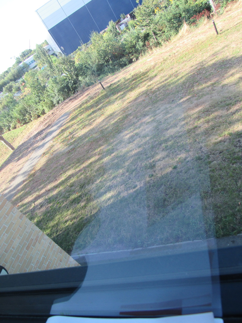
In this task I was asked to take a number of photos that fit they criteria of : out of focus, at an angle or extreme close up. For most of the photos, I chose to use out of focus and extreme close up because these are the two that I think look the best in abstract photos. I used my iPhone to take the photos because I wasn't too bothered about the quality of the photos; I think bad quality makes a photo a lot more abstract. I started off outside and took some out of focus photos of regular things such as fences and grass, but I tried to obscure it slightly more. As you can see, the focus is very soft in these photos which leaves the viewer to look more at the colours and shapes within the images. In this series of images, the colours play quite a big part. You can see that each photo has it's own sort of theme to it. Most of the time it's green, because of the location that it was taken in, but there is one photo that is slightly different. It's a very zoomed in, out of focus image of some chickpeas. This photo is quite abstract because of the repeating pattern of the small yellow shapes. The focus leaves the viewer wondering what the subject of the image is. Overall, I found this task quite hard. I think it was because there is not really a correct way to take an abstract photo, so I had to be independent and do it myself.
In this task, we had to take a number of photos inspired by Saul Leiter, that followed the criteria : Out of focus, Blocks of colour or Reflection. I chose the best 11 photos above. When I first started this task, I wanted to take a lot of out of focus photos that would be very abstract because you wouldn't know what was going on in the photo or what it is of. I found it quite hard to get the photos to stay out of focus. The cameras didn't have any manual settings so I had to play around with it to get it perfect. My favourite photo is the one of the window that has a reflection in it. It is quite bad quality and I really like the way the reflection is so unusual and out of place. For most of the photos, the focus is soft and detail is pretty much non existent. I definitely wanted it to come out this way. Even though Leiters photos usually have good detail, I really like the abstract grainy feel to photos. I think what I could have done better is used the block colours more. I only took 2 photos. I could have taken more, so next time I'll try and focus more on this part of photography.
My Final Piece
What I'm planning to do for my final piece is try out Projection Art. I am yet to do much research on it, but I have a basic idea of what it is. I'm going to use my camcorder to record some interesting video onto tapes, which I will edit to make a short film that's going to include strong colours. This was my initial idea, but then I realised it isn't that abstract. So then I came up with idea of projecting that video againts some people. When I do this, I'll film them having my video projected on them. I hope to do this in a room with a blac background, in order to draw attention to the shapes the person creates. I will then just edit the footage of these people together (with some music/sounds put over it) and make another short film of this. This will be the film that I use for my final piece.
I thought of this idea myself and I am yet to find someone that has done projection art with a video but I'm sure that there is someone thats done something at least similar.
I thought of this idea myself and I am yet to find someone that has done projection art with a video but I'm sure that there is someone thats done something at least similar.
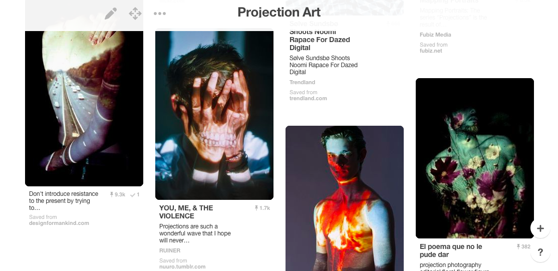
These are a few examples of some projection art. With these photos, you can see how necessary the black background is in order to separate the projected image from the background. From looking at lots of these photos I've noticed that a lot of them are projected at an angle, which is maybe how they managed to stop the projection from appearing in the background.
12/1/17
So far what I've done is simply edit together a small 30 second video that I wish to project onto different people. Next lesson I will use a projector, a black background and my camera.
12/1/17
So far what I've done is simply edit together a small 30 second video that I wish to project onto different people. Next lesson I will use a projector, a black background and my camera.
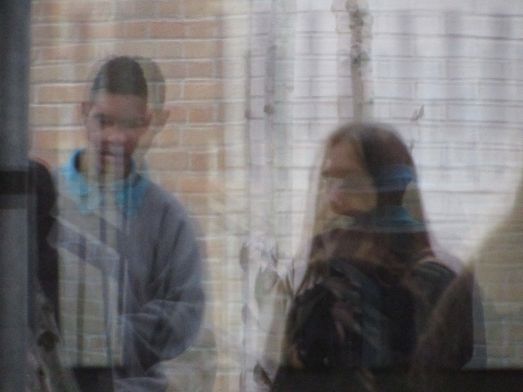
Above is the completely finished final piece. The video is just under 40 seconds, which is about the amount of time I wanted it to be. After searching the internet for similar videos, I couldn't find that many so I had to experiment with my own ideas and start developing them as I went along. I simply started by collecting some footage that I had from my tape recorder. I compiled this together using iMovie, and I made the 40 second video. This video took quite some time to make because I had to use a range of different techniques to get the video the way I wanted it. For example, the editing of the colours was quite difficult because I need to find the perfect balance between bright interesting colours and tacky over-saturated colours. I played around with the different appearances of the video in order to see their various effects on the viewer, and just experimented until I was satisfied with the atmosphere of the video. Once this was edited and exported I needed the projector. I used this to project the video onto a white background at the back of the classroom. At first I tried it with a black background because I thought it would appear more on the person in front of the background, but it didn't work so I settled with white. I asked Max to put on a white hoodie and then told him to stand in the way of the projector, to purposefully cast a shadow on the wall. We experimented with different shapes and shadows, and I filmed the video about 15 times, each with different positions. This was an experimental process because I didn't know which positions I was going to use and how they were going to effect the video in its final form. I also used a variety of different angles when filming so that the shadows would be seen differently in each clip. I wanted to make it obvious to the viewer that I wanted the shadows to be visible in the final outcome, so I selected a lot of the clips that had a focus on them. Once all these videos were filmed, it was back to editing the final video. This was the hardest part of my whole project. It involved having to keep the projected video in perfect timing with it's sound, but inside another video. I had to pay close attention to where the video was in the background so that it would line up perfectly, frame by frame, with the original video. The audio track that I used over the video is an extract from a radio show during the 1940's. This concluded the end of my final piece. I hope that this video presents abstraction as a very subjective form of art, and that there are many different ways to achieve a piece. The use of abstract video presents the subject in more of a divergent way in comparison to a normal video. I also hope that the audience notice the use of shadows on a digital video, since I made sure that the different shapes they made were noticeable.
I think deciding to make a video for my final piece at first was a bit of a challenge, since everyone else in my class was either doing a physical piece or some kind of photo. It meant that it was harder to reflect ideas and develop them with other students since my project was so different to theirs. However, I think it was a good idea to try something different and challenge myself.
I think deciding to make a video for my final piece at first was a bit of a challenge, since everyone else in my class was either doing a physical piece or some kind of photo. It meant that it was harder to reflect ideas and develop them with other students since my project was so different to theirs. However, I think it was a good idea to try something different and challenge myself.
