I chose to do my final piece on Fragments because of the opportunities it provides. For example, I can choose to edit my photos on photoshop and make a fragmented photo spread or I can choose to make a physical piece such as a sculpture. Fragments are quite hard to achieve without doing heavy editing as you can see from the photos below. There is also an element of abstraction in fragments, which is a topic I'm really interested. I think choosing this topic will provide me with a challenge, but also a lot of opportunity to make something good.
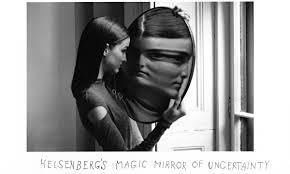
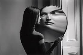
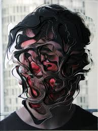
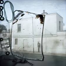
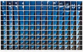
Duane MlchalsMlchals's photos are generally in black and white, and the photos specialise in fragments and has a slight element of abstraction. The subjects of his photos normally consist of one person, and the focus is normally on their face. I think he creates his abstract atmosphere by adding some sort of object or toy that wouldn't normally be there. The viewers attention gets drawn to this little piece of detail and it definitely makes the photo a lot more interesting. For example, the photo where the girl is looking into the mirror and her face gets distorted, and I would describe as abstract. The image within the mirror is not what's expected, as the face is very enlarged and stretched. I've noticed that he also has quite a large focus on reflections. Perhaps this is because reflections have a strong link to abstraction and they can be manipulated easily.
|
|

|
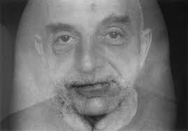
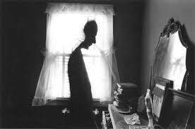
Out of the nine images above, this one is the one that caught my eye the most. It consists of a morphed body in the centre of a dark room, looking at a mirror. The first thing that strikes me in this photo is definitely the body in the centre. It's as if their head has been cut in half from the back and it looks like they have no arms. This gives off a very abstract feeling which I really like. The lighting is also a very prominent aspect of the photo. Behind the subject is a window which has very bright natural light shining through it. This light is very hard and contrasts greatly with the dark walls of the room. The camera is more exposed to the light coming through the window than the lighting of the room. This makes the photo very dark. I think this gives it a slightly depressing feel to the photo, and makes me question if there's something more to the disfigured person in the centre. Michal's composition of this photo is one of my favourite aspects. The way he's created contrast and a sense of unknown just makes the image so interesting. I would like to find out how he's edited the person in the centre to give them subtle disfigurement.
|
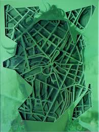
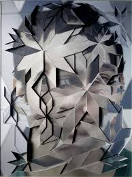
Lucas Simões
|
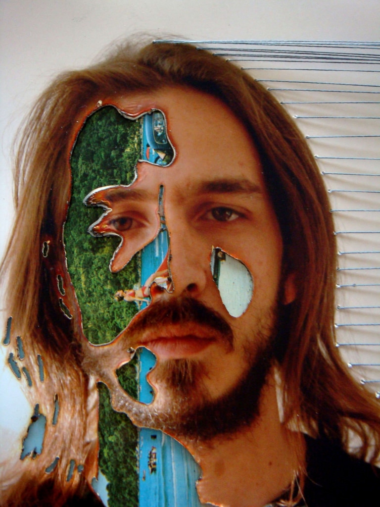
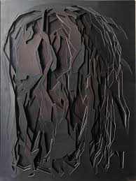
As you can see by looking at the photos to the right, Lucas' photos are very focused on fragmentation. He often takes one photo and makes a 3D sculpture. He does this buy cutting bits out of the photos and sticking them over a different part, but he makes it stick out, giving the images a sense of depth. Because of this approach, he is able to play with many different types of shapes and styles. For example, in some of his photos he has a scrambled, unclear pattern (like the green one on the right) but then he also has patterns that are very regular and continue throughout the piece (the one in the centre). I've also noticed that his subjects are genuinely a close up shot of somebody's face. Normally, the emotions seen on the subject's face can emulate that of the ones the viewer gets from the photo, but not so much in Lucas' photos. He completely scrambles their faces, so any sort of emotion or general feelings that come from the images have to come from the colour and tone of the sculpture. Furthermore, by looking at the bottom 3 images I feel like he has the approach to photography of a painter since they're are tonally dependant and rely more on colours.
|
|


|
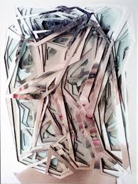
This photo by Simões is one of my favourites. I really like the textures and the way he's developed the colours. In terms of light, this photo is quite dark. There is a vignette around the edges of the photo which makes the viewer focus more in the centre. It's as if the photo is slowly 'growing' towards the focal point : the middle. The lighting here is quite bright and I would describe it as artificial, but still soft. This soft look could also have been produced through the colour scheme of the image. He's used 'woody' brown colours which are calm and don't stand out that much. I think the photo would have turned out a lot more different if he used extravagant colours such as bright blue or pink, since it would stand out and give off a complete different atmosphere.
Just by looking at the photo you can see that there is a focus on edges and lines. There are many dominant lines going through the image at different heights, directions and colours. None of these lines create any sense of motion since they're scrambled and have no specific direction. This makes the image seem very noisy. These lines act as the subject of the photo because there's no other dominant figure in the image. Through the use of colour and depth he's managed to give this image and 3D feel, which is one of the main reasons I like this image. It can be quite hard to make an image jump out to the viewer so it's quite impressive that he managed to do it. |
Experimenting taking Fragment photos
Further Experimentation - Fragments
Rough piece plan :
For my final piece for fragments, I want to create a physical piece to do with shattered glass. I am going to use a photo with nice colours and a simple composition. This is because I want the shattered glass lines to contrast against the uncomplicated photo. I would frame this photo, put the glass frame over it and hit it with a hammer so there's a visible point of impact with following lines coming from the epicentre. One bad thing about this plan is that I won't be able to keep the frame because picking it up will spill the glass everywhere.
For my final piece for fragments, I want to create a physical piece to do with shattered glass. I am going to use a photo with nice colours and a simple composition. This is because I want the shattered glass lines to contrast against the uncomplicated photo. I would frame this photo, put the glass frame over it and hit it with a hammer so there's a visible point of impact with following lines coming from the epicentre. One bad thing about this plan is that I won't be able to keep the frame because picking it up will spill the glass everywhere.
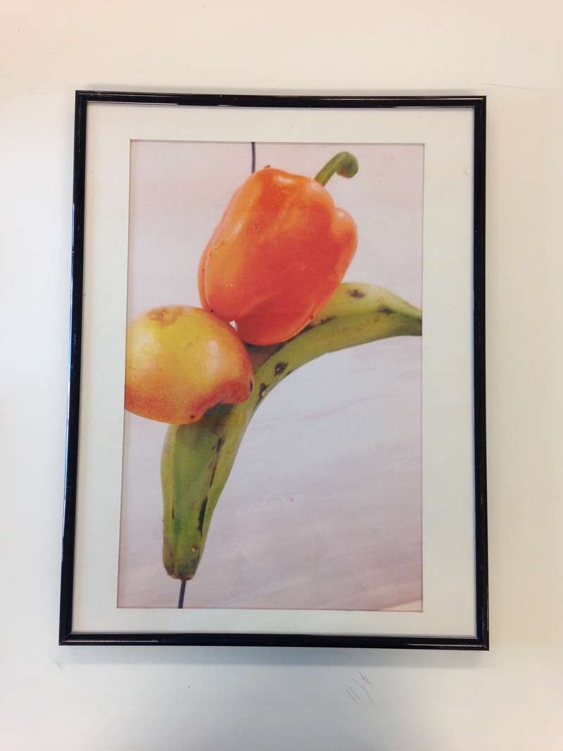
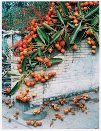
The Photo
The photo I used is of three pieces of fruit and vegetable, held up by a piece of wire. The reason that I chose this piece is mainly because of the colours. The colours are very bright natural colours such as red and green and they have a very saturated and contrasted effect on them. There is an obvious filter over the photo in order to enhance these colours. I also like the simplicity of the photo. The 3 pieces of fruit and vegetable make for a very aesthetic composition because they create an almost linear direction of 'movement'. What I mean by this is that all the action and things happening in the photo are going down the centre, leaving the sides untouched and creating a contrast within the image itself. Furthermore, the use of a simple plain background allows for more contrast and also makes the viewer focus on the subject of the photo and the details within it. I took this photo on my phone and the quality makes the whole photo quite soft, without any sharp definitions of detail and light, which I quite like since it has more of an aesthetic, relaxed feel. This is one of the main reasons I chose to use this image underneath shattering glass. A calm, relaxed photo will become something of interest once unexpected cracks and destruction are associated with it.
At first, I had a very large sheet of glass that was way too big for any frames that I had in school. Because of this, I had to resize and choose another sheet of glass with a frame. Luckily, I was able to find a frame that was perfect. I printed my photo in A3 size and had to create a white boarder in order to make sure that the photo fit in the frame. This was quite a simple process, and I simply glued everything together and placed it within the frame. The image above is what I had so far at this point. A part of me didn't want to smash the glass because I really liked the way the photo looked in the frame, but I went with it anyway.
Final Outcome
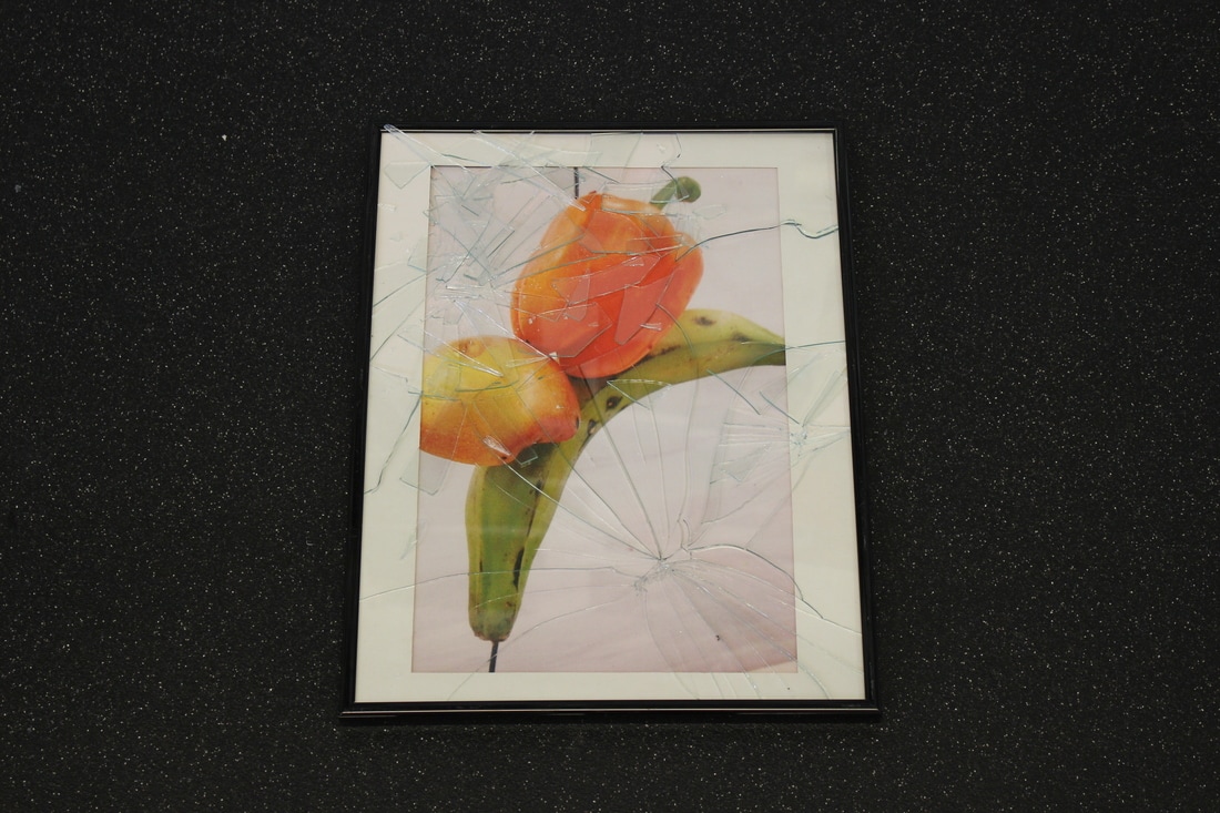
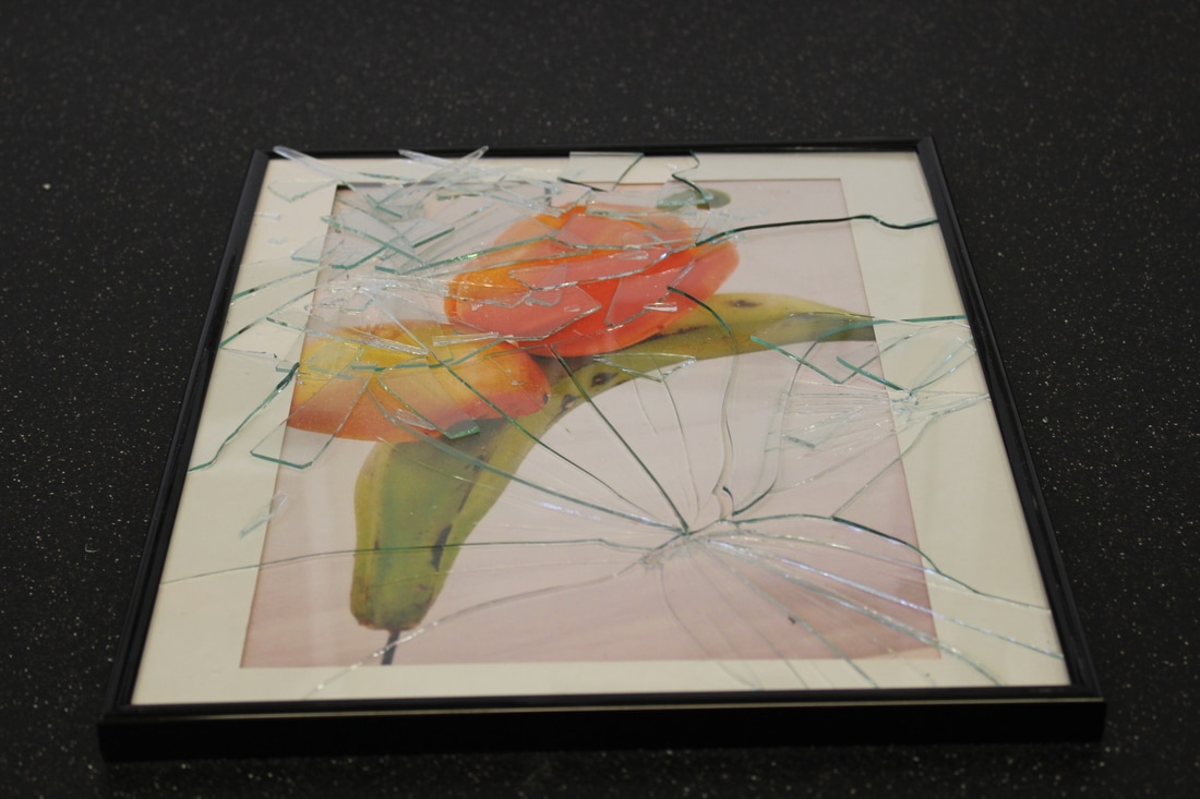
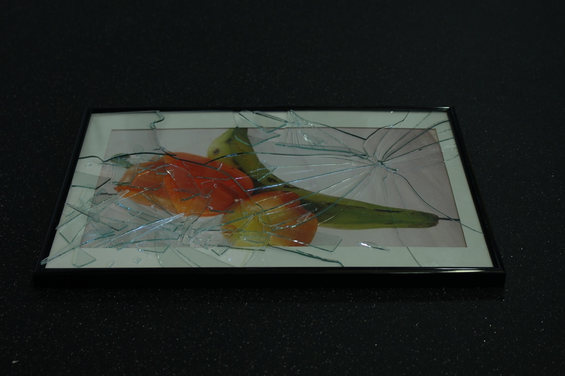
This is the final outcome of my piece. I am fairly happy with the way it has come out, and the process was quite challenging and out of the comfort zone. This definitely meant that it was a challenge at some points. Personally, I think that the topic "Fragments' is quite a hard one to do a project on because it isn't as simple as just creating something. You have to really think about how you're going to link it to the topic and how it is relevant. I found that this was a recurring question when I was making my final piece. Also, a lot of the time there is some sort of editing, wether that be digital or simply moving something into place. This does therefore allow for a lot of creativity and many different ideas to come into play.
Contrast was a strong focal point during the making of my piece. I think I have been able to properly capture how I want to express this in the final outcome. As said earlier, I wanted a contrast between the sweet, relaxing photo and the violently broken glass on top. As you can see from the photos above, this was quite nicely achieved since there's an array of different cracks and smash points on the image. I experimented with ways of smashing the glass as well. At first, I just swung the hammer into the glass and it shattered it into small pieces, which can be seen in the top left corner of the image. Although I think this looks quite cool, it isn't exactly what I was going for so I decided to change my technique and instead apply pressure to the glass and let it crack slowly. Overall, I quite enjoyed doing this piece and I definitely found it more challenging than most tasks that I've done before. I felt that it was quite hard to get started with a solid idea which I was confident. This could be seen as good, because I'm placing myself out of my comfort zone, but it also meant that developing the idea was difficult.
Contrast was a strong focal point during the making of my piece. I think I have been able to properly capture how I want to express this in the final outcome. As said earlier, I wanted a contrast between the sweet, relaxing photo and the violently broken glass on top. As you can see from the photos above, this was quite nicely achieved since there's an array of different cracks and smash points on the image. I experimented with ways of smashing the glass as well. At first, I just swung the hammer into the glass and it shattered it into small pieces, which can be seen in the top left corner of the image. Although I think this looks quite cool, it isn't exactly what I was going for so I decided to change my technique and instead apply pressure to the glass and let it crack slowly. Overall, I quite enjoyed doing this piece and I definitely found it more challenging than most tasks that I've done before. I felt that it was quite hard to get started with a solid idea which I was confident. This could be seen as good, because I'm placing myself out of my comfort zone, but it also meant that developing the idea was difficult.
Further Experimentation
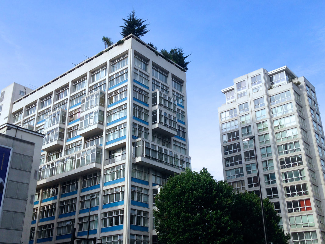
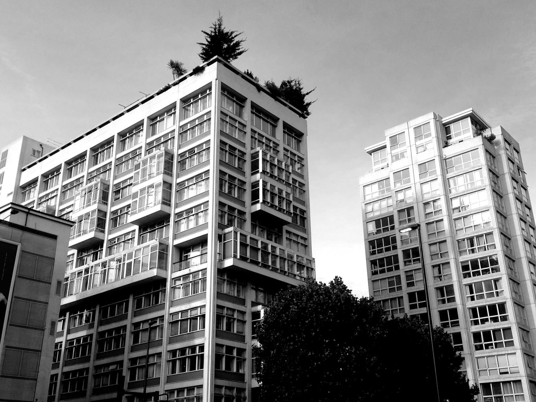
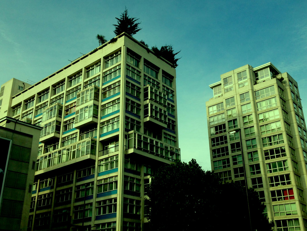
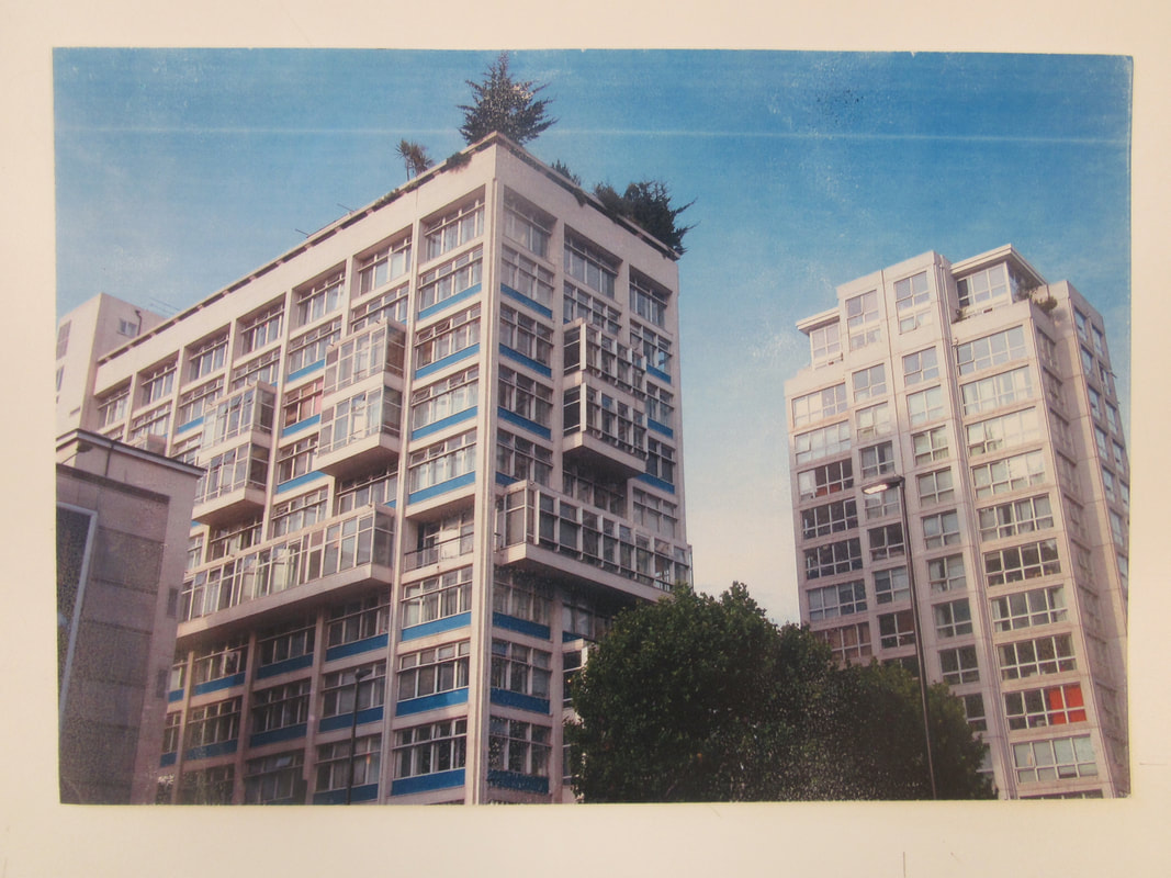
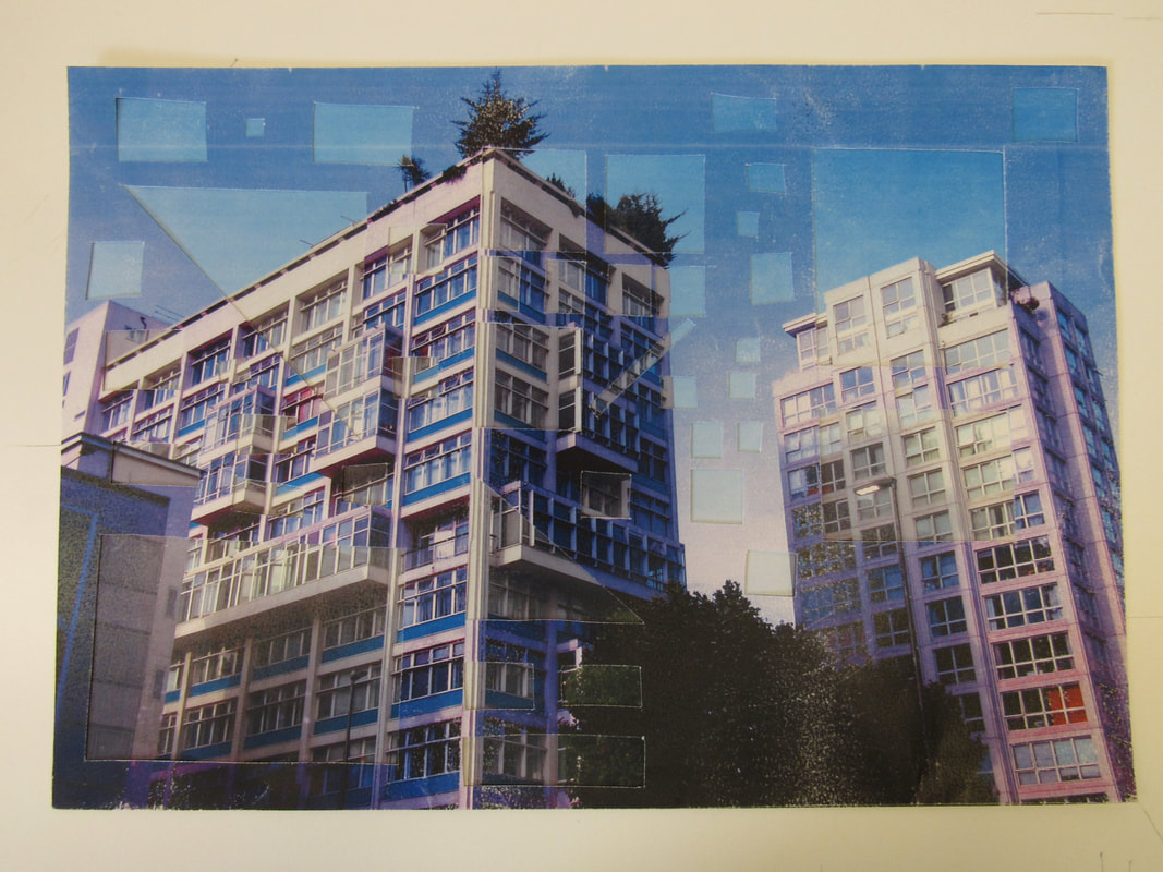
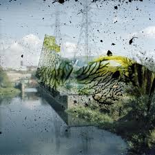
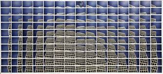
I have chosen to start experimenting with a different photo and and a different process. I chose this photo because I think it relates to Fragments in many different ways. The photo consists of two quite tall buildings, taken from street level which creates a sense of scale. One of the buildings has these blue patterns of colours covering the whole building. This is one of the reasons I took this photo. Among the grey and industrial feel to the photo, the blue blocks stand out and give the photo a sense of life and it's own 'theme'. There is almost a colour scheme to the whole photo because of the bright blue sky and the blue colours on the building. The trees at the top and bottom of the photo add further contrast to the grey of the building on the right because of their strong green, but they compliment the blue in the photo. I think it's quite interesting how a photo taken in a quite industrial setting can have such a natural feel to it, which could definitely catch a viewers attention, and is why I took this photo myself. I also really like how there are trees on top of the building which almost adds an abstract feel to it since it's such an unusual sight. Furthermore, the shapes included in this photo are quite 'Fragment-like'. You can see this with the building on the left. It has blocks sticking out of it, quite unnaturally, which give a perfect opportunity to alter the image and really bring out the unusual elements.
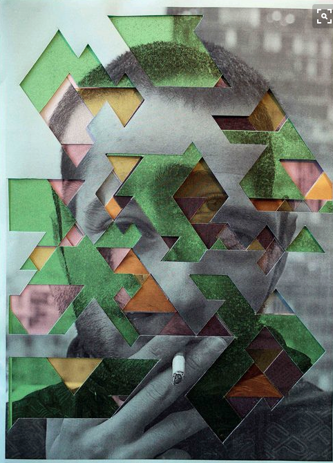
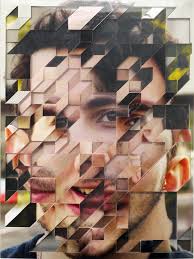
I used this picture as inspiration for my project, which I found on Pinterest. The photo is of a man who has a cigarette raised to his mouth, and is looking straight at the camera. The composition of the photo itself is very simple, as it is just a portrait photo of the man, in black and white, with nothing of too much detail in the background. The artist has layered the same photo three times over the original. Each different copy of the phot has a different colour theme.The artist has included green, yellow and pink as their colours for each of the copies. They have then cut geometric shapes through each of the layers and finally layered them on top of each other, creating a colourful pattern that contrasts greatly with the black and white of the original photo. The first thing that caught my eye was the intricate shapes. They don't seem to follow any particular pattern, but the are all made of straight lines and look very fine and clean. I think the main idea behind this artist's photo was the contrast involved. Not only have they created contrast through the array of colours, but they have creating contrast between the soft shapes of the original photo and the sharp geometric shapes cut into the layers.
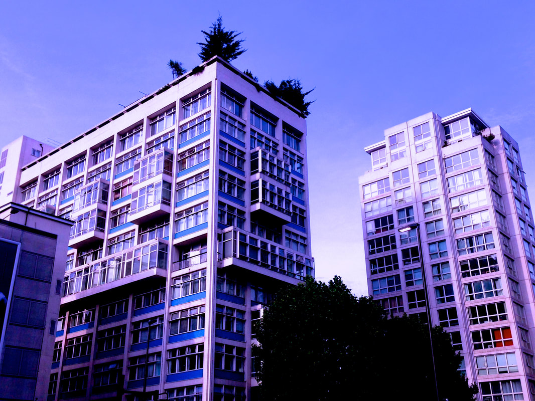

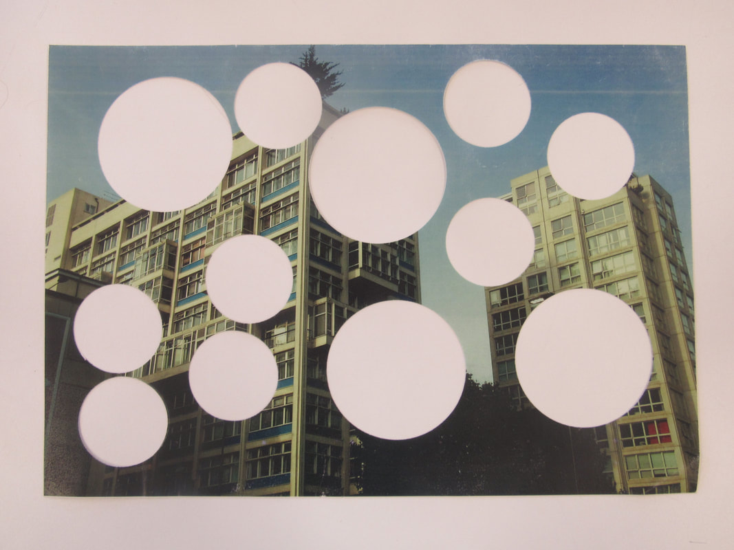
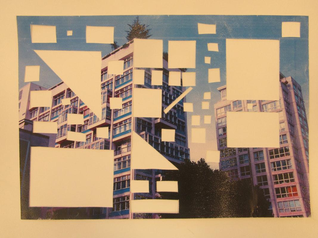
I was inspired by the artist above, who used one singular image, but layered them different colours. I decided to do this with my experimentation. I edited the image that I took so that I have 4 layers that I can use for my layered cut-out. First, I just made 4 copies of the image, knowing that I would change 3 of them. What I did was tint each of the photos slightly so that there's a clear difference in colours and texture. I chose to tint them purple/blue, black and white and finally green. This meant that there would be a clear contrast between each of the photos, which would be very obvious in the final outcome. I printed these 4 photos onto pieces of card-like paper so that it would be easier to cut them in the process, and so that they would have more of a 3D feel in the final outcome. Once I had printed the 4 photos, I wanted to decide on a type of shape for each of the layers. I chose circles, squares and random triangles as my 'shape themes' for each of the layers. I chose to do this so that when layered on top of each other, they create different shapes or I can just use one layer.
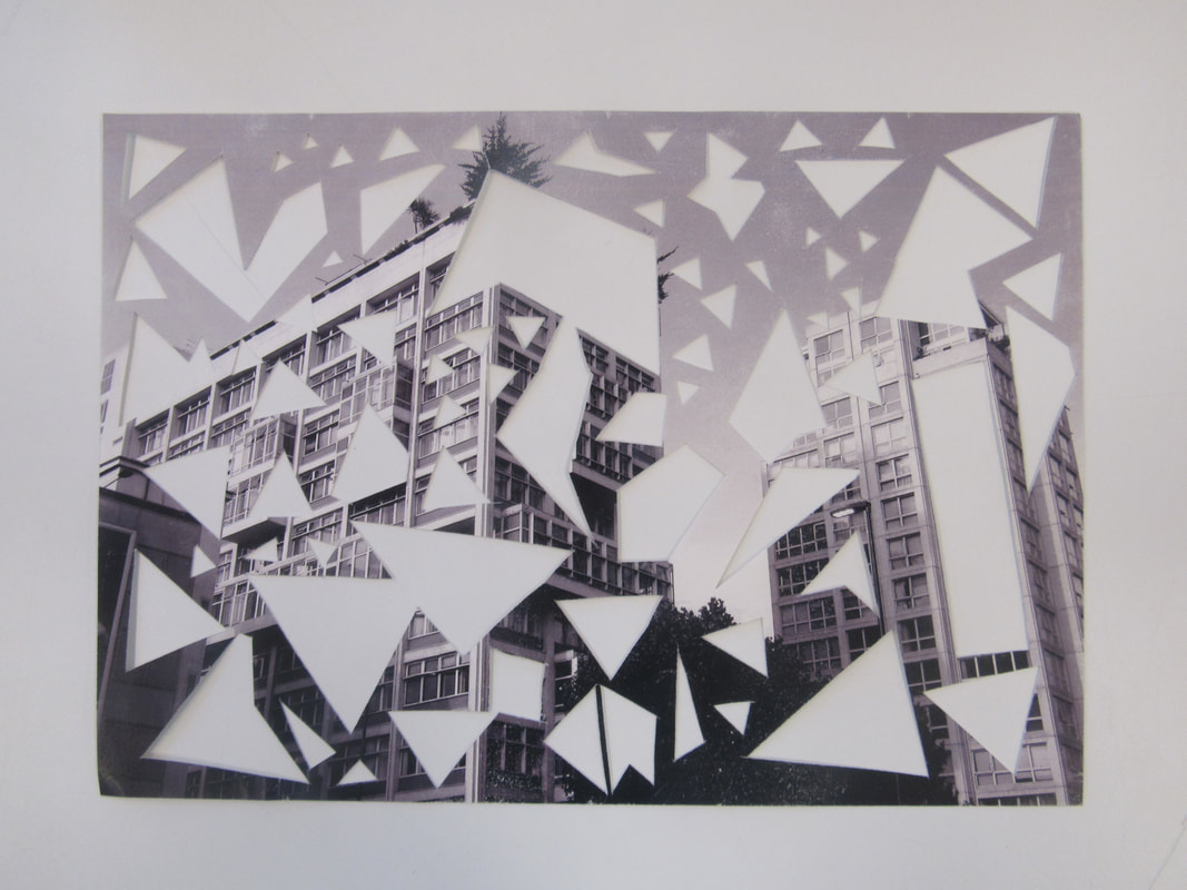
Cutting the shapes was fairly easy as I could use rulers and special cutting tools, but some lines came out quite uneven, which may have affected how similar it looks to the cleanly cut shapes in the photo above.
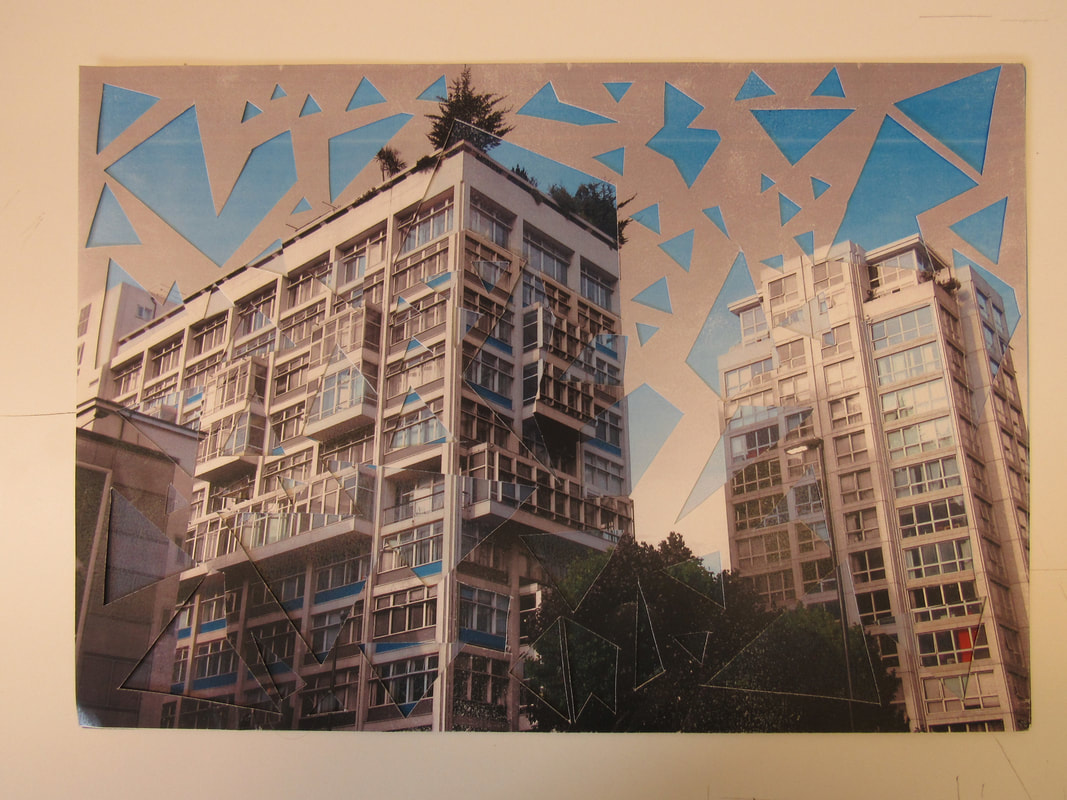
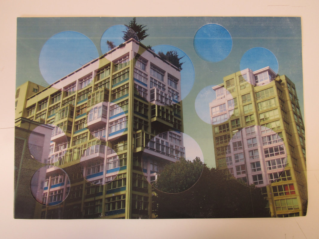
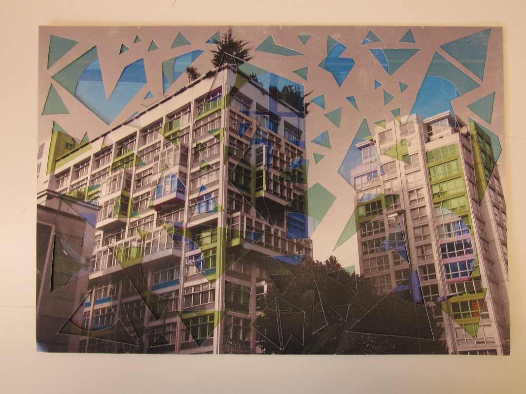
This here is the final outcome of my project. I am really quite happy with the outcome and the process was really enjoyable. Above are 4 photos that I would consider my final outcomes, the last being the one with each layer included. When I first started the project, I wanted a singular photo to be my final outcome because that's how it is in the photo that inspired me. However, when I started to near the end of the project I realised that it looks quite good with only a single layer above the original. When all the layers are on top of each other, it starts to look very cluttered and busy, and the viewer starts to loose the focus on colour and contrast. Furthermore, not all of the shapes get fully displayed, so it doesn't allow them to fully impact the viewer like I intended. Personally, I prefer the photos with only one single layer. My favourite one is the one with the circles layer. I like this one because the original photo doesn't have many curved lines or changing shapes. Instead, it is filled with sharp geometric straight lines. By adding these circles, It creates a massive contrast and the layer really stands out to the viewer. Also, because of the tint in the layer, it is very easy to see where each of the circles start, and it's almost as if they're letting in sections of non-tinted photo. The other two layers (The squares and random triangles) came out quite similar in the way that they both contain sharp edged shapes, but I prefer the random triangle layer a lot more than the squares. This is because when you look at the photo, you can straight away see the presence of the layer because of it's contrast against the blue sky. Given that the layer was printed in black and white, it's colour contrasts massively against the powerful blue of the sky in the original photo. Something interesting that I noticed was that the shapes don't actually stand out that much against the buildings. I think this is because they're both made of geometric sharp shapes, so it's hard to distinguish the two. Because of this, the shapes are only really visible around the building itself, which really adds depth to the whole photo and makes it look as if the buildings are standing out from the rest of the photo, almost 3D. This is one of the reasons I really like this photo in particular. As for the squares one, I don't think this photo came out as impacting as the others. Although the combination of colours is quite pleasing to the eye, the shapes look too regular and aren't as spontaneous as the ones seen in the other photos.
Throughout this project, I had to change my approach many times. What I thought my project was going to look like began to change as I progressed through my work and new problems arose. However, all in all I am very pleased with the outcome of this project. In order to improve it as a final piece, I would start to think about possibly doing a digital version of the photo on photoshop. This way I would be able to get a very clean look and possibly experiment with different shapes and colours.
Throughout this project, I had to change my approach many times. What I thought my project was going to look like began to change as I progressed through my work and new problems arose. However, all in all I am very pleased with the outcome of this project. In order to improve it as a final piece, I would start to think about possibly doing a digital version of the photo on photoshop. This way I would be able to get a very clean look and possibly experiment with different shapes and colours.
Second project
For my next project/outcome, I want to expand on my previous ideas of cutting shapes into photos. However, I wanted to challenge myself by branching into a fairly unknown technique. I chose to do something with film photography, and developing film in the darkroom. I chose this because it's a fairly hands-on technique and it requires a lot of trail and error. Also, I have been using film photography a lot throughout this year, but I am yet to do any work in the dark room.
I decided to take a strip of negatives that contained photos that I thought were especially related to "Fragments". Bearing in mind that these were colour negatives, I had to take into consideration that the photos may not come out as clear as expected. The dark room equipment is specialised for black and white film, so I had to accept that there would be some issues concerning contrast and definition in the prints. I decided to use it and simply experiment with what I had.
I decided to take a strip of negatives that contained photos that I thought were especially related to "Fragments". Bearing in mind that these were colour negatives, I had to take into consideration that the photos may not come out as clear as expected. The dark room equipment is specialised for black and white film, so I had to accept that there would be some issues concerning contrast and definition in the prints. I decided to use it and simply experiment with what I had.
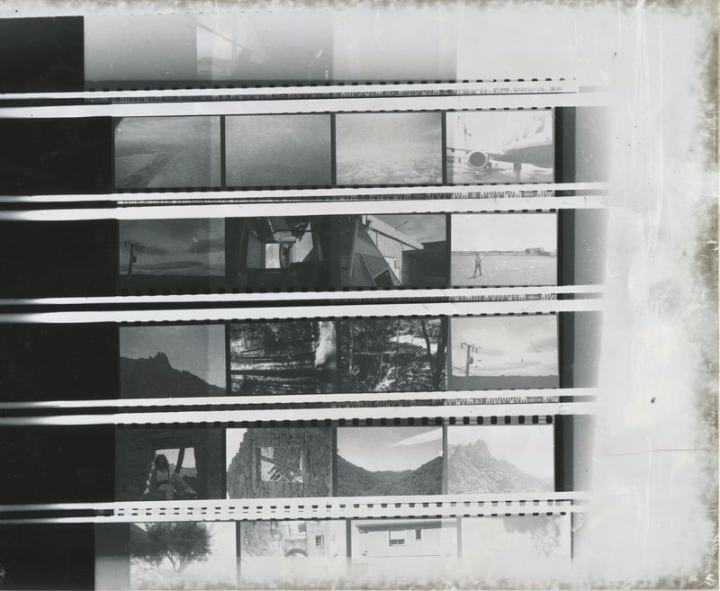
First, I had to work out how long of an exposure was perfect for the type of film I was using. I did this by placing every singe strip of negatives from the roll of film into a contact sheet printer. I put this under the enlarger, over a sheet of light sensitive film. I set the exposure time to 20 seconds. I turned it on, whilst holding a piece of card over each row accept the last one. Every five seconds, I moved the card one more exposure across. I did this until the exposure was finished. I went from left to right, the left side having been exposed the most and the right side the least. As you can see, 20 seconds is far too long of an exposure, since the paper went black. 5 seconds was too little time since the paper stayed white and didn't fully expose. From this, I now knew that around 10-15 seconds was the optimum exposure time if I want to photo to come out well contrasted and defined. Something that I found surprising was that despite the negative being colour, they came out very contrasted, almost as if they were originally black and white.
After I knew that the optimum exposure time was around 10 to 15 seconds, I took the singular negative of the photo that I wanted, and put that in the enlarger for experimentation. I experimented by using a range of apertures and exposure times until I was satisfied with the outcome. I tried to make the image bright enough for all areas to be visible, but still keep the thick contrast within the image. Since the negatives are colour negatives, the contrast will never be as strong as the original colour image.
I further experimented with my prints by trying to make some more, creative shapes in the photos whilst still exploring abstract and new ideas. This time I tried making a sort of negative out of the prints that had been made. I did this by making two copies of my photo, both different sizes, and then cutting them out. I placed the smaller image on top of the larger one and scanned this in. I then placed this over photographic paper in the dark room and continued to experiment with timings and light intensities until I was able to get a clear image. After two images turning black with 4 second exposures, I did a 2 second exposure and the photo above is my first semi-successful result. The contents of the image have been completely lost, and it is no longer clear what the photo is and what's in it. I then decided to cut out the very prominent and obvious shapes, so that they became white. This added an element of negative space to the already abstract image. What I now plan to do is either keep on working on this process, printed out photo upon photo and making a very abstract image, or diverting and doing something more inspired by Lewis Baltz or Stephen Gill. This process is quite lengthy and can sometimes not produce the results you want, With developing negatives in the dark room, you have to be very patient and open to to new ideas and you also have to accept that it isn't always going to work. This is one of the most challenging things about the process that I'm using, but I think it is worth it because my final outcome will have value.
After thinking about the piece so far, I felt that I wanted to try a slightly different experiment because I didn't like the absence of shape and definition in the photo above. So, what I did was take the original photo and increased the contrast in Photoshop. I did this because I needed the difference between dark and light to be very prevalent, enabling it to stand out more in the final outcome. I then cut out some obvious shapes out of the photo, giving me a negative.
The plan was to now use this photo as a negative and place it over a piece of light sensitive paper, and expose it. I experimented with this 3 times in order to get the optimum lighting and contrast on the image. My best result came out as follows :
What I ended up with was a very grainy and shape-reliant image. The shapes that I had cut out of the original negative gave me thick, black negative spaces that stand out from the light tone of the surrounding. I would say that this area of the image is the main focal point, as all other shapes and lines in the photo are tampered with grainy blemishes, except these four - almost smooth - shapes. Having accomplished my goal of bringing out these shapes, I turned to the rest of the photo; What I noticed firsts was the lack of detail or depth in the bottom left of the image. On the original, there was an underexposed area of the photo, which led to an overexposed area of my new scan. I wanted to improve my image by focusing on this section of the photograph. The area is quite large, so I felt that it would be possible for me to fill it with a completely different image and make new negative, rich in detail.

|
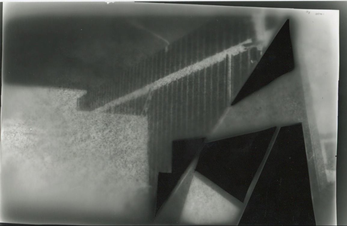
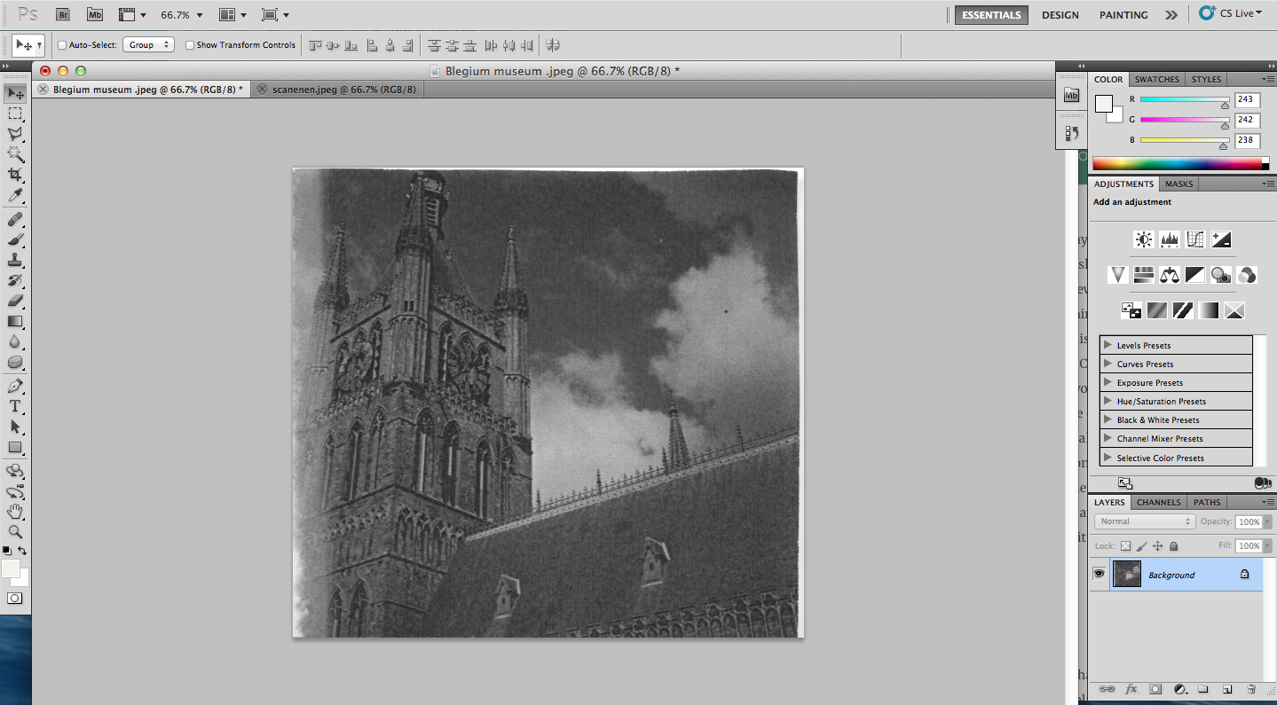
I chose this image as my addition to my negative. I chose it for several reasons, mainly related to the shapes in the photograph. Being a black and white negative, I knew I would need a photo that mainly relied on shapes and lines within the photo, as colour and generally the subject go unnoticed. This image is of a grand building that fills up the majority of the photo. Considering the photo as a negative, you can see how the photo would function well, as there is a clear line running through the centre of the image : the outline of the building. The building also has small spikes pointing out from it, which although may be too small to come up, could provide some more shape-detail in the final outcome.
I knew that the sky would not provide any detail as there aren't any clear, hard shapes, so I decided to cut it out as to not leave an empty space on my negative. |
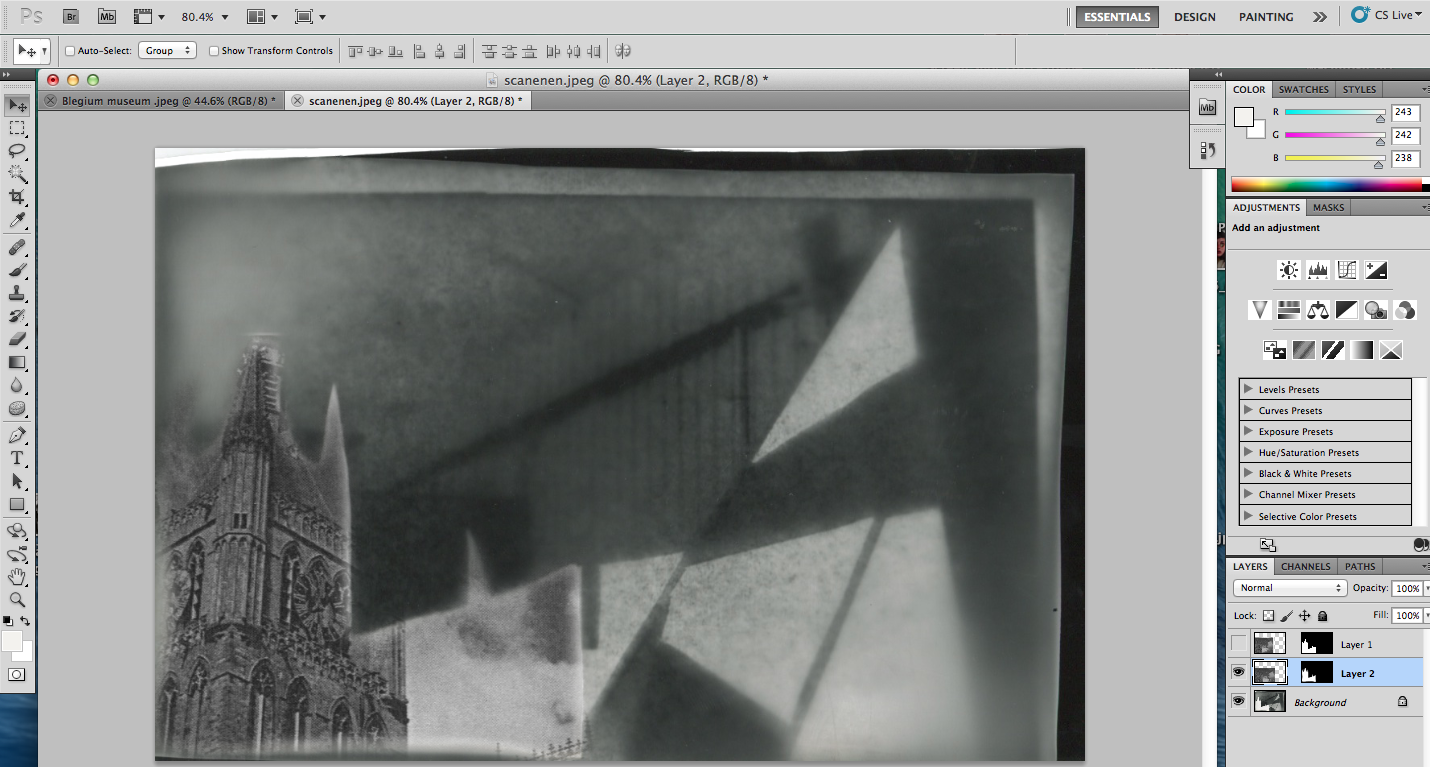
Now what I had to do was scan my photo onto a computer and then print it out onto regular paper. This is how I have been able to let light through the negative and onto light sensitive paper. I went into the dark room with my image on the paper and placed it over some light sensitive paper. I also placed the cut out image of the museum over the white area. I knew that my outcome would have reversed tones, so the prominent black shapes from before would now be white,and the rest of the image black. I continued and produced 3 different images, each using different timings ranging from 2-5 seconds. Below are my results :
My images resulted in having a new shape in the photo. I would say that this shape is not an accurate depiction of the original negative, as the outlines are not sharp or definite,however it does add a new, foreign item to the composition. The lighting of the photo has taken a turn back to being very light because of the underexposure on the light sensitive paper. This illuminates the photo as a whole and allows the new white shapes to become more obvious and stick out more. On the flip side, the contrast that we were left with previously has now disappeared and the photo has lost a lot of its definition. I was happy with the new shape that I had produced and I felt that it was an improvement to the photo, but it didn't seem like enough, leaving it as an empty white space.
Using Photoshop
|
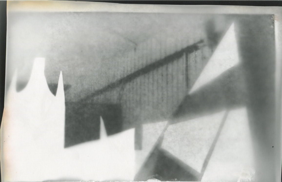
I decided to experiment further using Photoshop. I started by importing the photo of the museum. I wanted to simply turn the image black and white, so that the two images blend together inconspicuously, and there be less of an overall "purposeful" look. I didn't fee l as if the photo needed any increase in contrast since the colours are already quite contrasted and there are plenty of lines and geometric shapes present. I then copied this layer, selected the shape of the building from my negative and pasted it behind.
|
|
What I had now was a fragment of the building, inside the shape of the building from a different perspective. I began to see more of a complex structure forming, as more shapes and elements filled the empty space. I decided to place the building in this way so that there was a contrast from the smooth grainy texture of the first photo to the intricate, detailed texture of the second.
|
|
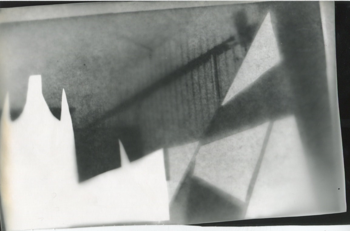
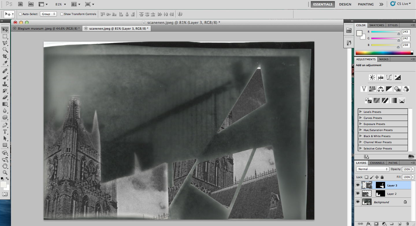
I then decided to do the same but with the triangular shapes on the right side of the photo. I selected these using a Polygonal Lasso tool on Photoshop so that I could accurately cut each one out. I then pasted the layer of the building underneath the other photograph and my result came out on the left. I had to learn a bit more about using Photoshop, since I had never edited photos with it, so experimenting like this was a new experience and something new to learn.
|
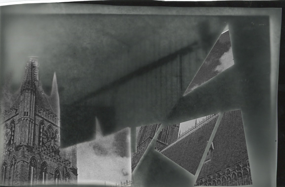
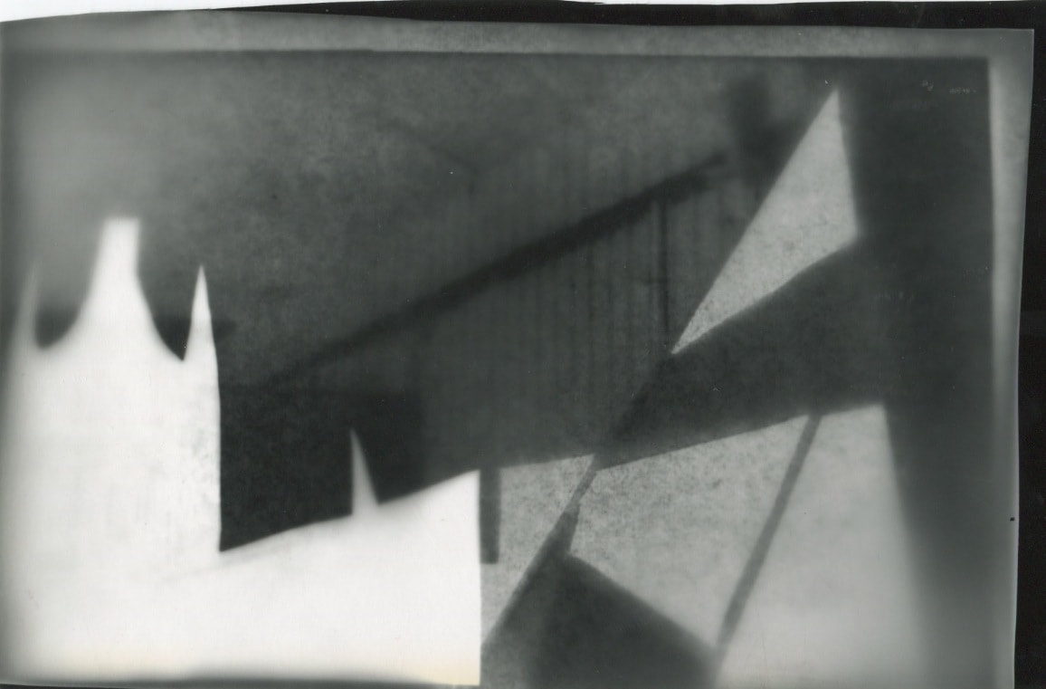
This is the final outcome of all of the photoshop experimentation. The lighting of this photo is very dark. With the excessive experimentation and adjustments to the original photo, most of the detail was lost, leaving only faint outlines of its shapes. Since it's in black and white, it is quite hard to find especially bright areas of the photograph, and any that were there before were reversed when I turned them into negatives. What is visible however, is the contrast between the two images used; In the top half of the photo, we are left with little detail. The texture of the image is very blurred and we are merely left with changes in colour from grey to black. For a viewer, this isn't a very enticing part of the image. However, as we move down the photo we see the addition on a new image. This image contrastingly contains intricate details and small lines which give the viewer something to focus on. The original photo lost all its detail through the manual processing, but the photoshopped image lost none, which is why there is such an obvious difference between the two. Furthermore, the original photo has a very soft focus, further depriving the viewer of information and detail; This is not the case with the photoshopped image. It has a sharp focus. When I edited the building photo into the triangles, I decided to change it slightly. I used a tool on Photoshop that enabled me to change the perspective of the photo. Although not instantly obvious, this is a subtle touch to the overall image that simply moves it a bit further from a simple composition. One could say that there is a running theme of complexity and simplicity : the building and the original photo. After creating the negative spaces it opened up a window to experiment with adding more to the image. The process of getting to this image was very much a lengthy one. I had to do a lot of experimentation and try different exposures in order to get the optimum image, and then had to try and learn a bit of Photoshop, which is completely new to me. In all, the process was quite interesting in the way that it utilised not only manual, dark room development, but also digital editing and experimentation. In order to achieve my final piece, I plan to produce more images like this, using manual techniques and then involving Photoshop for contrasting details or possibly even colour.
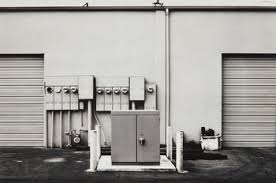
After using the Photoshop to create my photo, I decided to experiment further. Instead of incorporating development in the dark room, I chose to solely use Photoshop in order to save the detail on contrast in the original photo. I started with the original photo by making it black and white and increasing the contrast. This really brought out the different shades of black and white and how many tones the image has. As with the previous outcome, the bottom left and right corners of the photo are very dark and 'hard', whilst the top half displays bright tones and softer textures.
I repeated the process of outlining obvious shapes in the image that I wanted to fill with something else. I also wanted this to be in black and white, as to not appear 'out of place', so I chose the image on the right. I had to put this image in Photoshop and increase the contrast and turn it black and white. I ended up with a very contrasted image, full with multiple lines and different shapes. I thought that this photo would compliment the other.
I repeated the process of outlining obvious shapes in the image that I wanted to fill with something else. I also wanted this to be in black and white, as to not appear 'out of place', so I chose the image on the right. I had to put this image in Photoshop and increase the contrast and turn it black and white. I ended up with a very contrasted image, full with multiple lines and different shapes. I thought that this photo would compliment the other.
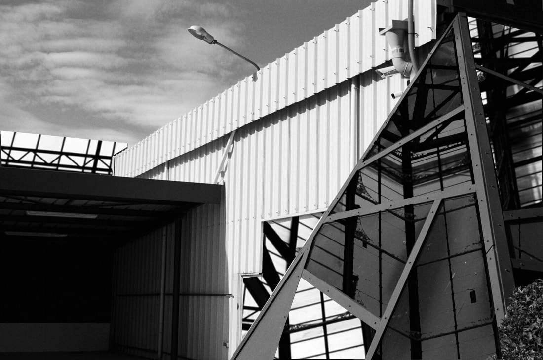
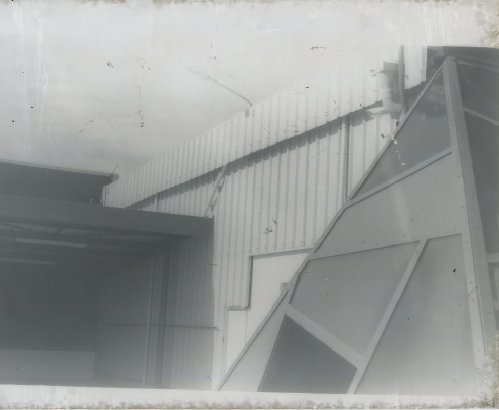
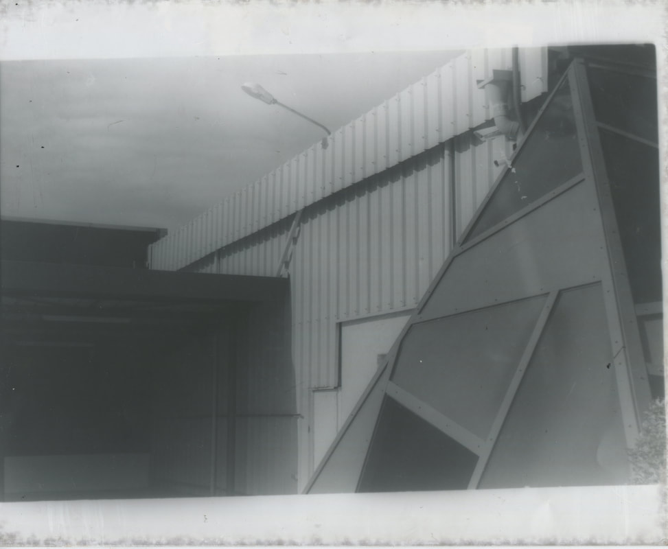
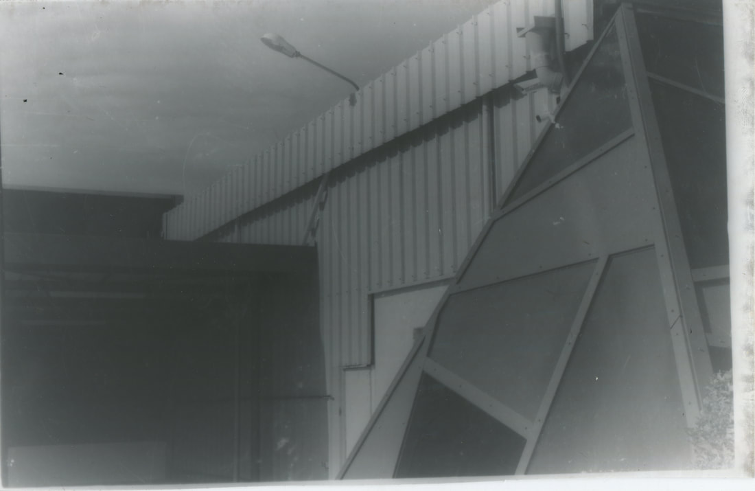
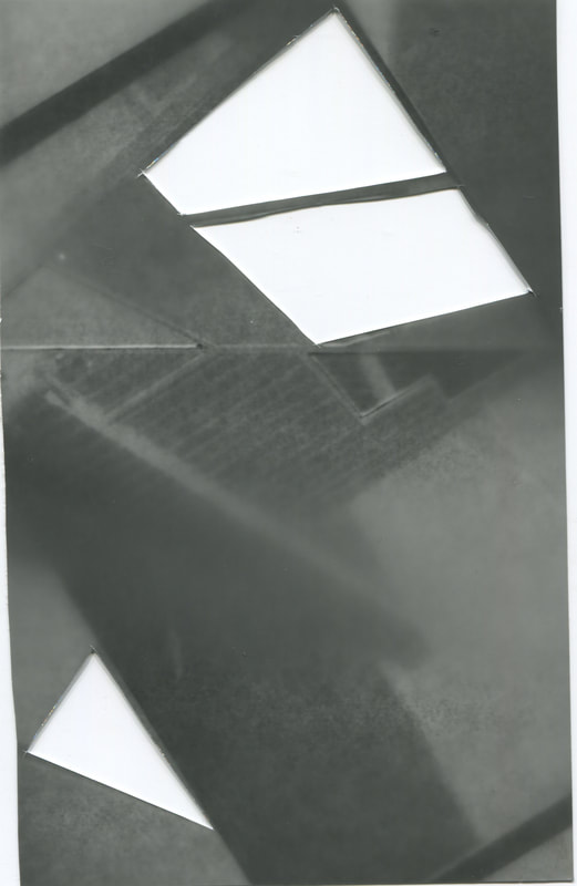
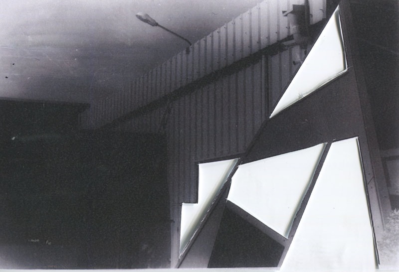
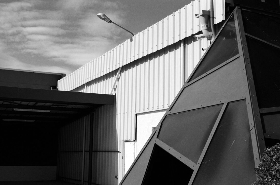
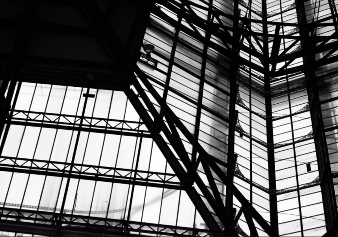
This is the final product of my Photoshop experiment. I am very happy with the way that this photo came out for a number of reasons, one of them being the new experience and information learnt along the way. This was a completely new process for me and I really had to persevere in order to get a good quality outcome. The original photo was taken by me on a very sunny day. It is of a wall of a building which is made out of corrugated metal. Without any editing, the photo already had very clear lines and a very clear, crisp focus. This gives a pleasing effect, as all shapes and colours are brought to their full potential. I decided to turn the photo into black and white in order to relate to my previous experiments. I also increased the contrast to further emphasise the difference in tones and especially bring out the shapes to the right of the photo, which I then began to edit. In my previous experiments, I inserted different photos but they gave an impression of being out of place - an almost messy look. Even though this is somewhat what I was aiming for with the manual development in the dark room, I know that I wanted to create a precise and 'neat' outcome. So, I used the Polygonal Lasso tool in Photoshop again in order to accurately cut out each shape. The second photo that I used to insert into the gaps has loads of geometric shapes and lines that almost mimic those of the cut-outs. I also made this photo black and white and greatly increased the contrast in order to help the two photos blend into each other - so there would be a smooth transition but an obvious change. The outcome came out very pleasing to the eye, as the new photo looks as if it belongs there, but still proposes questions. It isn't immediately obvious what the second photo is which could possibly give the image a slightly abstract feel because there is a sense of the unknown. One thing that I like the most about this image is the tones : The corrugated metal wall is very bright and is stricken with regular lines running down the surface, which although aren't that dark, still add a different shade to what would be a plain sheet of white. This bright wall is contrasted greatly by the triangular black box right next to it as it only contains dark matte colours. The overall colour of this object is especially pleasing because it is very smooth and crisp, only containing black and white. The simplicity of the colours is not reflected it in the shapes however. They are very irregular in this area of the image, which is different to the lines on the wall for example. I think the addition of the second photo was very necessary, and without it, it would be completely different. The process of creating this photo was fairly challenging in the sense that there was a learning curve, but the result came out very rewarding after the numerous attempts, and I am very happy with this photo.
Stephen Gill
Stephen Gill is a very interesting photographer who combines photos with objects and then retakes the photo. Although there's more of an element of nature, his photos contain a lot of elements of fragments. When I find out how Gill takes his photos, I knew that I could link it to the techniques and ideas I had been working on previously with the prints of my negatives. I could take inspiration from him and place colourful objects over photos filled with hard lines and contrasting shapes. By looking at his images, you can see that he focuses more on the objects placed over the photo than the photo itself, which shows shows the impact that the artist is trying to make upon the viewer. It's almost as if the images in the background have little relevance to the final photo produced. Of course, without the photo in the background, the images wouldn't be the same, but there are many photographic elements that have been reduced in these photos. I think that Gill has chosen to use photos in the background that have very desaturated colours so that he is able to bring out the colours using his objects. Considering this, I could say the contrast was an import component when creating these photos, not only with the colours but with the shapes too. For example, the photos covered by objects that create many shapes often contain few shapes of their own. Again, this is another technique used by Gill in order to create contrast among his images.
Lewis Baltz
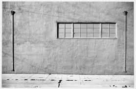
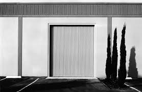
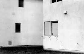
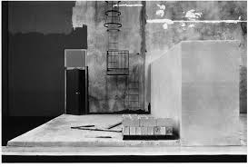
As you can see from the photos above, Baltz's photography is very minimalistic and architecture based. His photos are in black and white, with high contrasts bringing out each and every line in the image, furthermore revealing the link to fragments. Something that you can notice straight away is the way Baltz composes his photos. Each image has a very simplistic, straight on view, making it clear what the subject is and where he wants you to be looking. The fact that the composition is so simplistic allows the shapes and colours to really stand out from everything else, and blocking out all other unwanted lines or shapes from the image. The colour that blatantly stands out from the rest is the white the flushes most of his images. Since his images are all black and white, the viewer is left to observe shapes and lines, and the white is used perfectly to bring these out further. White is a great tone to use in this situation and further enforces the element of simplicity.
The lighting in his photos is often very bright, yet dispersed and natural. Perhaps this effect is enhanced when editing, since it is one of the first things the viewer notices. On the contrary, the harsh lighting allows for more shadows to be produced and he utilises this by allowing them to create shapes and silhouettes, which contrast the white. For example, the image on the bottom left has very direct light cast against the wall. This means we see the wall very clearly and we are aware of the line and shapes. However, there are some trees to the right of the centre, and the fact that they're silhouettes means that they create negative-space shapes. Contrast is often mentioned when speaking about colours or lighting, but here you can see that he has contrasted the hard straight geometric shapes with the natural curved shapes of the trees, which I think was a clever way of composing the photo.
Baltz's images can greatly influence those of my current project. Since I am working on a piece which contains black and white images and fragmentation during editing, I can use the prominent elements of his photography (lighting, shapes, simplicity) in order to come up with knew ideas and techniques to improve my experiments.
Maurizio Galimberti
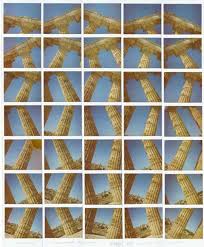
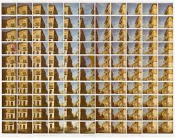
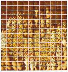
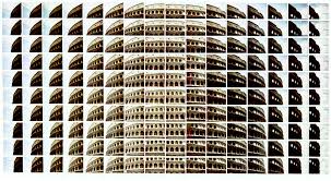
Galimberti is an Italian photographer and artist who was born in Italy. I think that the location an artist lives can heavily influence the type of art they produce, especially in photography. Simply by looking at the photos above, you can see that he's quite drawn to architectural approaches and grand buildings : Coliseums, The leaning tower of Pisa. He creates these complicated pieces by using multiple photos taken using a Polaroid camera, and then laying them together and photographing the final piece. By doing this, he is able to manipulate a scene and completely change the way the viewer sees the image. What I like the most is the image of the girl on the bottom left. This is because he has created a new pattern within the scene. Notice how from the bottom of the image, he has chosen not to include the girl's face, and instead use the complex shape of her hands to make a dense and 'busy' area. As the viewer looks up the image, the picture of the girls face becomes more common and concentrated in the centre, which creates a new overall photo. I like this because it's almost as if there's to elements to the photo : the broader, wider photo where Galimberti has used multiple photos to make a new image and new patterns, and the closer more in-detail images of individual stories. By doing this, he is able to make somewhat basic photos into very intricate and impressive pieces of art.
Sohei Nishino
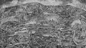
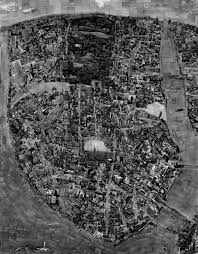
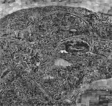
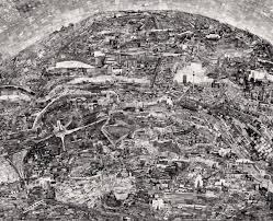
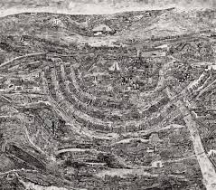
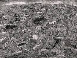
Nishino is a photographer who was born in Japan. His work consists of huge collages, made out of photographs that he's taken himself of different parts of a city. He prints these photos out and lays them in correlation of a map of the areas. The final outcome is an incredibly complex and detailed black and white map, filled with different perspectives and little details that can be found everywhere. At first, I really didn't like the look of his work. The lack of colour meant that I was reluctant to give it a closer look, and I simply wasn't interested. I then decided to look at one of his images and I noticed that there were multiple abstract elements. One of these was the change in perspective in different places on the map. He has taken photos of structures from the side and laid them on the map as if they're from bird's-eye view. This can only be noticed if you look closely at the image. It gives the image a very abstract feel, since he is able to manipulate the environment. He is also able to change what the viewer chooses to focus on, by making certain photos larger than others or changing the perspective. If I were to create a piece inspired by Nishino, I would try and add colour to the image because I feel that this is what would draw a viewer in. Since it's in black and white, he focuses the viewer's attention more on shapes and lines. Due to the complexity of the image, I feel that this can be slightly overwhelming and the addition of colour would compliment the images a lot.
David Hockney
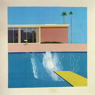
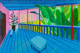
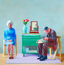
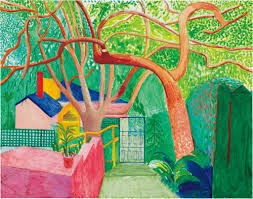
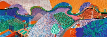
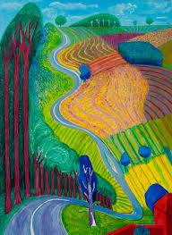
In contrast to Nishino, Hockney's work has a very prominent focus on colour. Simply by looking briefly at all of the photos above, it is very obvious that this is one of the most prolific elements used in his art. Hockney creates his images by painting. Although his work isn't actually photography, I can definitely take inspiration and learn from it. I feel his images have a mixture of being both complex and minimalistic in composition. For example, the very famous image to the top right, "The Splash", has quite a simple and geometric feel to it. The majority of the image is filled with straight lines and block colours, not really using texture anywhere accept the splash itself. This gives a very nice aesthetic feel it to the image, as colours feel very smooth and it's almost very easy to look at. There is also little depth to the image. The colour of the pool is the same as that of the sky, meaning that the viewer can't really differentiate between the two and the only thing they have to acquire depth is the building. This again, doesn't really have any depth to it. Hockney hasn't drawn any shadows or made the house three dimensional. Instead, he's left it two dimensional, much like the other objects in the image. This has also given him the opportunity to create contrast by making a very 'messy', free part of the photo : the splash. This is the central part of the image. He has chosen to make it mono-tonal, which allows him to experiment with shapes and lines instead of colours. This image as a whole contrasts quite a lot with the other photos above; They have very complex structures and shapes and are filled with colour at the same time, leading to a thick texture and a very busy photograph.
