Edges
Edges photography is quite a broad subject. If you think about it, all photography is Edges. This means that if you want to do a project on it, you have to really focus on making sure that the edges are the subjects. I think this is going to be a bit of a challenge, because just like any other focus, you have to try and make it prominent.
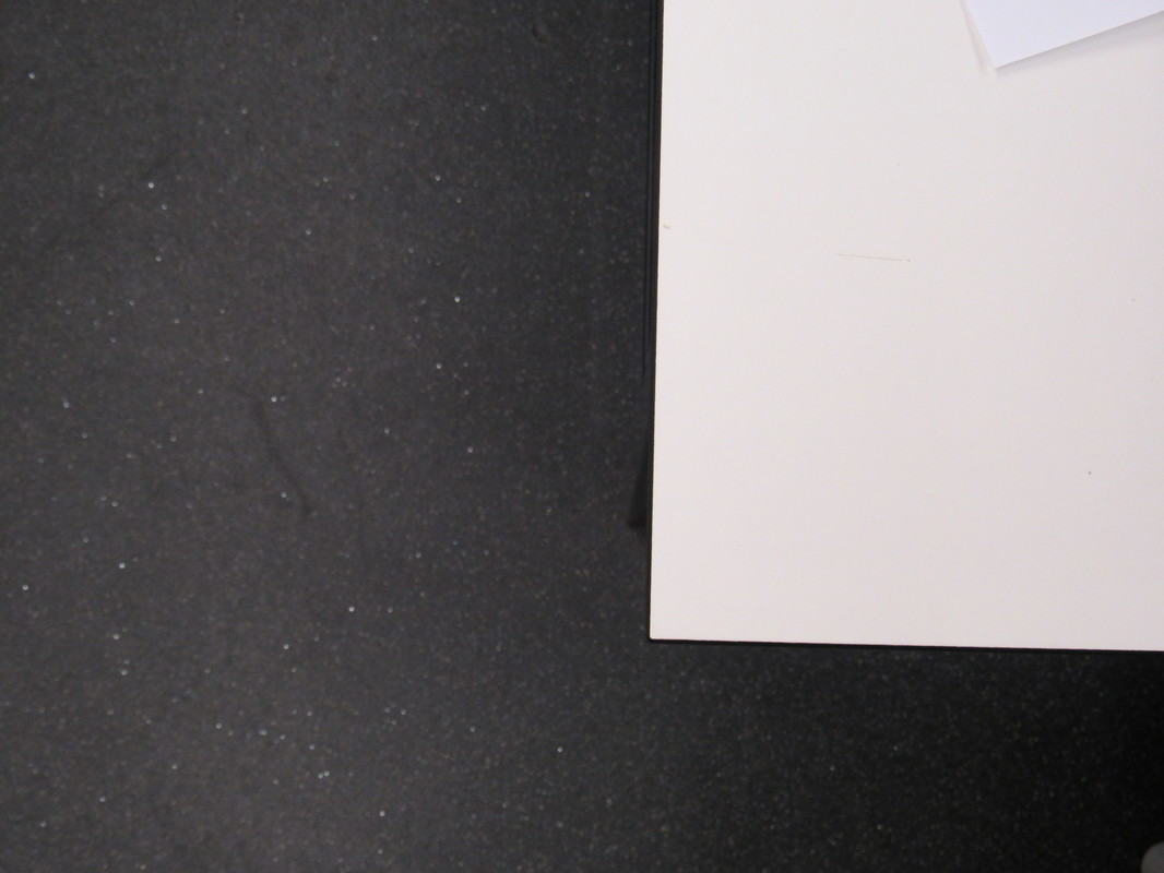
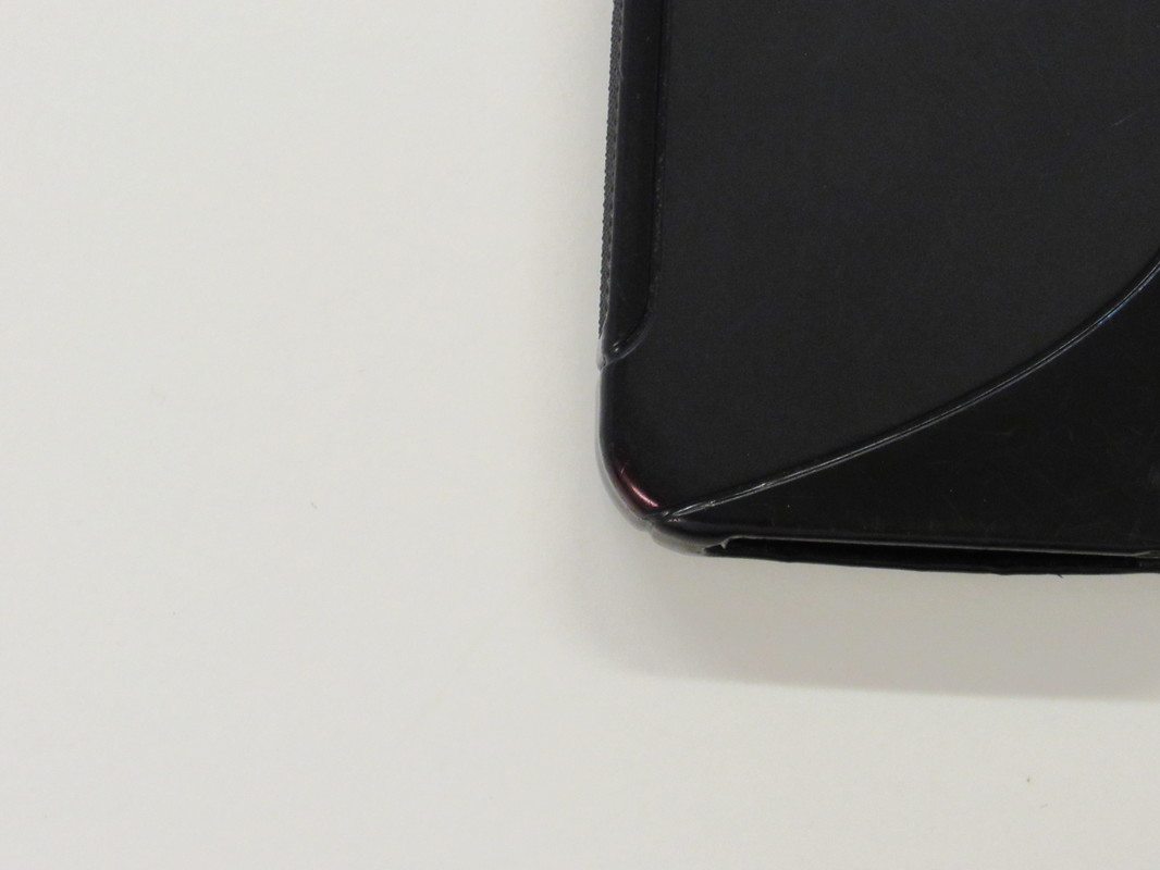


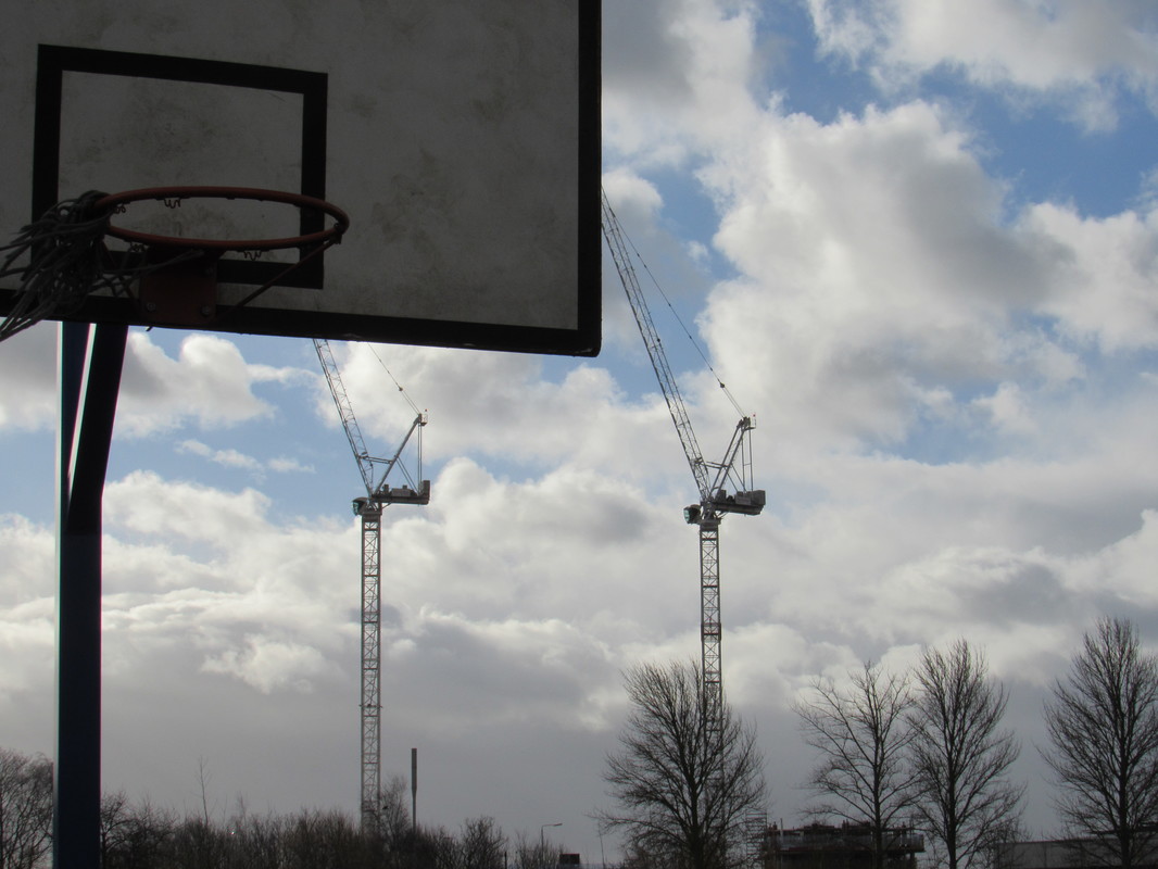
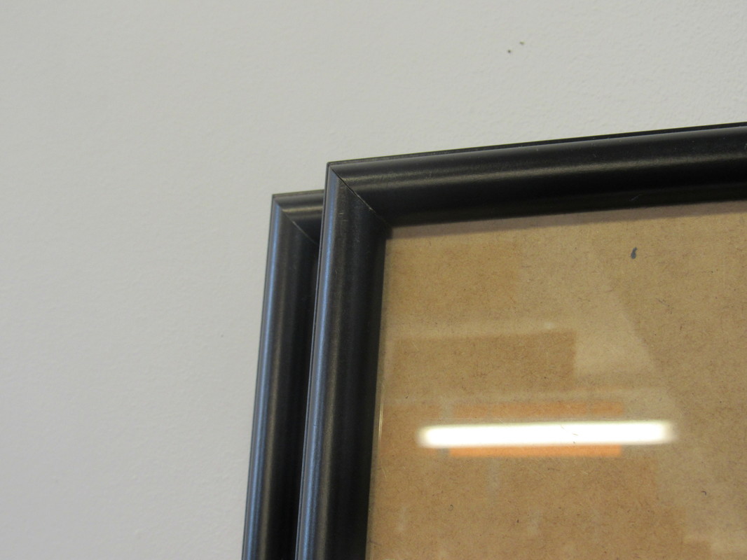
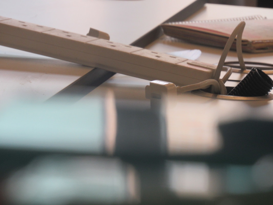
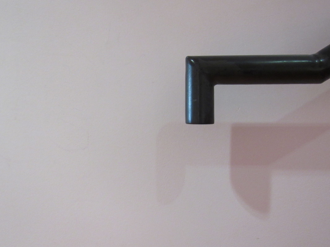
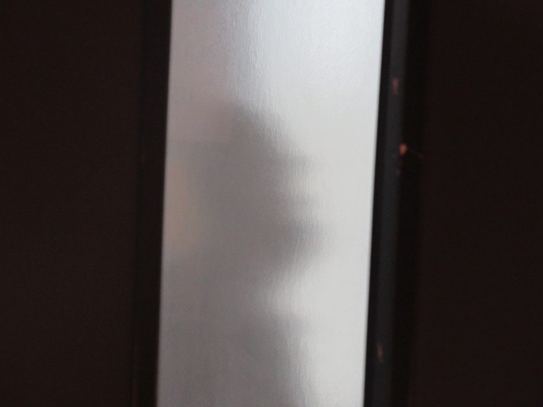
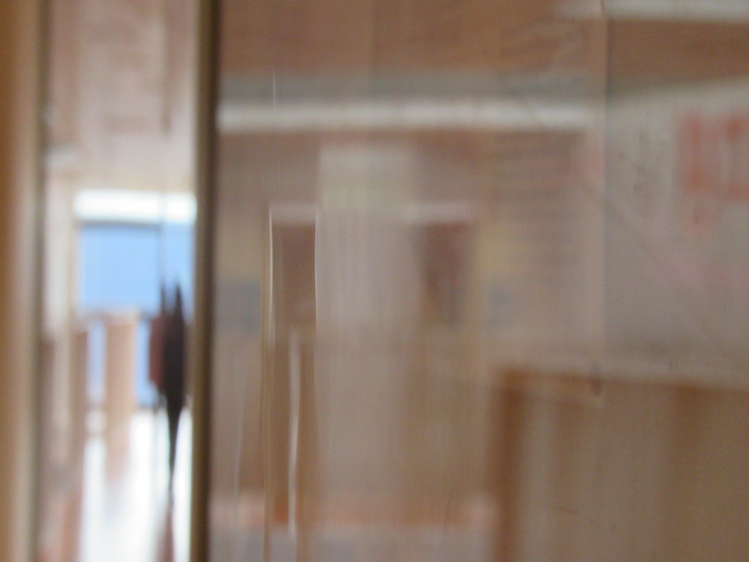
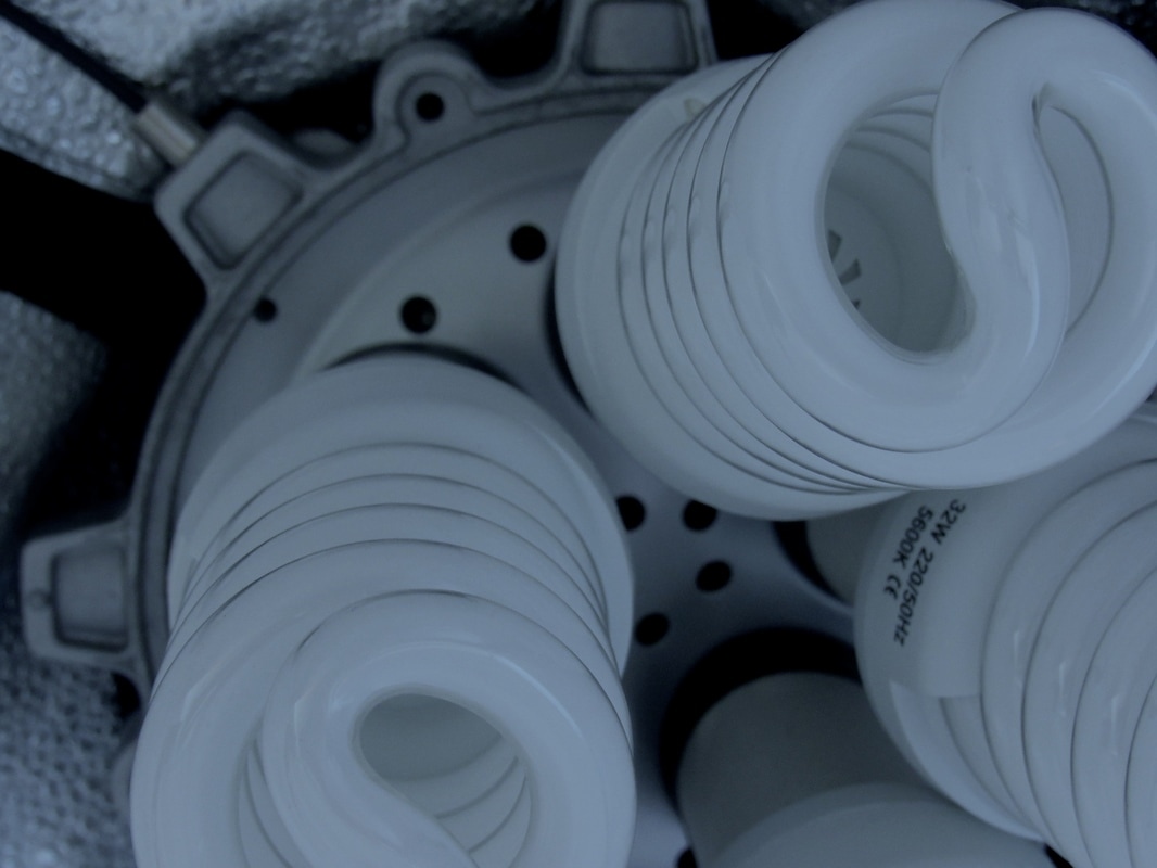
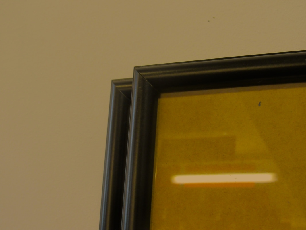
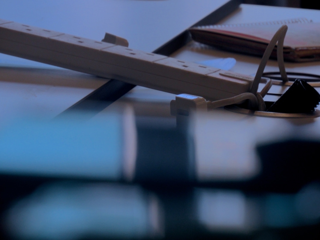
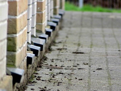
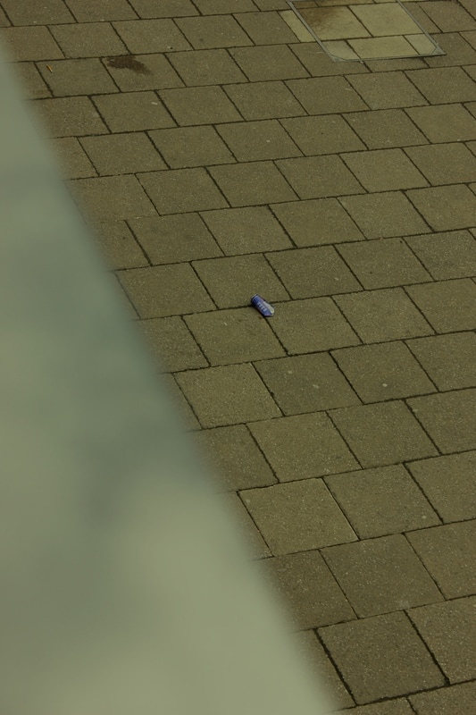
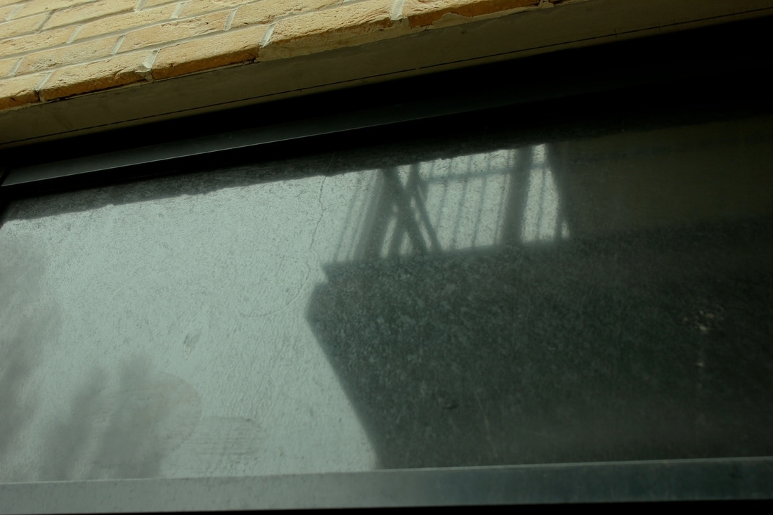
In this task, we had to take 30 photos of different edges. We started by writing down 30 different things that we could take photos of, and then used them as ideas. At first, I started by simply taking photos of singular edges such as tables and pieces of paper. As I went further with the task, I started to incorporate multiple edges into different photos. After looking back at the images, I notice that I didn't focus on the actual silhouette edges of the objects, but instead the edges that are on the object, or formed through colours and tones. Overall, I enjoyed the task. It didn't feel challenging or new but it was fun to practise these skills again.


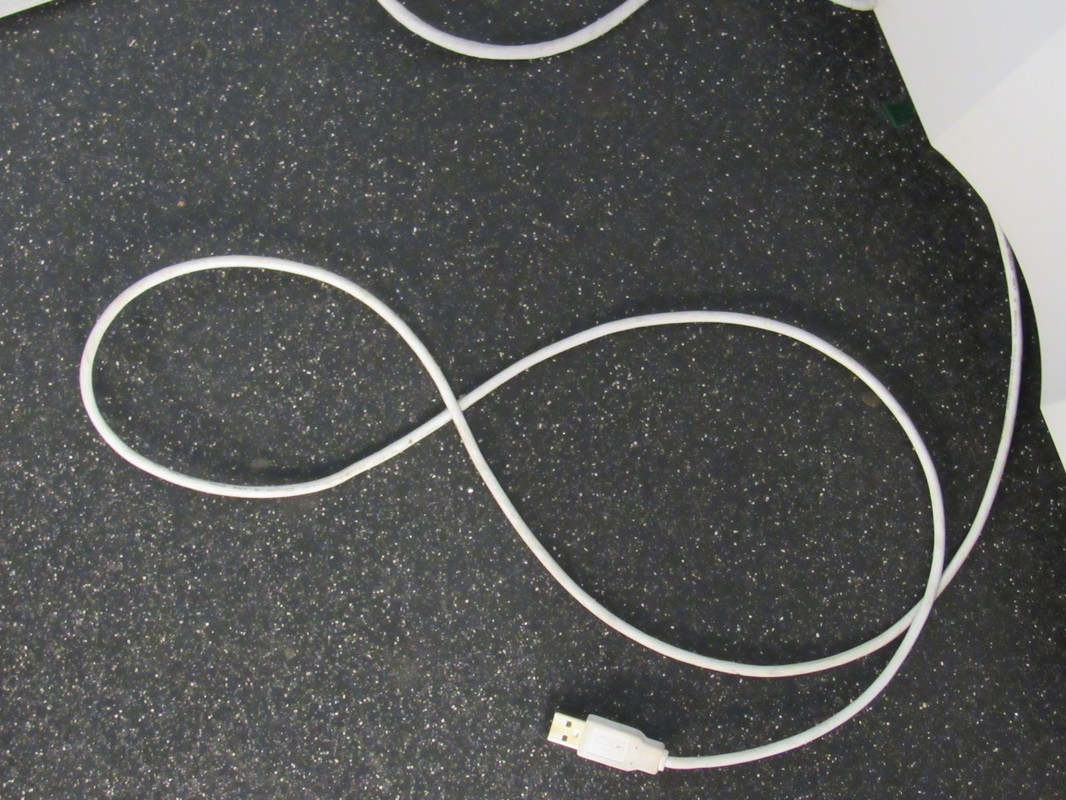

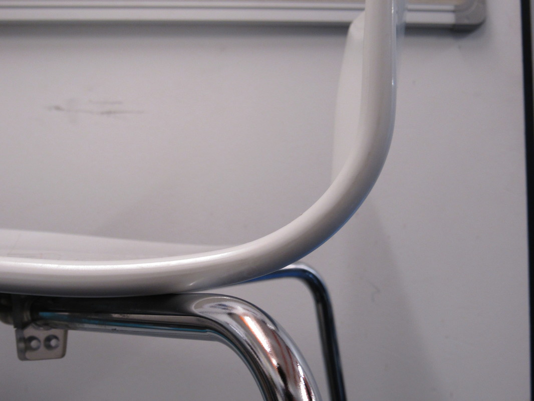
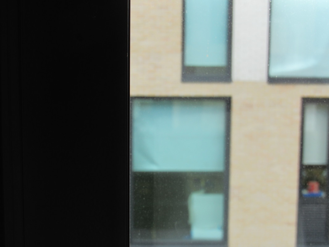
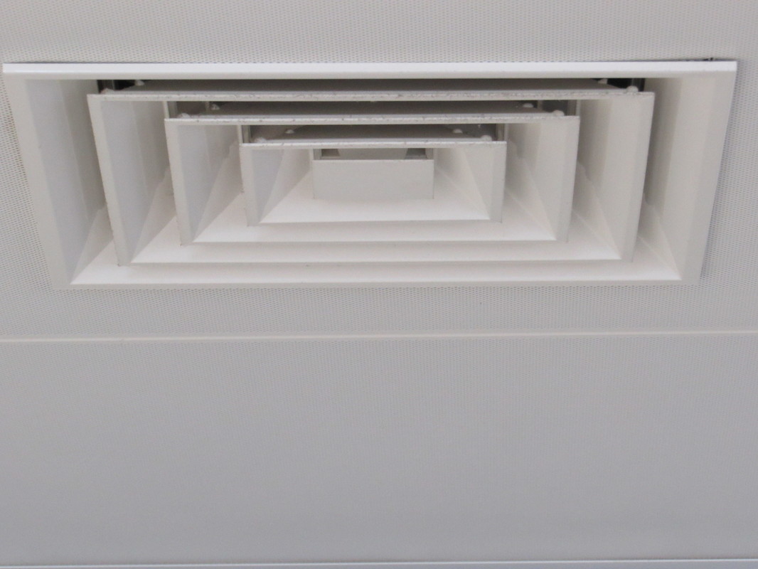
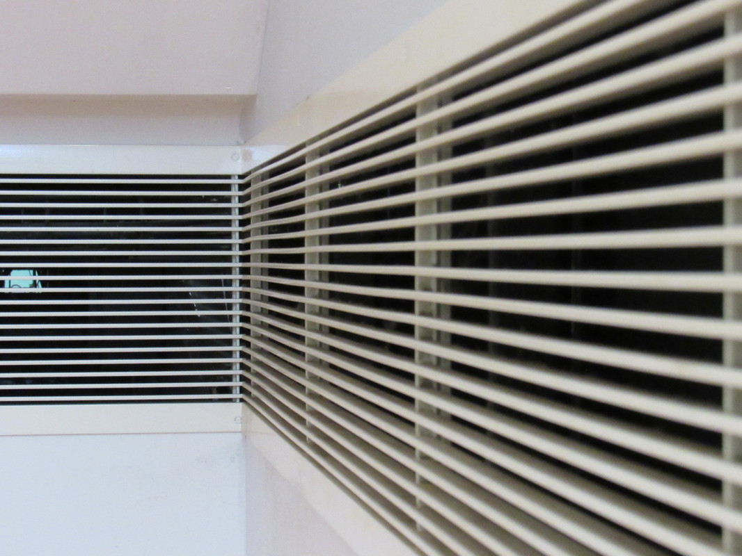
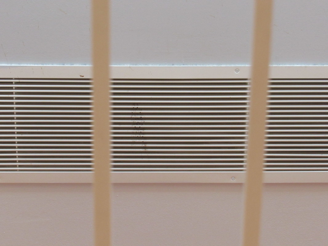
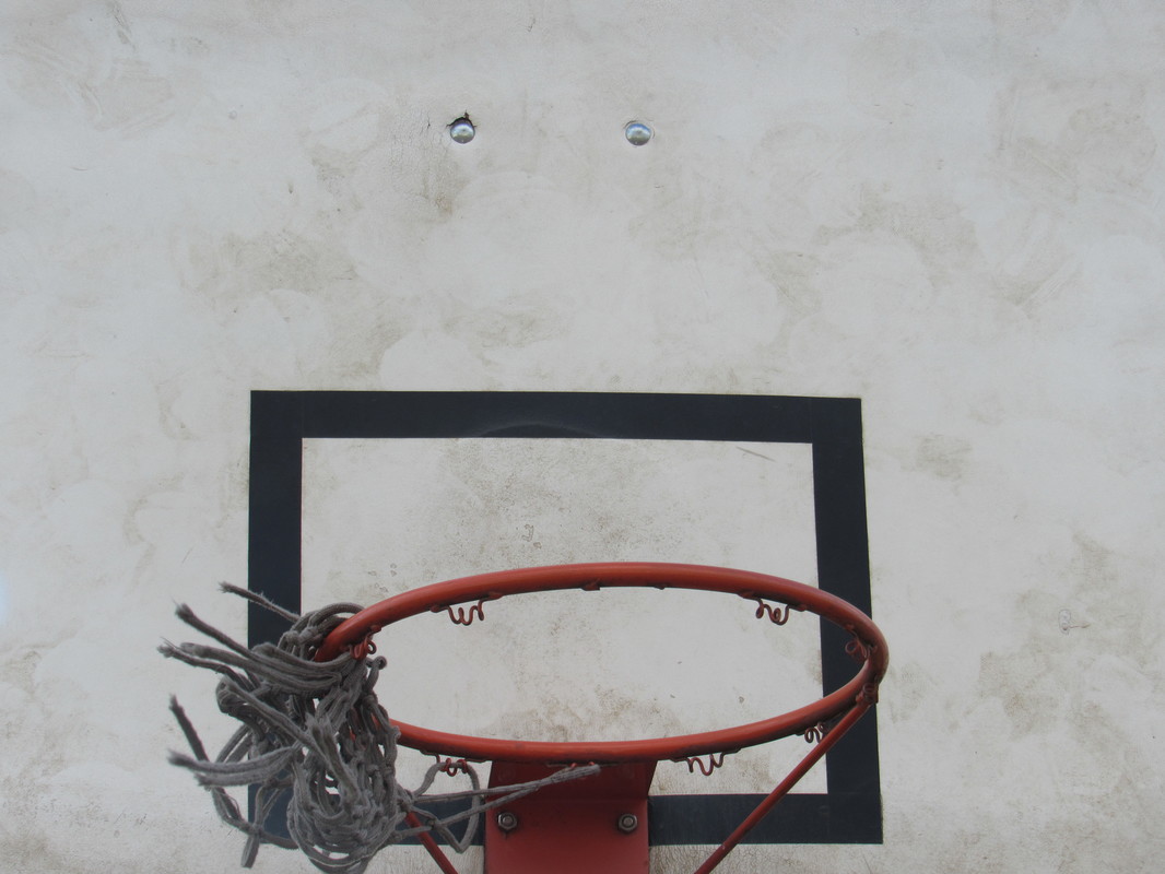
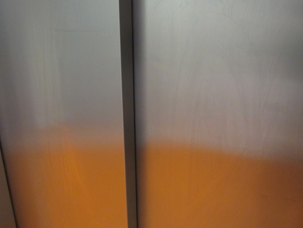
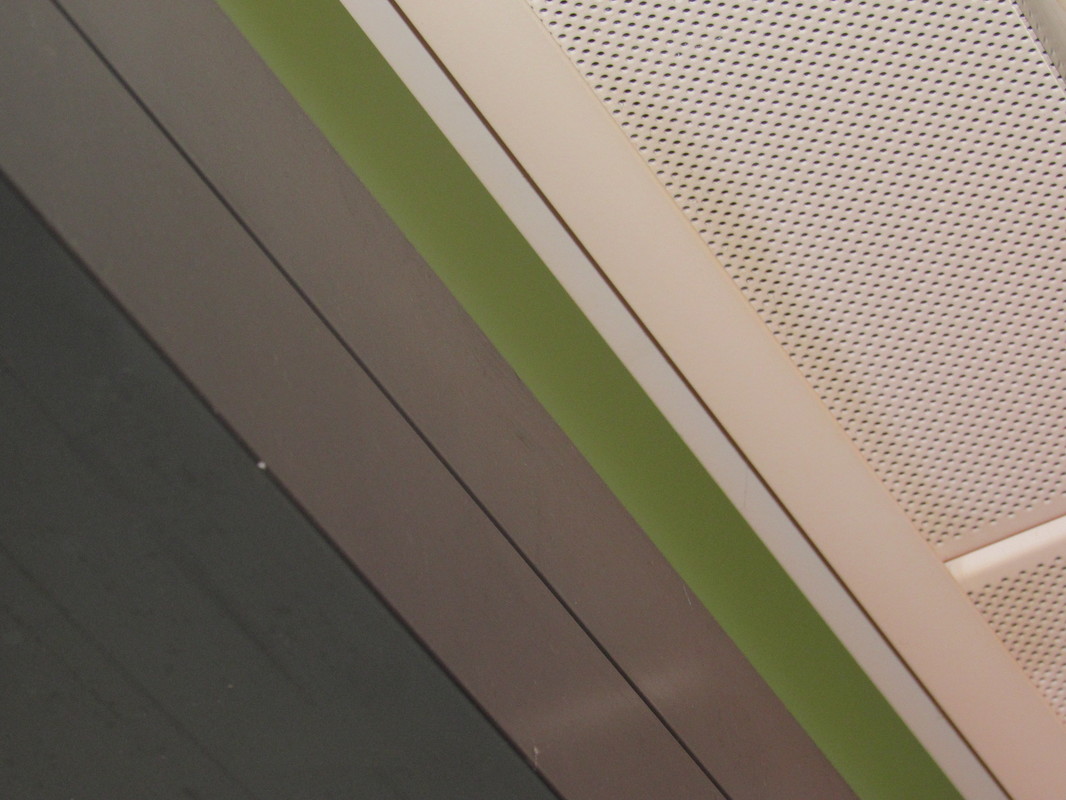
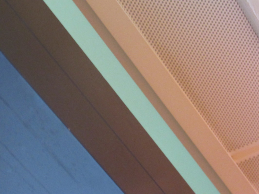
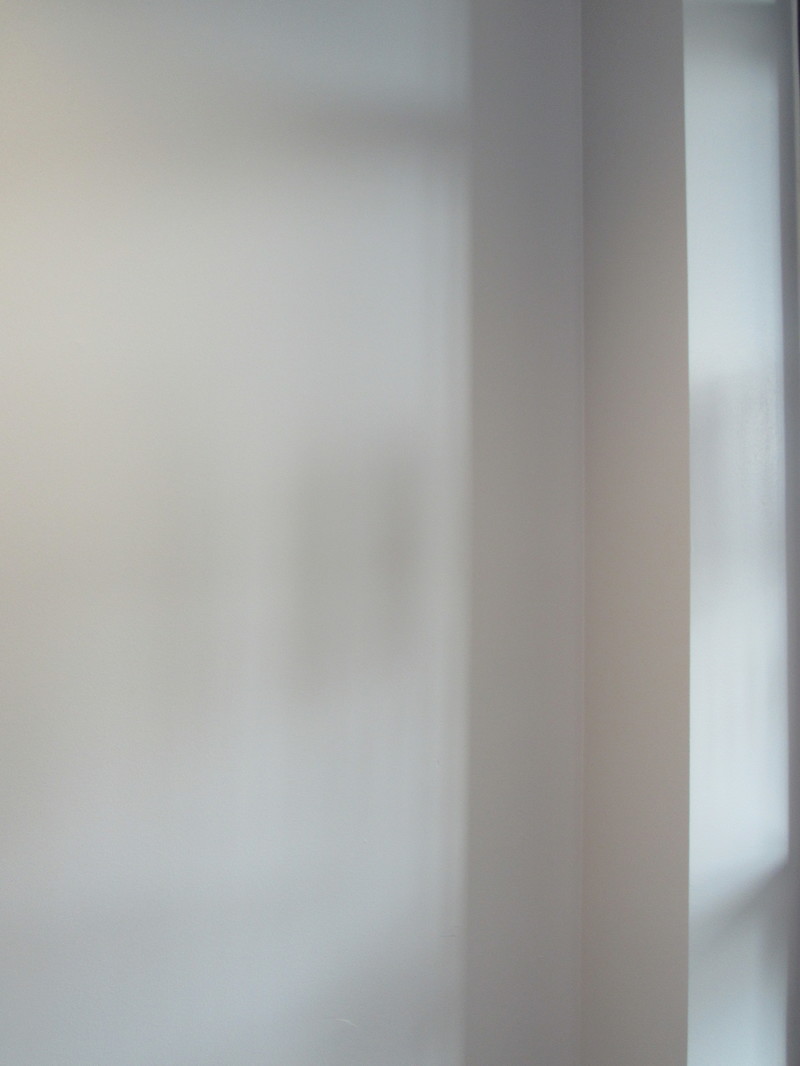
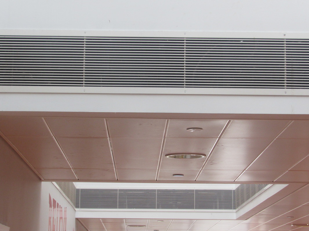
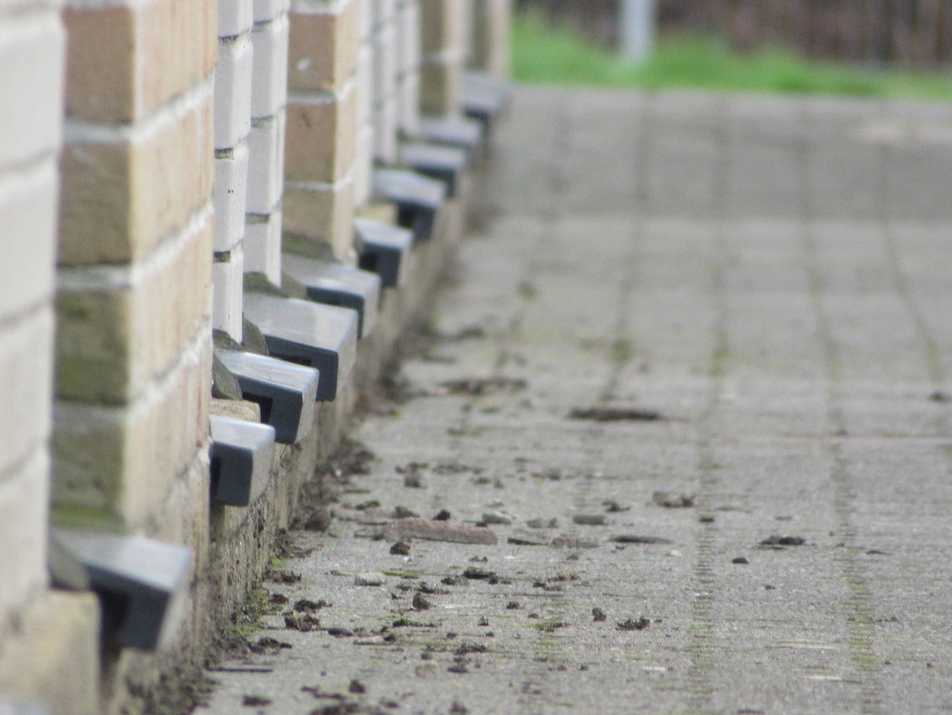
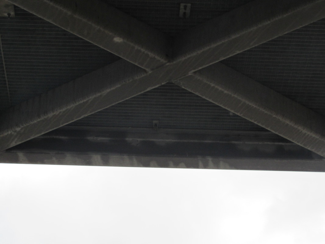
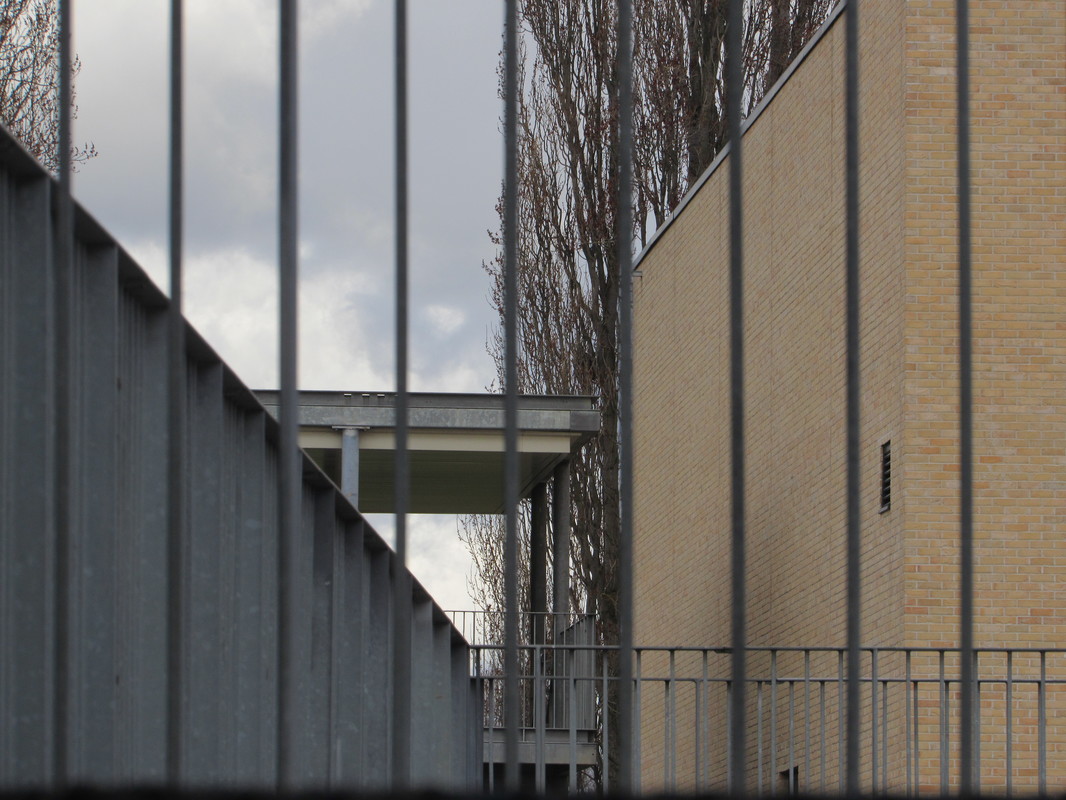
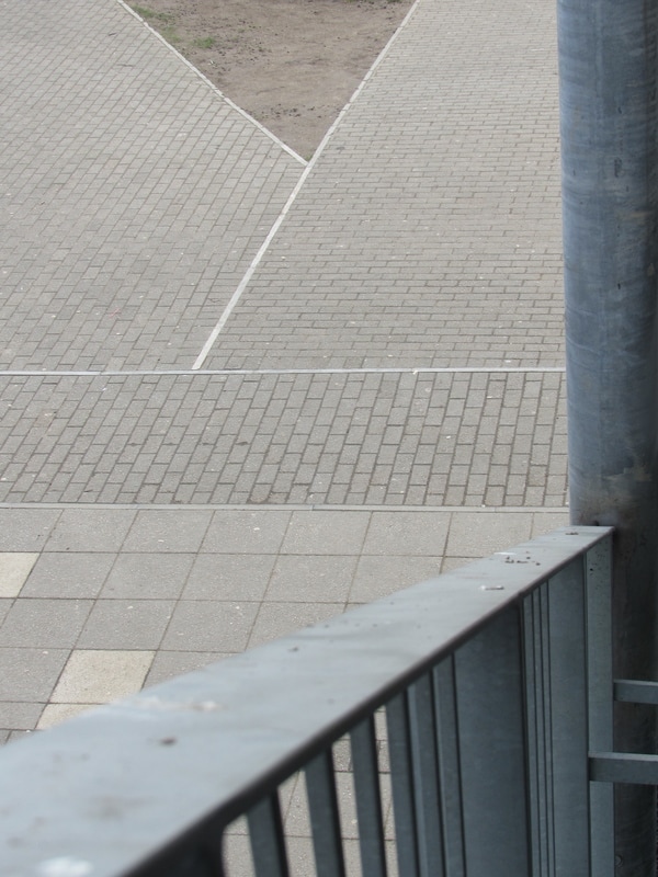
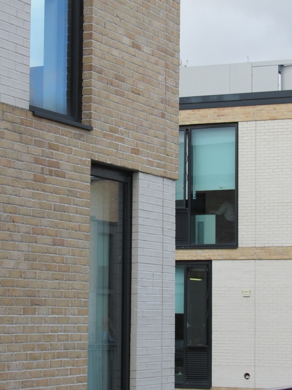
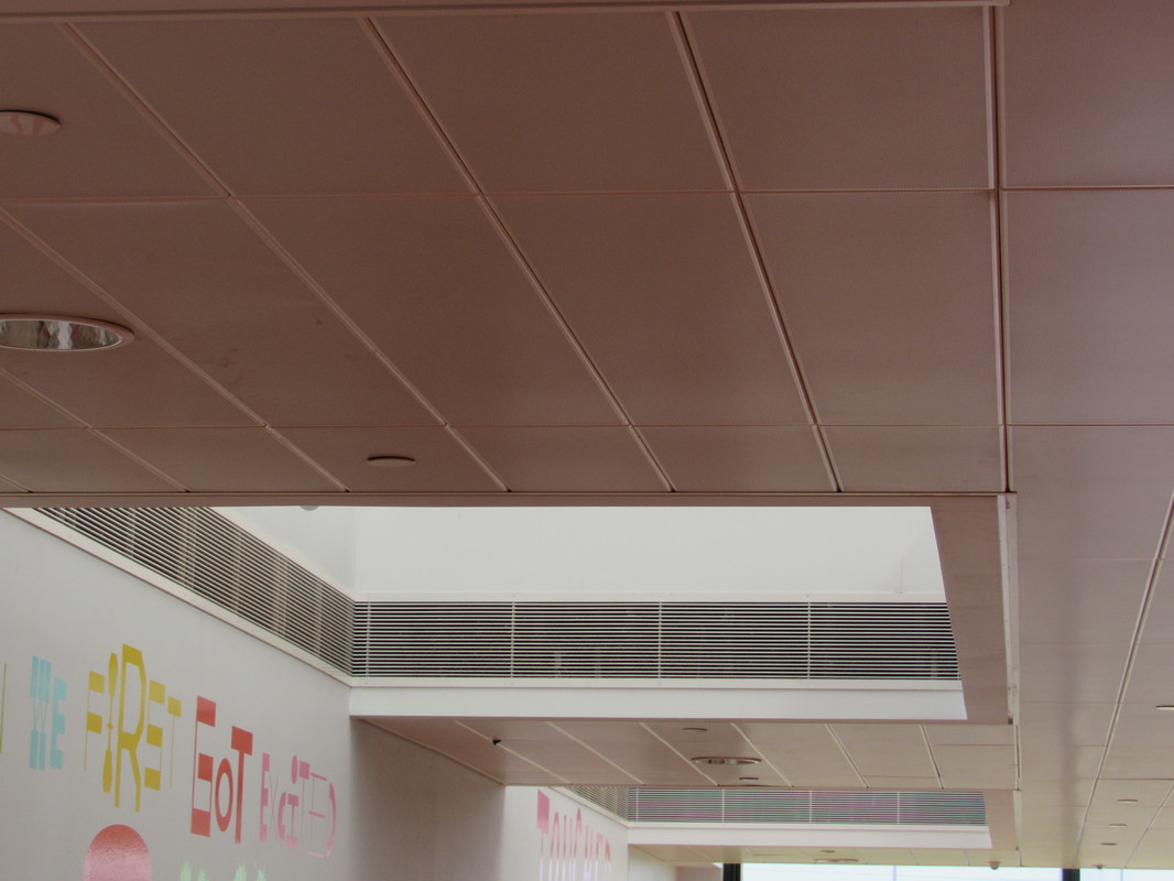
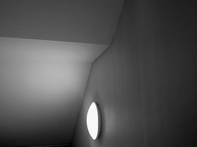
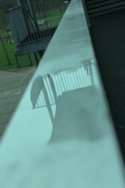
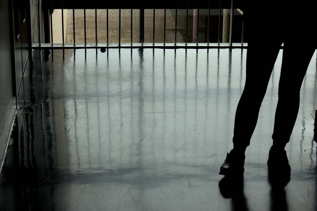
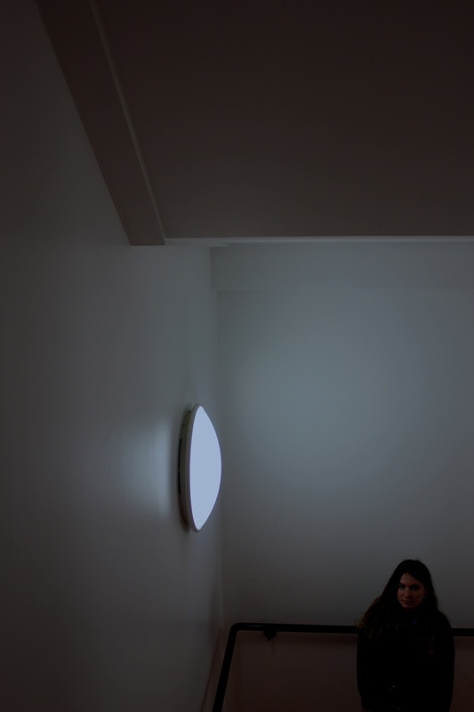
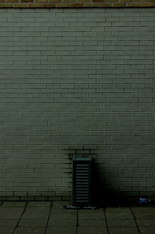
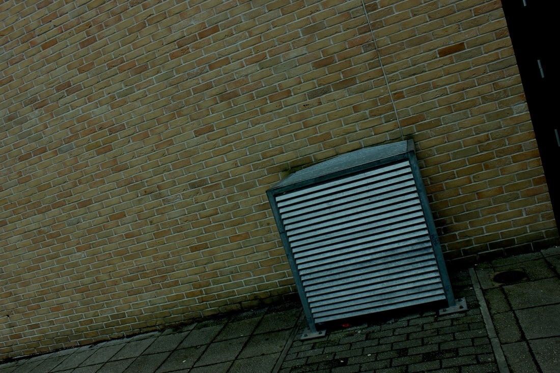
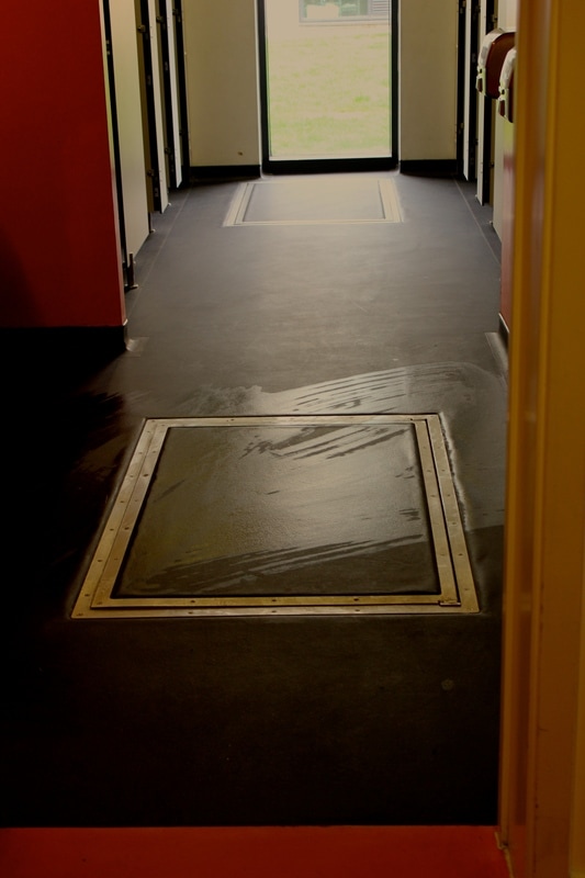
In my opinion, these 6 photos are the best out of the 30 that I took. I like these photos because of the composition, and the subjects in the photos. As you can see, the angles of these photos are basic, standard, and straight on. I chose this kind of minimalistic approach purpose because I knew that it would complement the simple edges. The colours in these photos are mostly white and grey, which is another characteristic of minimalistic art. Out of these, my favourite is the one of the air vent. I chose to have the vent running along the side as well as in the background so I could incorporate background and foreground. There is a depth to the photo, since you can see the way I've zoomed in and let the lines run through the side and carry on further than the viewer can see. These are obviously very prominent lines and the black shadows contrast with the white lines. It has a cold atmosphere around it due to this blank colour scheme, which I think leaves the viewer focused more on the edges and shapes created rather than the colours. To improve these photos, I think I could try and work on using different angles such as looking down or possibly playing with reflections.
Dolores Marat

|
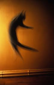
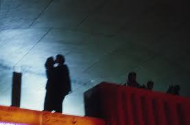
In this photo, the subject is two people kissing. The photographer has taken this from a low angle, possibly somewhere far away. You could describe this photo as slightly abstract due to the silhouetted figures and odd use of light and colours. I think that the photographer wasn't involved with the people in the photo, and simply captured it when she saw it. The composition is very interesting, first because of lighting. Detail on the couple is completely indistinguishable, and being so dark allows it to contrast with the bright light being shone on the ceiling. The viewer could question where this light is coming from. Possibly a street light?
At first, I interpreted the two people kissing as just a silhouette, but upon a further look, I notice that they're a shadow of some other people that aren't in the frame. I think it's very interesting that I thought this at first, because it makes me wonder if Dolores Marat did this on purpose. Her composition is one of the most developed techniques that she used. The two people aren't even in the visible frame, hence posing a new question : Where are they? Why aren't they in the frame? It's almost as if the couple are projected onto the ceiling. I think she chose this so that it appeared more prominent as the subject of the photo, aided with the use of contrast and light. Marat uses a wide range of colours in a lot of her photos. In this, the majority of the photo is made up of dark, cold colours. However, theres also the very warm orange colours present. Much like the use of light, she uses contrast to make them stand out and feel noticeable. Overall, the main developed techniques that I relate to are Light/Colours and Composition. |
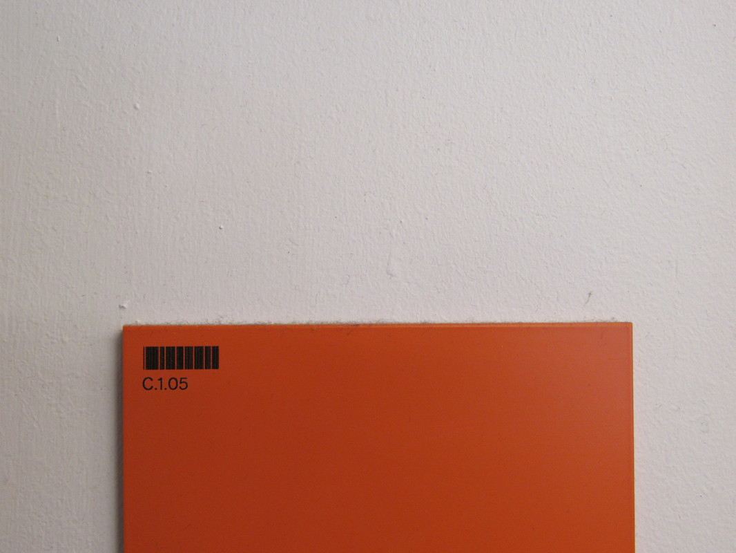
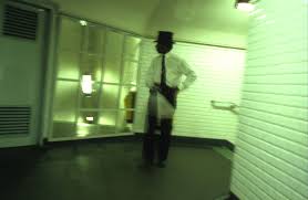
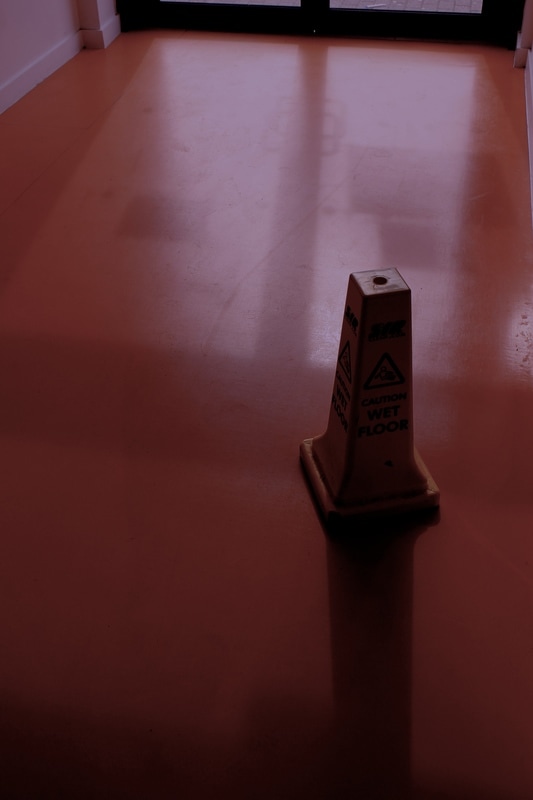
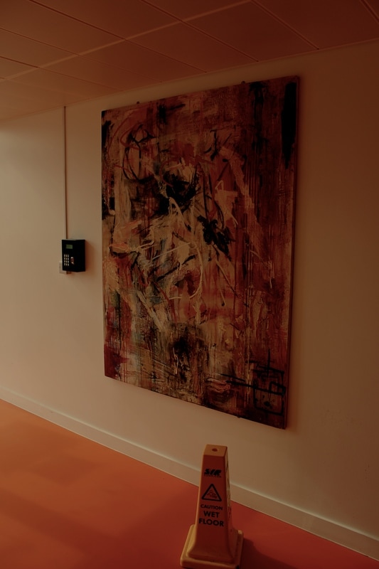
For this task, we had to take a number of photos inspired by Dolores Marat. I chose to approach it by photographing things with strong contrast and outstanding colours. I also chose to photograph things using a very close up angle, which gave it a slight abstract feel. I started to take these photos in the block with the orange theme. I purposefully did this so that I would have a bright colour in all of my pictures.
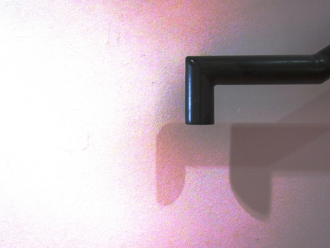
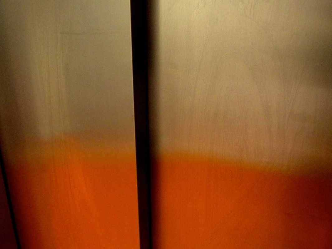
After I took these photos, I had to edit them using iPhoto. I decided that I wanted whatever colours in the photo to be amplified and become very visible. I started by increasing the contrast and making the temperature match the colours. For example, the first photo was filled with white and grey tones so I gave it a very cold temperature. With the photo of the lift doors, I gave it a warm temperature. I haven't done much with editing photos in the past, so I had to play around with the settings a bit so I knew what each bit did. Out of taking the photos and editing the photos, I found editing them a lot more fun because it gave me the opportunity to improve on a photo, or change the whole feel to it. It was definitely a new process.
Arthur Erickson
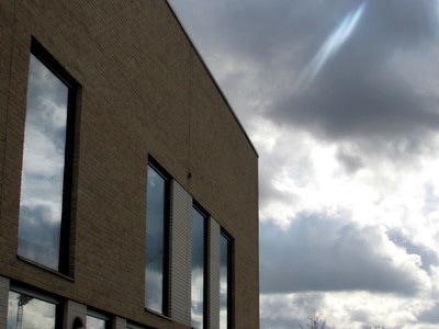
I found this photo whilst searching for artist that take photos related to edges. The photo that really caught my eye is the first one in black and white. I like the way that he utilises shadows in to work side by side with the various lines. For example, the stairs in the bottom of the photo have multiple lines because of all the shadows. I think that he definitely wanted these to be in the photo. Also, due to his composition, he has created a contrast between busy and smooth textures. You can see this effect with the stairs and the ramp like ground next to it, and also in the background with the sky and buildings. This is a really interesting part of the photo. Since it's so far away, you can't see detail very clearly, so you're left to see the shapes of things - the edges. These buildings stand out against the negative space created by the monotone sky colour. All of these techniques are present in most of his photos. He often stretches long lines far into the background to create depth. There's often a theme of colours in each of his photos, and if there's a lack of colours he relies on shadows.
Criteria for photos influences by Arthur Erickson
- Shadows
-Colours
-Depth
Criteria for photos influences by Arthur Erickson
- Shadows
-Colours
-Depth
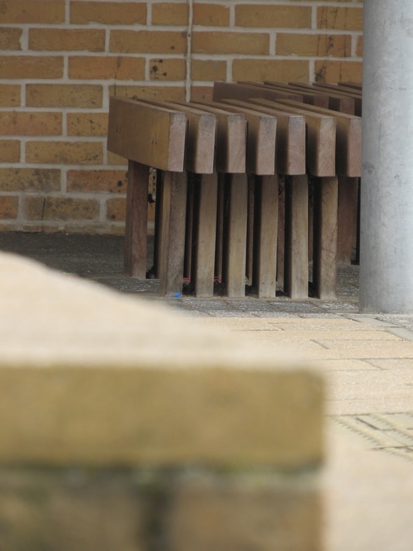
After researching some of Erickson's work, I went out to take some photos inspired by him. I kept in mind the three points about what he utilises the most, but I found I was using some more than others. For example, throughout the task, I didn't really take many photos using shadows. This was partly because of the locations and weather, but I think I simply focused more on the depth and shapes of things. I tried to take photos of things that have lots of layers such as things sticking out of walls or benches because I think it is one of the best ways to create depth. Looking at my images, this appears to be the best technique that I used. However, I don't think I focused on colours that much, despite it being an outstanding technique. If I were to take photos again influenced by Erickson, I would definitely try and focus more on a subject and colours. In most of my photos, there isn't really a subject. This could be a problem because it makes the viewer slightly confused or means that they lose interest. In conclusion, I found this task fairly easy, but there are some things that I could have tried using more.
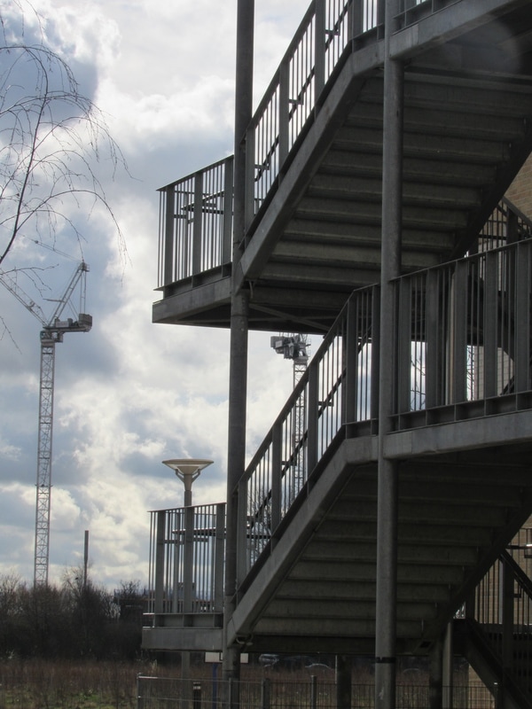
Final Sequence
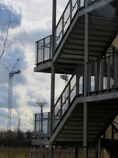
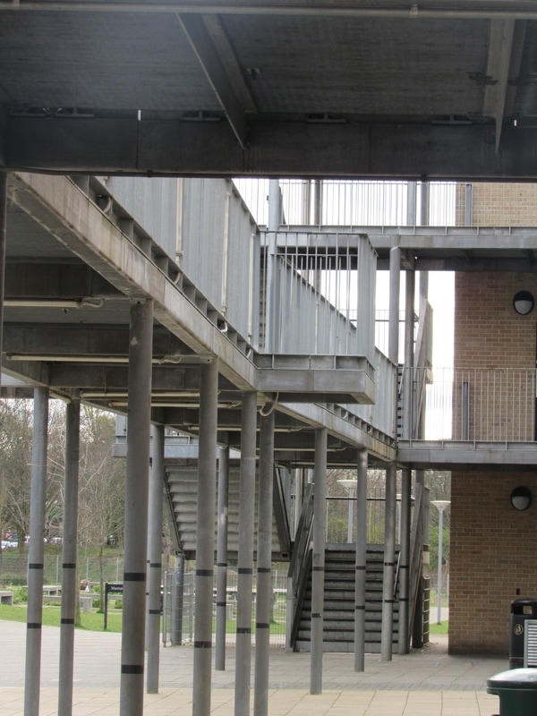
These are the 4 photos that I chose as my final piece. I chose these because I think they captured the depth of the edges the best out of all of the ones that I took. For example, the first one is very focused on the shape of the staircase. I edited the contrast so the edges of the stairs are more prominent against the white clouds. This brings the viewer to look at the frame. There's also a crane in the background, which gives the image scale. This type of large scale is also present in the third photo, because you can see the shear size of the building and how it's outlines contrast against the sky. I like the way the sky is in this photo because it acts as a sort of negative space, meaning there is more focus on the shape of the building. The second photo along is definitely more about depth. It was taken very zoomed in, and I did this so that the viewer would get a sense of how far away the other "blocks" are. The edges of these also run parallel, giving an aesthetic feel. The last photo is quite different from all the others, seeing that there is no colour. However, the sharp contrast allows a sense of colour. There is also a very clear line cutting through the centre of the image. This stands out, but not all attention is given here, since there is the bright white circle also there. Overall, these are my best images taken so far, since they use the outstanding techniques and came out how I wanted them to.
Further Experimentation - Edges
Plan For Final Piece :
What I want to do for my final piece is create a sculpture. I want this to be a simple rectangular frame with shapes inside that relate to edges. I wasn't directly inspired by a certain artist when thinking of this. It was more the fact that I wanted to create a very simple plain shape and fill it to make it slightly more 'busy' with lines and edges.
The first thing that I had to do was take a series of images. Of course, these had to relate to edges so I went out and tried to focus on any particularly distinct lines or contrast between colours. I then settled with the best four images that I took. These are the images that I chose...
The Images For The Piece
I chose these images because of two reasons : their characteristics as individual photos and how they work together and what effect this creates. For example, the first images is quite colour based since there is a a large contrast between the pink and blue. These pink leaves have quite a thick texture and they're not seen as individual lines. The textures then also contrast in the photo since the blue is monotonic and fills most of the photo. You could definitely say that this image is more colour based than 'shape based', but I think that it's contrasting composure and textures give it a definite focus on edges.
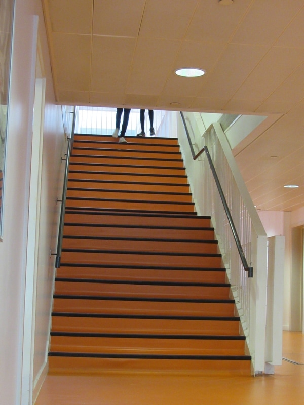
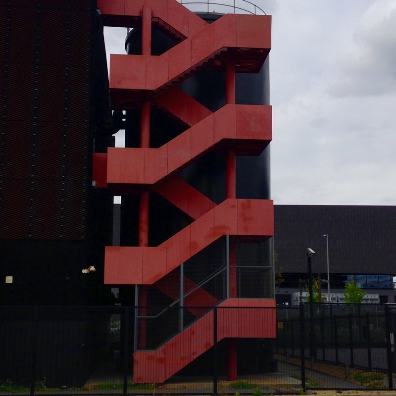
For the next two images, it is obvious how they relate to edges. The second one has an outstanding, strong line of staircases running straight down the centre of the image. They have a repeating pattern which zig-zags over one another. Upon first glance, this is the first thing that will catch the viewers eye and make them look in more detail. I think that it is quite pleasing to the eye because of it's repeating pattern. Also, the fact that I chose to compose the image so that they run through the middle plays a big part in the aesthetic feel. As the shape of the stairs is quite simple and smooth, it felt intuitive to do the same with the composition by arranging geometric shapes. Not only this, but also the colours make them stand out. Bright red is definitely something that will catch a viewers eye. I would describe it as quite a minimalistic photo. The stairs lack any sort of detail upon them, and what remains in the background is dismal and uneventful. This then leads the viewer to focus on the shapes within the photo, hence why the edges are so prominent.
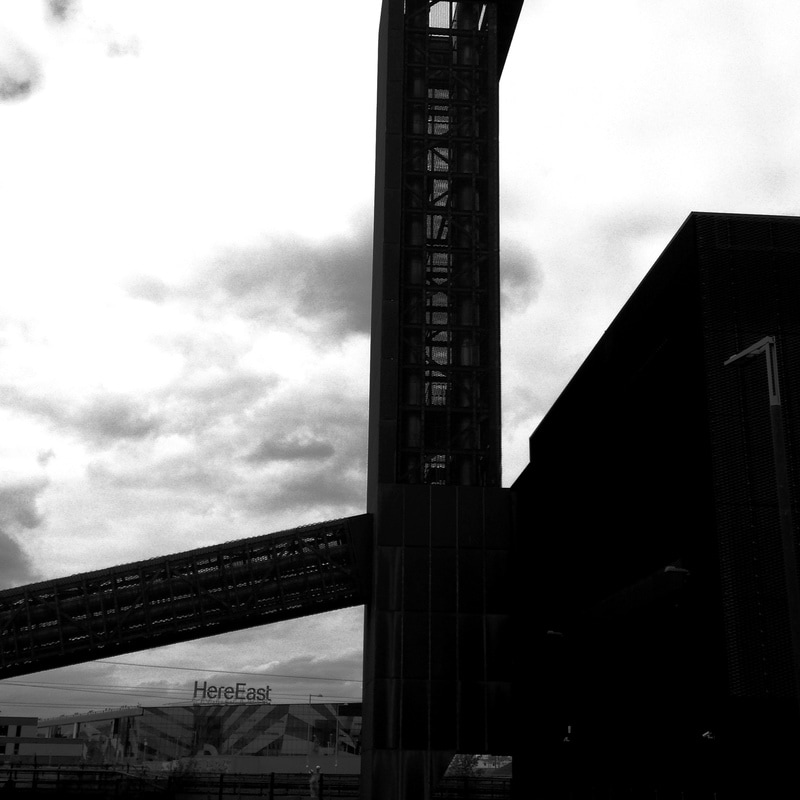
In the last photo, I edited it so that it was completely black and white and I increased the contrast greatly. Now that colour is out of the equation, the viewer is once again focused on the shapes. The photo consists of a very large chimney-like part of a building that rises very high into the sky. It also has another 'shaft' going out at another angle. This is quite an unusual piece of architecture as it is not the sort of building you would see in any given place. These two protruding lines cut right through the photo and stand out against the harsh exposure of the clouds in the background. When editing these photos, I made sure that the contrast stood out on this one because of the dark building against the white sky. This definitely makes the shape of the structure become noticeable and I think it is the main focus of the photo.
When all of these photos are put together, you can see how they complement each other and how they can be used as one piece. The colour range is very wide, going from bright flamboyant pinks and blues, and slowly draining to harsh black and white. The textures also contrast greatly. The last photo has a quite a smooth texture with not much activity, whilst the first is busy and full of different shapes and depths. I think that the thing that is noticed within all of these photos is the lines and edges, which is why I chose them. There is a range of small and intricate to large, bold blocks of lines that fill up the whole image.
For the next two images, it is obvious how they relate to edges. The second one has an outstanding, strong line of staircases running straight down the centre of the image. They have a repeating pattern which zig-zags over one another. Upon first glance, this is the first thing that will catch the viewers eye and make them look in more detail. I think that it is quite pleasing to the eye because of it's repeating pattern. Also, the fact that I chose to compose the image so that they run through the middle plays a big part in the aesthetic feel. As the shape of the stairs is quite simple and smooth, it felt intuitive to do the same with the composition by arranging geometric shapes. Not only this, but also the colours make them stand out. Bright red is definitely something that will catch a viewers eye. I would describe it as quite a minimalistic photo. The stairs lack any sort of detail upon them, and what remains in the background is dismal and uneventful. This then leads the viewer to focus on the shapes within the photo, hence why the edges are so prominent.
In the last photo, I edited it so that it was completely black and white and I increased the contrast greatly. Now that colour is out of the equation, the viewer is once again focused on the shapes. The photo consists of a very large chimney-like part of a building that rises very high into the sky. It also has another 'shaft' going out at another angle. This is quite an unusual piece of architecture as it is not the sort of building you would see in any given place. These two protruding lines cut right through the photo and stand out against the harsh exposure of the clouds in the background. When editing these photos, I made sure that the contrast stood out on this one because of the dark building against the white sky. This definitely makes the shape of the structure become noticeable and I think it is the main focus of the photo.
When all of these photos are put together, you can see how they complement each other and how they can be used as one piece. The colour range is very wide, going from bright flamboyant pinks and blues, and slowly draining to harsh black and white. The textures also contrast greatly. The last photo has a quite a smooth texture with not much activity, whilst the first is busy and full of different shapes and depths. I think that the thing that is noticed within all of these photos is the lines and edges, which is why I chose them. There is a range of small and intricate to large, bold blocks of lines that fill up the whole image.
The Sculpture
Now that I had my images, I had to make the frame that I was going to stick them in. I made a rough sketch of what I wanted on a piece of paper and then started gather the materials that I would need. I needed :
- A wooden frame
- Card (to stick the photos on)
- wooden sticks (roughly one by one inch to create the shapes inside the frame)
- A glue gun
I luckily found a frame that was suitable to use in the classroom. This would've been quite time consuming to make myself so this sped up the process quite a lot. After this, I measured out the lengths and shapes of the wooden sticks so that they would fit within the frame the way I wanted. I cut these into shape with a saw and then used a glue gun to stick them in. This is what the frame looked like at this point :
Now what I had to do was cut three pieces of card out to fit three of the gaps made inside the frame. This was quite hard because I had to get the measurement exact and it was tricky using a pencil against the wooden sticks. I messed this up a few times but when I got the correct shapes I began to cut my photos out to stick them onto the card. I printed the photos in A4 size to make sure that they could fill the entire piece of card. I stuck the photos onto the pieces of card using a glue stick. Now I had to stick the photos and card onto the pieces of wood themselves. I was planning to use the glue gun again because it seemed most efficient throughout the making of the piece. However, when I tried it, it proved to be a lot harder than I thought. The glue dried extremely quickly and I didn't have enough time to spread glue across the whole wooden stick in time. I had to change my technique and use blobs of glue instead of one continuous line. In the end it stuck onto the wood perfectly and there were no problems.
Refining the piece
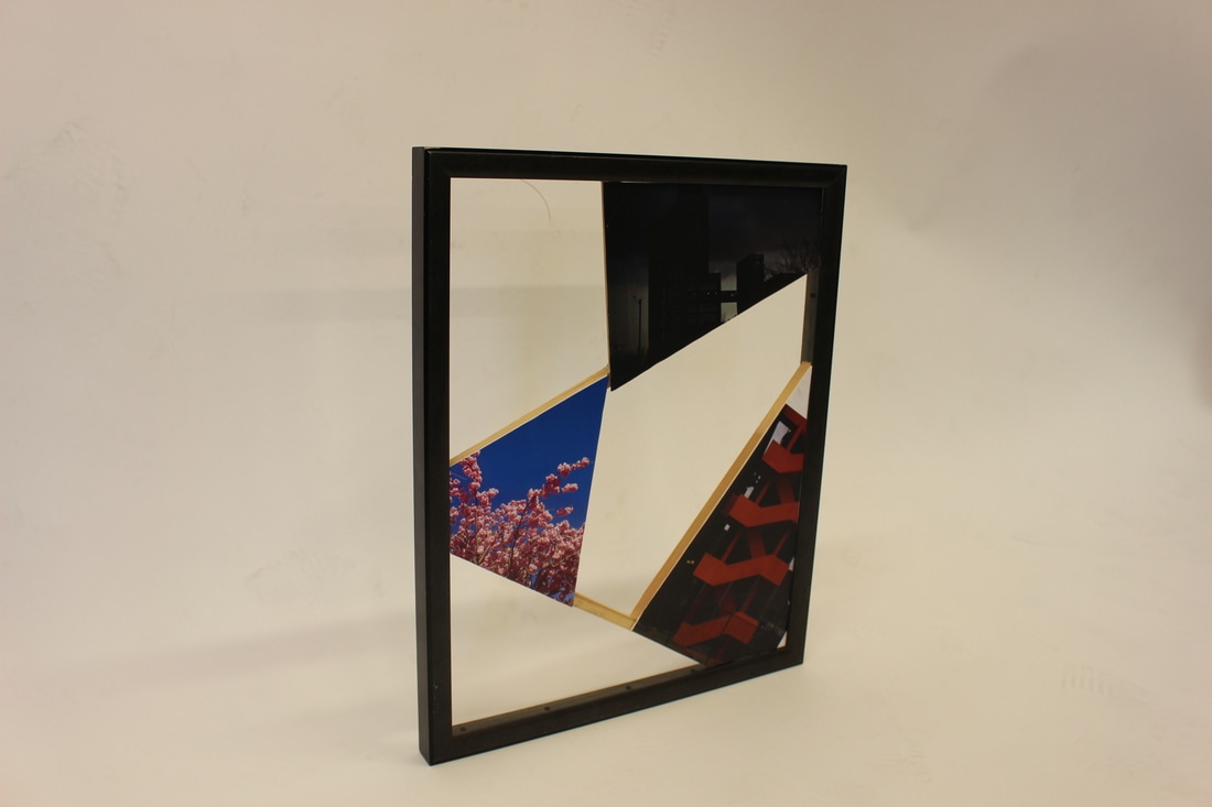
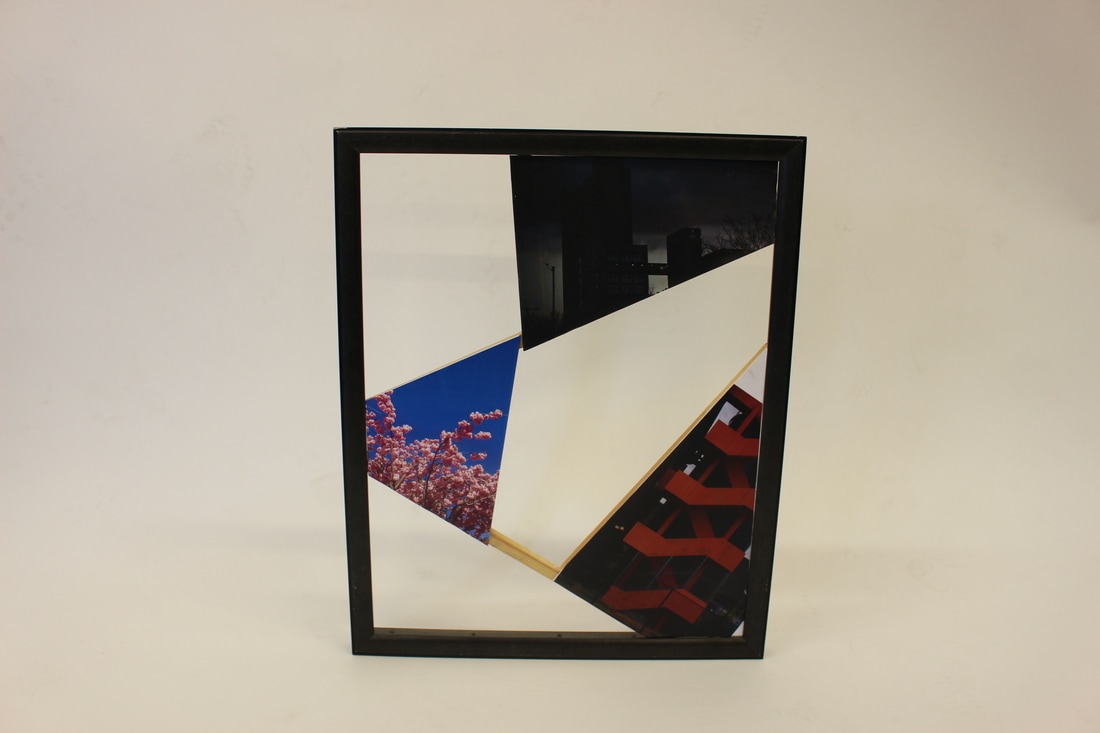
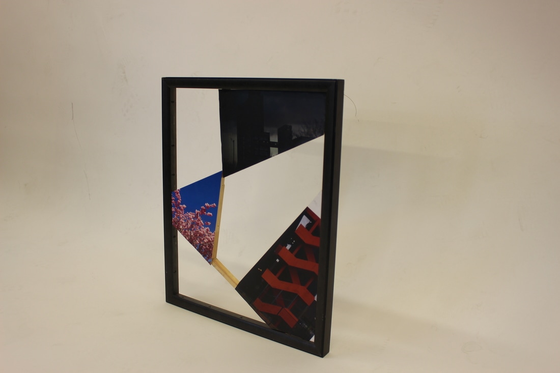
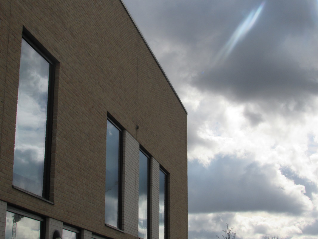
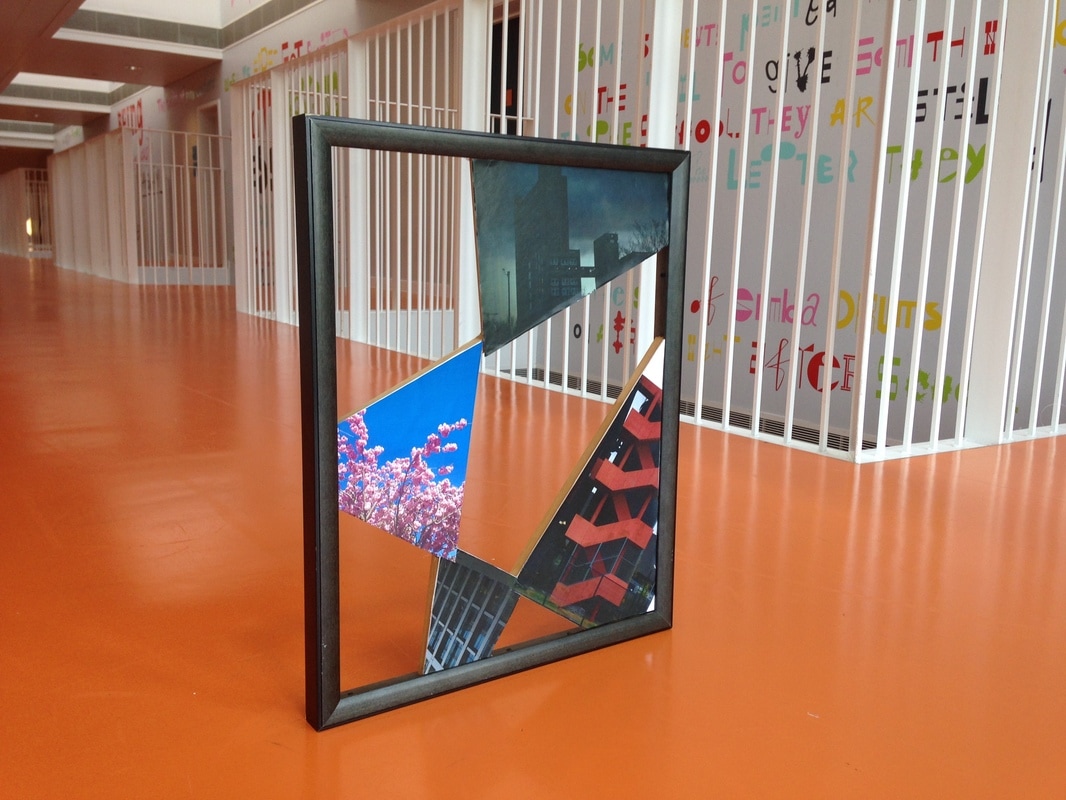
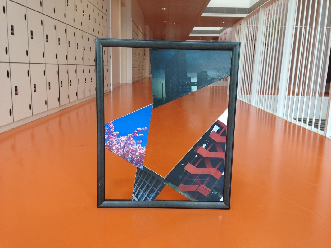
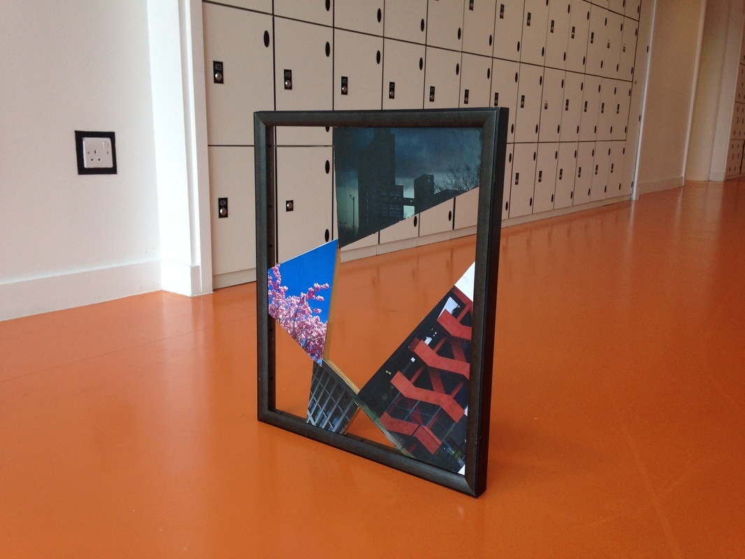
This is the outcome of the piece. After looking at it some more and talking to some other people, I decided it would be a good idea to cover up up the piece of wood that wasn't covered at the bottom. At first, I thought of just simply sticking a photo across the wood but I thought that it would be quite weird just having a random line going through it, so I decided to make another 'panel'. The photo I used was this :
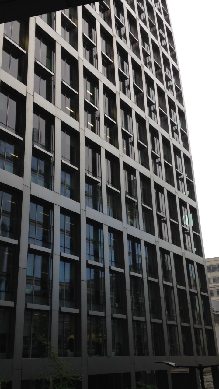
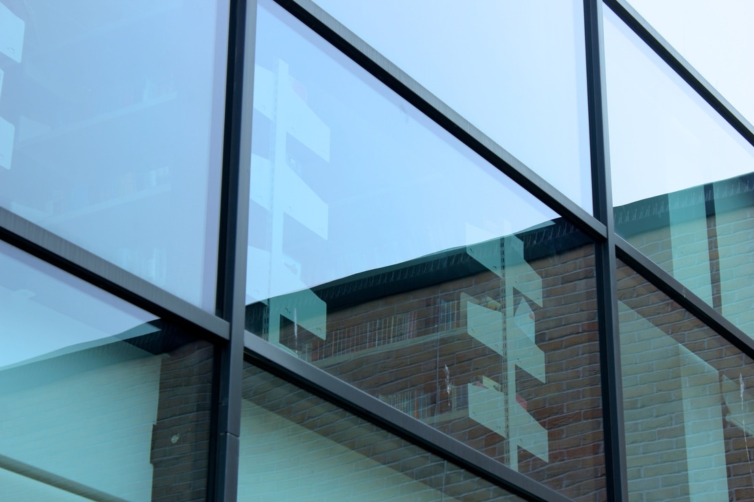
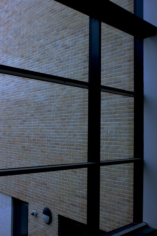
I chose this photo because there is an obvious focus on edges. The photo is of a very large building, and it's been taken from a low angle, emphasising the scale. There is also a regular pattern on the face of the building. The rectangular window frames cross over each other in a sort of lattice structure which gives the overall photo a 'tidy' and satisfying feel to it. Also, the sun is slightly shining on the upper half of the building, but less so on the lower half. This creates a gradual fade from the top of the photo to the bottom, where the top has a more intense lighting. I think the colours cast upon the window frames are really soothing and fit with the very neat feel to the photo. This is quite a contrast to some of the other photos that I used, which have messy contents.
Overall Task
Overall, I found making this piece very exciting. This was the first time I took full responsibility for my time management and I was able to express myself freely. I had to be very disciplined in my work, as I was required to make correct measurements and judge things critically. When I first started making the piece, I only had the desire to have 3 photos inside the frame. Once I had measured everything out and taken time to make the frame accurately, I cut out and stuck on these three photos. I was happy with the result and I was proud of my work, but I saw a way that it could be developed. I thought that all in needed was one more image, possibly darker than the rest. Although this piece was about Edges, colour played a big role in the piece itself. Out of the total 4 photos that I used, two of them are colourful and vibrant, and the rest are quite dark and gloomy. This created a contrasting effect and I was able to emphasise this by placing the colourful ones next to the dark ones, bringing them out and making them more obvious to the viewer. I also quite liked the fact that I had created not only a picture frame, but a sculpture too. I had incorporated two things into one and it really allowed me to explore lots of ideas and different ways that I could express edges. If I were to create a similar piece again, I would like to add more elements to the final frame such as more sections for photos, or maybe a background attached to the frame itself. This would add more depth to the piece, and although I am extremely happy with it, I think there are many ways that it could be improved. Considering this, I think I experimented successfully and prepared well in order to create one of the best final pieces that I could. I really enjoyed experimenting with this area of photography, and I would be happy to try it again.
