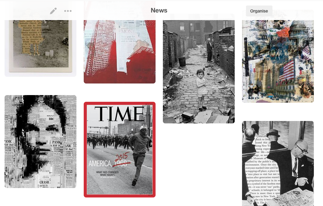
In The News
I have chosen to work on the theme In the news. I chose this theme because of the wide range of approaches that are available, and how it relates to current world situations. I like the idea of a piece of work that can express opinions and be interpreted differently by different people. I think it will also be quite a challenge, as I'll need to do active research and work outside of the classroom, but I am looking forward to the change in style of work.
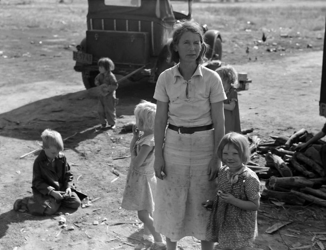
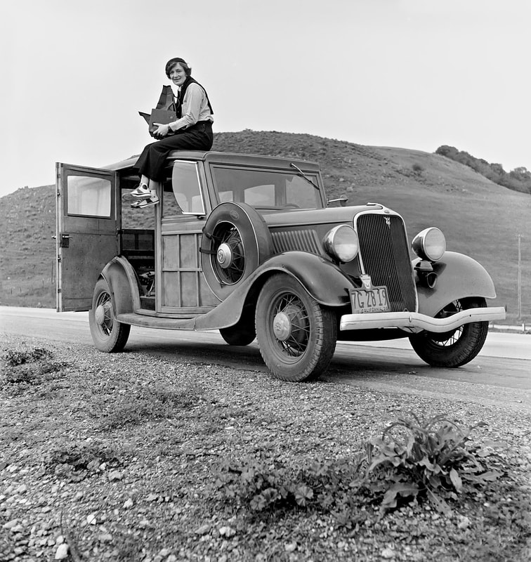
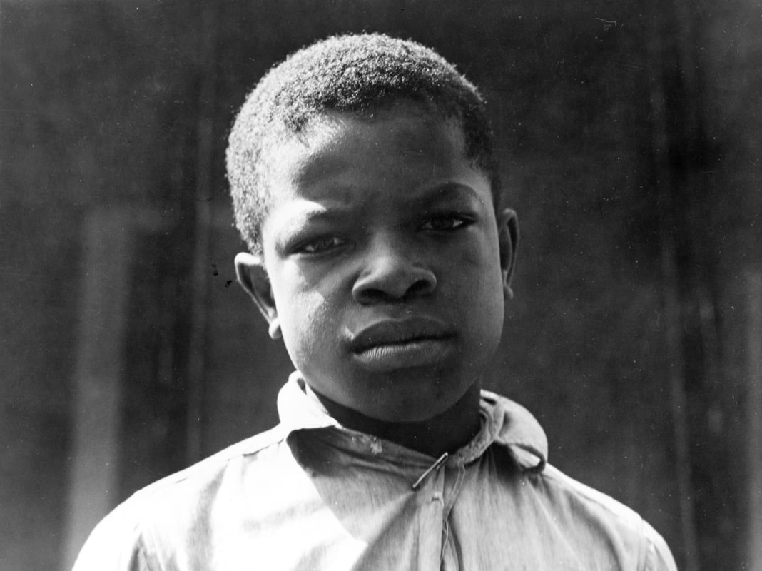
Dorothea Lange
|
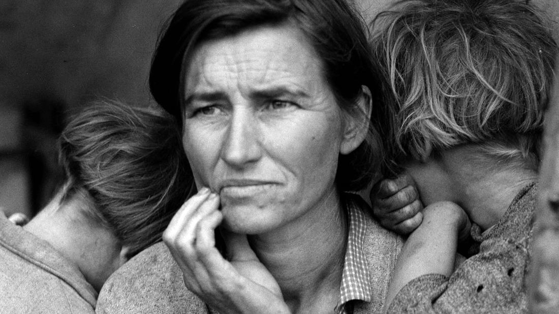
Dorothea Lange was a documentary photographer and photojournalist who was most famous for her work during the depression era in America. Her photos portrayed the different living conditions of migrant workers. The majority of her photos are focused on the emotions of the subject, by taking close up photos of their facial expressions and portraying them in their true light. They have a very powerful effect on the viewer because the composition of the photos simply contain the subject and their living condition, wether that be shown through their clothes or possessions. The photo on the right is especially effective. It shows a woman with (presumably) her two kids, who are hiding their faces in her shoulder. She has a very concerned looked upon her face, and this is one of the first things that the viewer notices. We are left with very little context, but as viewers, we can assume that she is in a hard place in her life. Furthermore, the lack of colour reflects the depressing feel to her photos and emphasises the sense of struggle and poverty. I think her photos are extremely effective in portraying the lives of her subjects because we are captured by the emotions, and she displays her art in an honest way.
|
|
Bob Martin
|
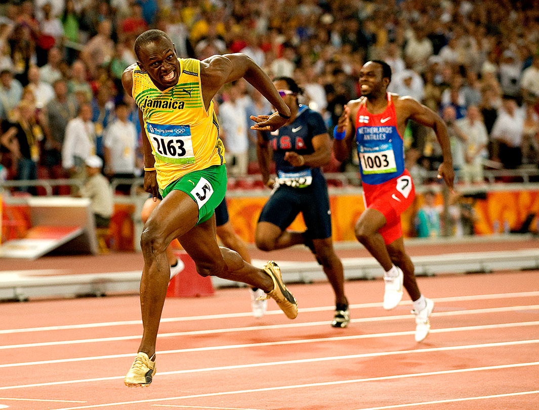
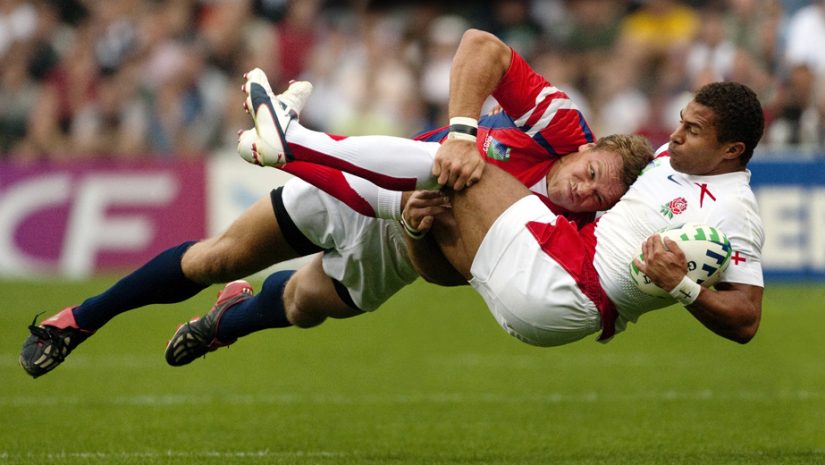
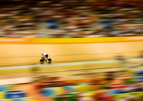
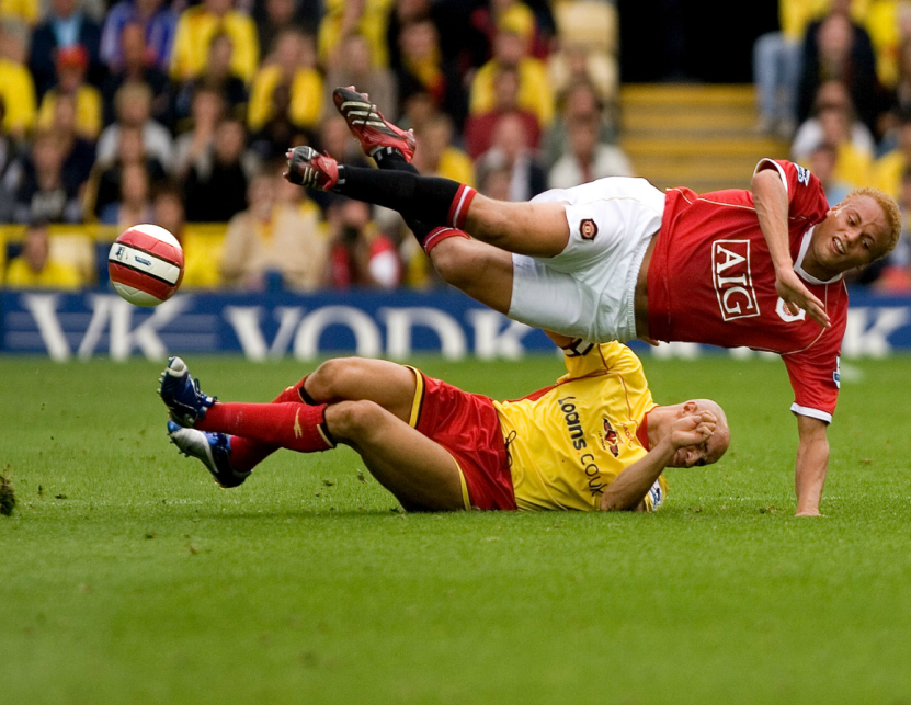
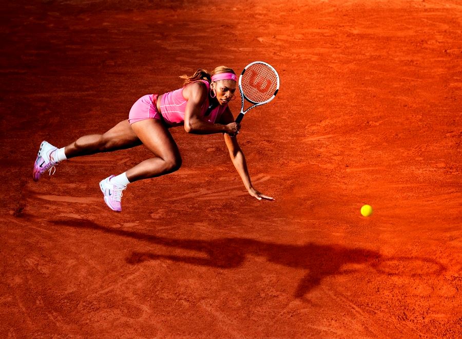
Bob Martin is a photographer of sporting events. He takes photos at world famous events and he has won many awards for his work. From the photos on the right, you can see that his takes very action-packed images that are usually captured right in the heat of the moment. When taking images of sporting events, it is important to use a high speed camera, and this is what has made it possible for Martin to take such photos. The photo at the top right is of two men playing rugby, captured as they're suspended in the air during the game. To the viewer, this photo is very excited and shows a very intense scene. Their facial expressions are clearly visible and are an important part of all of his photos, as they show the passion of the players and promote the sport in a positive way.
By looking at all of his images, you can see that they have a very sharp focus and wide depth of field. They look clean and very precise, which is also important in sport photography. The photo the cyclist was taking at 1/1000th of a second, which is incredibly fast, but it was what was necessary to get a photo like this. I think a lot of his images are such high definition and precise because of the demand for good quality in the media; the subjects of his photos are very exciting and eye catching, but I think the sharp quality and professional impression really promotes his images. |
|
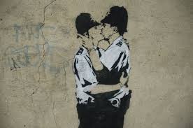
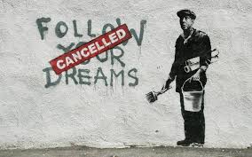
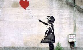
Banksy
|
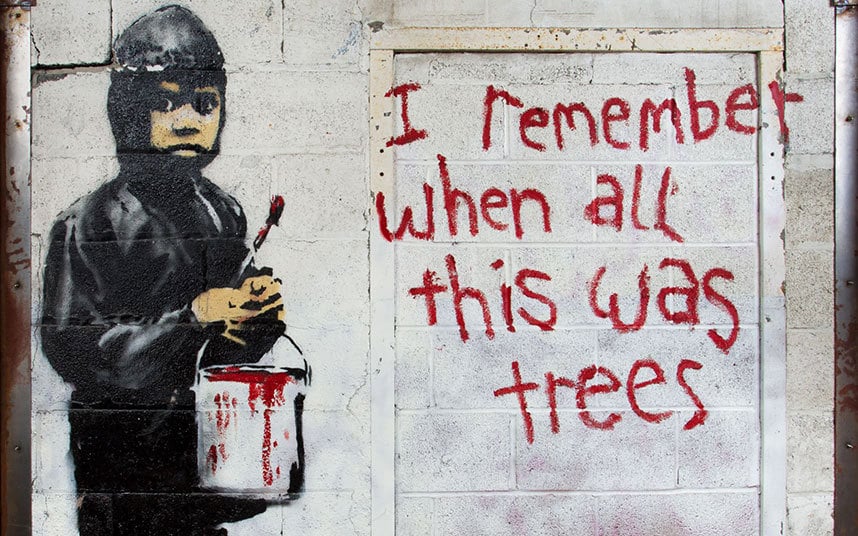
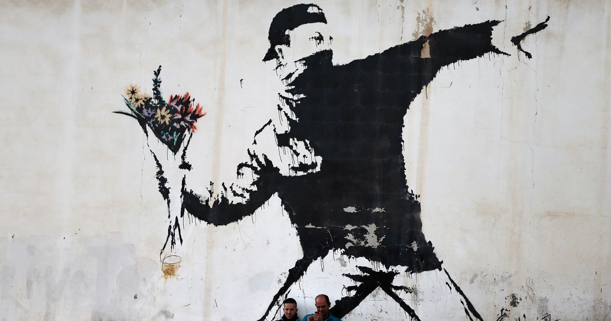
Bansky is an anonymous graffiti artist who works in England. they are a political activist and also a film director. Their art consists of simple 3D drawings on streets and walls that have concise and often deep meanings, usually related to moral or political opinions. Their work has been praised all around the world and has influenced many people to create similar art; 2006-07 was known as the "Bansky Effect", as many street artist began to grow along with Bansky's success.
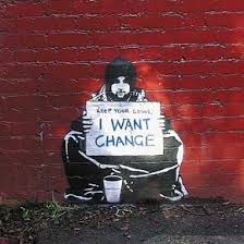
The image on the top right consists of stencil graffiti on a wall of a homeless man holding a sign reading "Keep you coins. I want change". The homeless man is of life size, at street level, and is depicted with the typical homeless-look. However, instead of having a sign asking for money - a temporary fix for the homeless - he is asking for societal change; towards homelessness, or perhaps society in general. This has an extremely powerful and subjective impact on the viewer, with its straight forward message and urban origin. Many of their images are like this : A simple yet effective message with the aim of raising awareness or encouraging change in society. I really like their work because of the simplicity and the fact that they remain anonymous and make their art in the streets. |
|
Tom Hunter
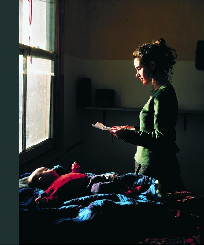
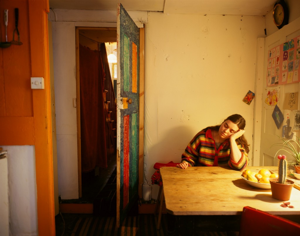
Tom hunter is an artist based in London who does work based on local stories in the news. All of his photos are recreated by himself in order to show his view on the said stories. By looking at the photos above, you can see that light plays a big part in his photos, generally varying from each photo. For example, the photo at the top left and bottom right both have a central, bright light which almost unifies and completes the photo. In the top right one, the bright artificial light illuminates the subject, almost like search light, linking it the the news story "Murder : Two Men Wanted.". I think he has recreated it to look artificial by overexposing the light on the subject, which could possibly point to his view on the story or the harsh context. Hunter has a very developed and unique approach to his art, recreating photos in his own personal way which often contain small details that aren't obvious upon first glance. I would definitely like to try and develop some work inspired by Hunter. Doing so would require a lot of preparation and a clear set of ideas, since he takes photographs outside, in an almost theatrical environment. However, the results are pleasing and it is a very efficient way to convey views about things happening in the news.
30 Experimental Photos.
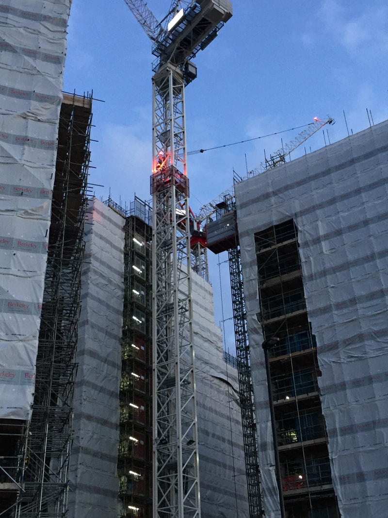
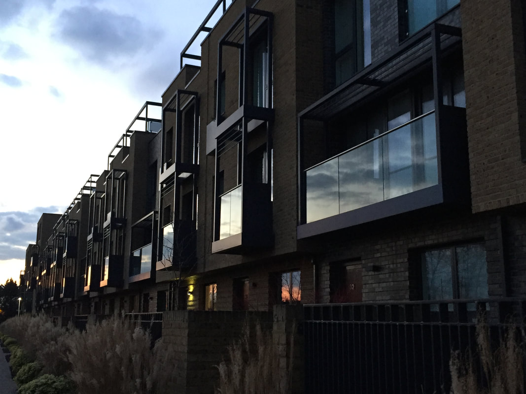
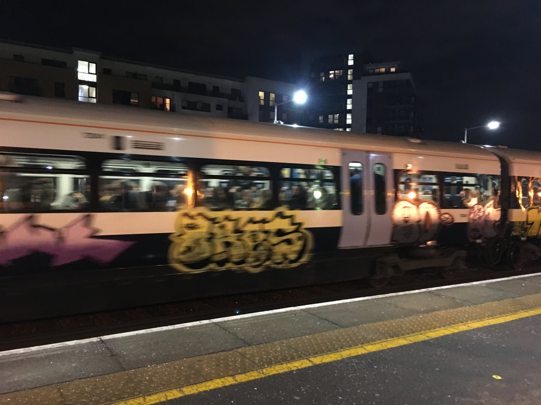
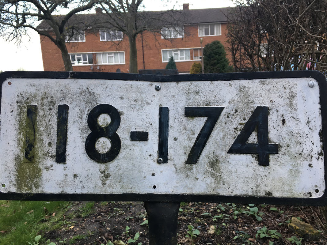

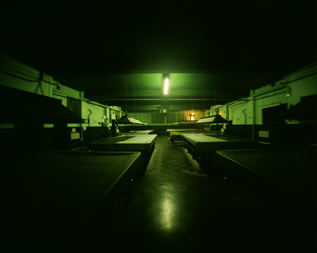
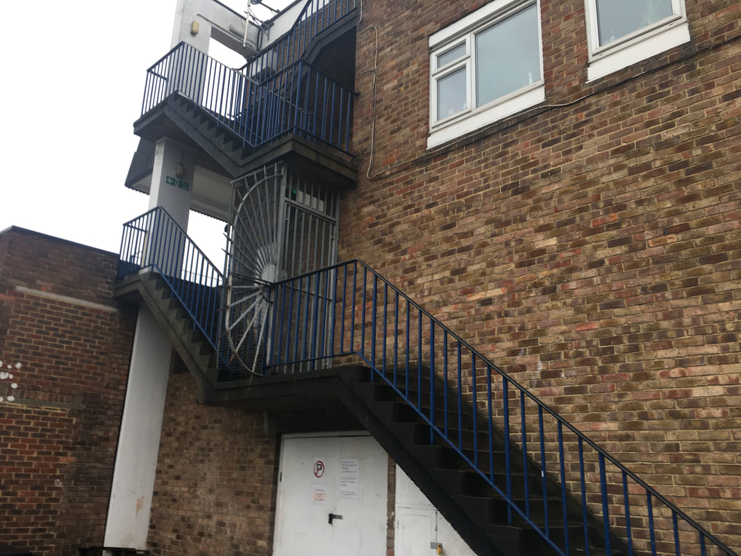
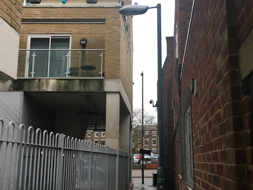
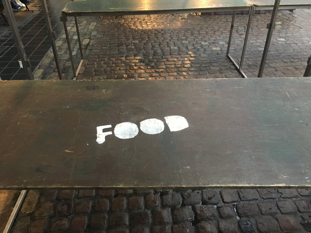
My task was to take 30 images relating to my theme "In the news". I also had to take them influenced by work from previous researched artists, such as Tom Hunter. I found that this was actually a very hard theme to photograph, and it is quite a broad but also needs to be clearly related to something in the news. Because I had such little time, I found it hard to relate my photos to recent stories in the local news, so instead, I decided to photograph things that I thought could be related to the news. For example, the photo of the train covered in spray paint seems to me like something that could be reported. It is very out of the ordinary and comes across like an urban photo : taken in the moment and showing an illegal event. The photo was taken in low light which meant that there was motion blur. I would like to recreate this image and take it again in better lighting in order to get better quality. Out of all of the photos that I took, I think this one contained the most interesting subject, but lacked in composition quality. For the other photos, I captured things such as construction sights and street signs. Something I would like to focus on more is the lighting of my photos. Tom Hunter's photos have a large focus on lighting, and I would like to incorporate this into my work.


I think that these three photos are my best. They both incorporate themes from the news such as graffiti, construction and warning signs. I quite like the composition of each photo, as they all are framed as if reporting the event; everything is shown in each photo and there isn't any extensive cropping or effects added. I took some inspiration from photos in news articles that have this 'factual' approach to their images. However, these photos could also be greatly improved. Although they link to the news in some ways, there isn't always an obvious link, so I would like to go out and take some different photos that directly incorporate things happening in the local news.
Tom Hunter inspired photos

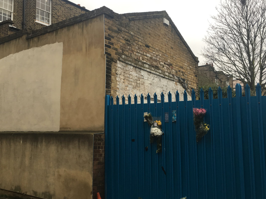


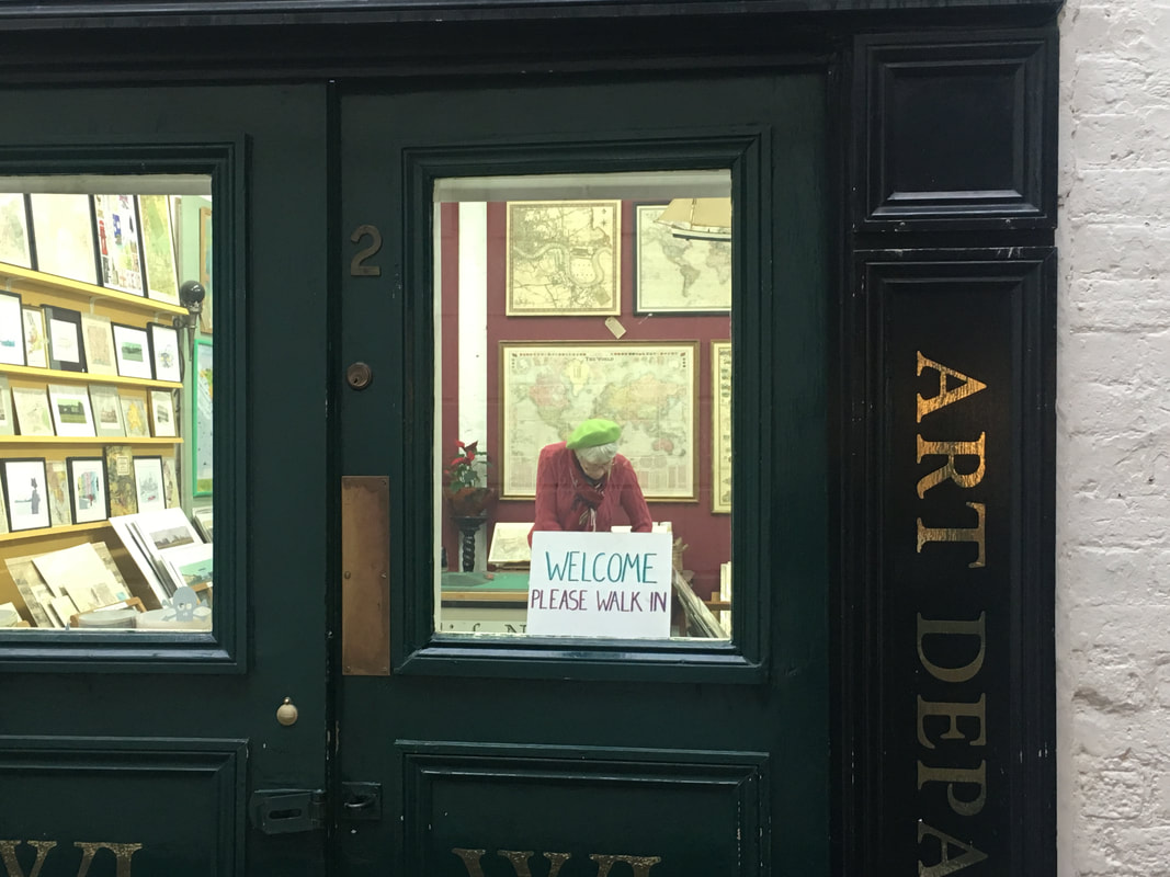
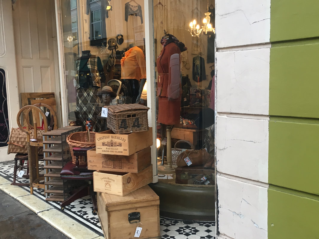

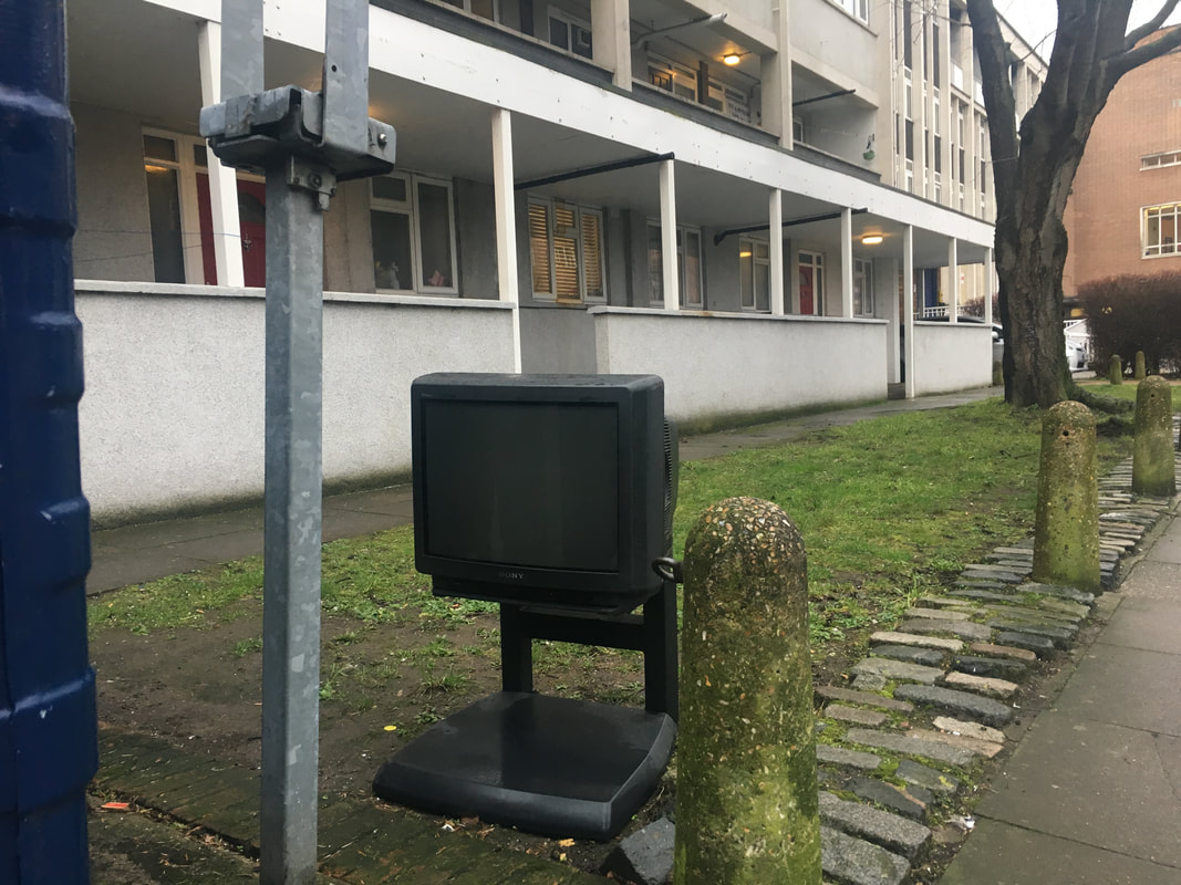
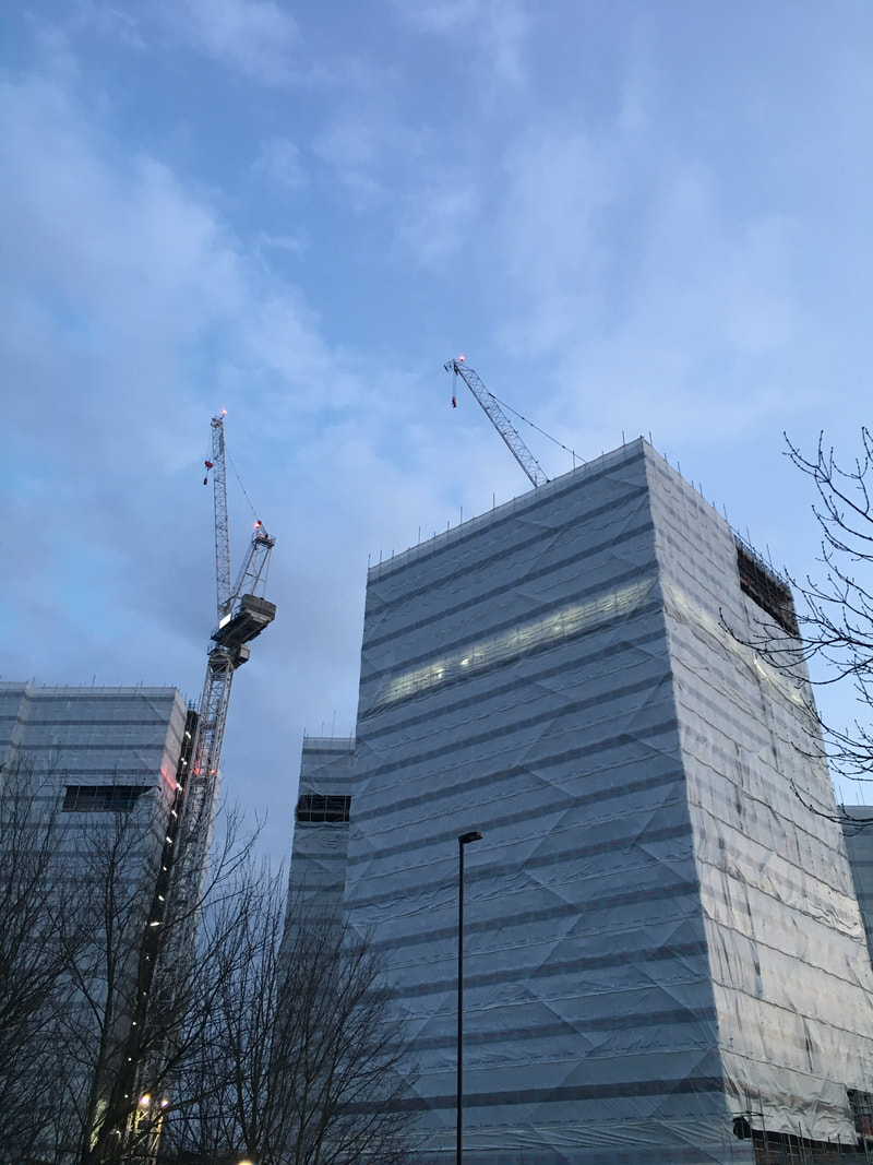
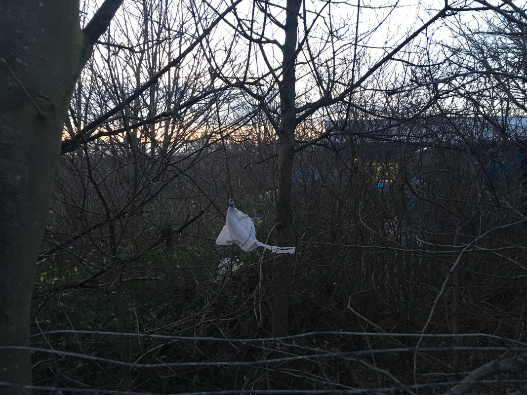
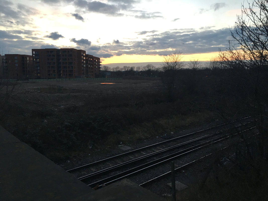
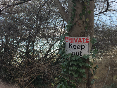
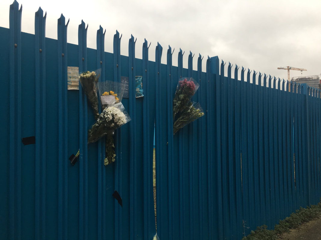
I took these photos as a response to the work of Tom Hunter. He recreates stories in the news by using models and photographing them in the scene, often with his own little twist added. Inspired by this, I decided to take photos around my local area that I thought could belong to a certain article headline. I have seen many comical approaches to this kind of work, where people photograph unusual things and give it an ironic pun as a title. I did not want my work to have a jokey aura, but I liked the idea of renaming the photos. I went out and took photos of things I felt stood out, such as the flowers on the fence, or the tv in the street. When I saw theses, I tried to imagine a news-like headline across the top of it that provided some context to the image. Whilst taking these images, I made sure that I focus especially on the framing and lighting of my images. These are the two things that can really change the way a photo is presented, especially when linking them to a name. I made sure that the lighting was always simple and no drastic contrasts - just like formal news reporting. I also made sure that the framing captured the subject whilst also providing background context - allowing a title to be given.
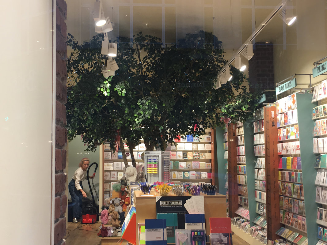
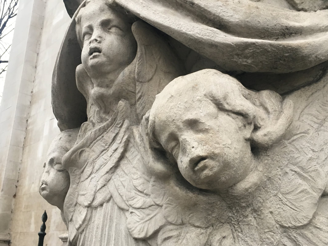


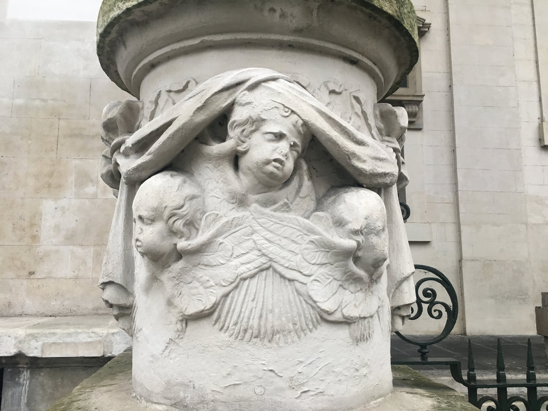
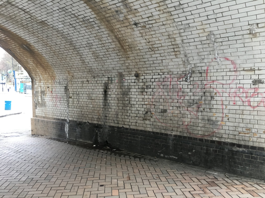
I think these six photos are the best out of the ones that I took in response to Tom Hunter. Each of them have something about them that proposes a question. For example, the first photo has a tree growing in a shop. When I saw this I knew that I had to capture it because it was something out of the ordinary and quite surprising. The composition of the photo displays all details with it's straight-on angle and is well lit with colours from the books and lights. I found that when doing this task, I was searching a lot less for photographic elements such as colour and shapes, and looking more at context. The second photo has quite a big impact on the viewer straight away. It shows a statue of three young faces, each of them missing their nose. The photo was taken close up in order to put the rather uncomfortable image right in the viewer's sight. When I saw this, I could straight away image there being a headline over this photo discussing something to do with noses or smells. I would say that the next two images focus more on light and contrast than any of the others. Both of them are taken where you can see the gloomy clouds in the sky, and they both have an element of decay or dirt. This can be see on the blackened walls in both images. This created a very large contrast against the white of the sky and I felt that they could both tell some sort of solum story in the news. One of my favourite in terms of context is the last photo. When clicked on, you can see that it shows two lampposts, one of which has fallen so that their lights are in exactly the same place. I found this to be quite an ironic scene and could definitely suit a quirky news headline.
Overall I had lots of fun taking this images and imagining different captions. This helped train my eye in noticing stories behind scenes and/or photos.
Overall I had lots of fun taking this images and imagining different captions. This helped train my eye in noticing stories behind scenes and/or photos.
Experimenting with video
I have decided that working on a project in video form would be much more immersive and would allow me to explore the theme better. I am particularly interested in working with old video format such as camcorders, so I decided to use an old camera that I have in order to film some footage around my local area. My plan is to then edit the video using Adobe Premiere, adding different elements such as photographs and newspaper cut outs in order to ensure that it relates to the theme.
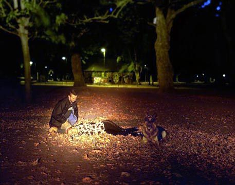
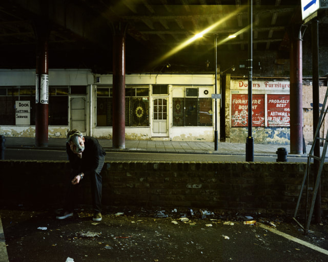
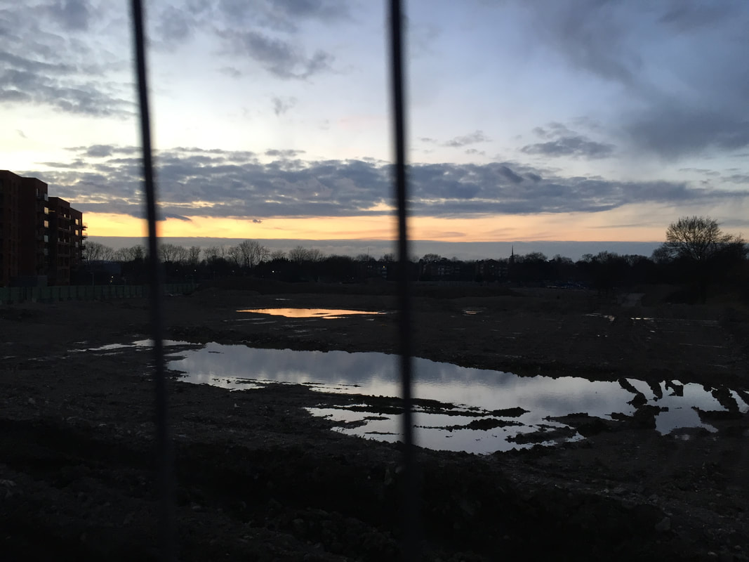
This video was filmed around my local area using a HI-8 format camcorder. I took the same approach that I did with my photographs; taking videos of things that I could imagine being in the news. I was also inspired by the idea of documenting homelessness and decayed-looking areas. Whilst filming the video, I was thinking of how I could incorporate the footage into a final piece form, making sure that I captured certain shapes and used certain video shots. I am happy with the outcome of the video, but I know that in RAW form, it simply isn't enough. After collecting the footage I feel a lot more confident and I feel like I have a set idea on what to do next. I know that editing will take a lot of time as the software that I am planning to use is new to me, but I am looking forward to experimenting. Something that was difficult with using this format was actually getting it onto a computer. I had to use a Firewire lead, which sounded simple enough, but the tapes proved to be very faulty. I had a problem where the top section of the tape misaligned with the bottom, and meant that the footage was very very glitchy. At first, I tried to adapt to the situation and try using this glitched footage but the computer wouldn't allow me to convert it. I had to work out how to fix the footage. I did this by repeatedly rewinding the tape back and forth until all the video had realigned, which took some time. I was glad that this worked because I was very keen to work with HI-8 format, because I feel like when working with such a subjective theme like the news, this old style of footage can really make the video feel more genuine.
If I were to improve this footage in some way, I think I would try and make it obviously related to "In the news". If I showed this footage to someone who didn't know any of the context, I doubt they would link it to my chosen theme. This is why I know that I have to heavily edit the video and explicitly show that it relates to my theme.
If I were to improve this footage in some way, I think I would try and make it obviously related to "In the news". If I showed this footage to someone who didn't know any of the context, I doubt they would link it to my chosen theme. This is why I know that I have to heavily edit the video and explicitly show that it relates to my theme.
Final Evaluation
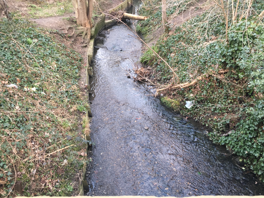
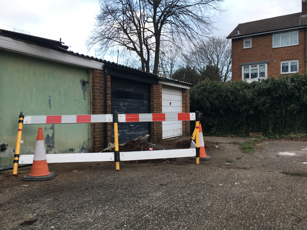
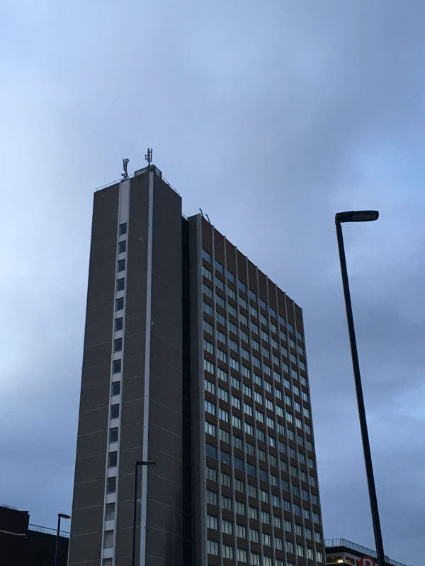
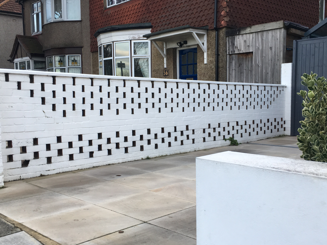
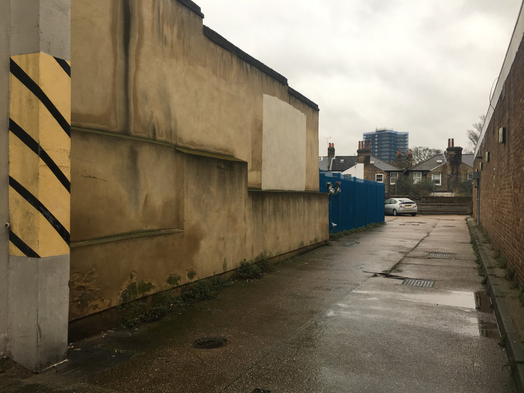
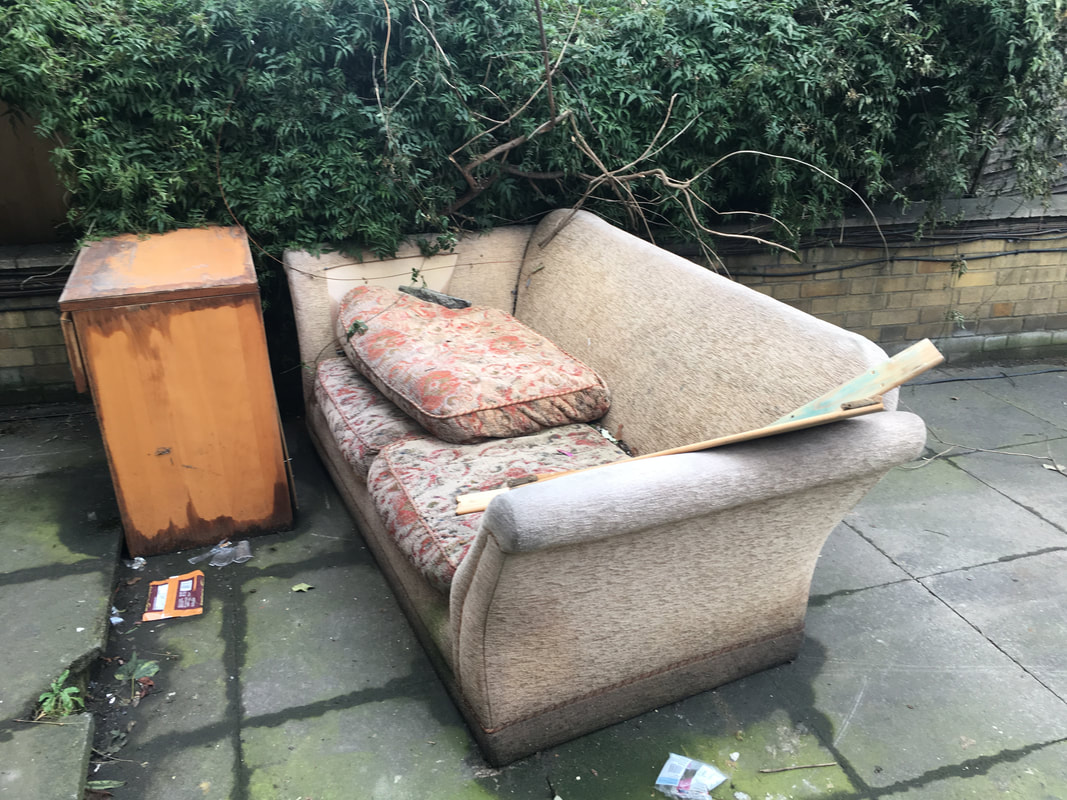
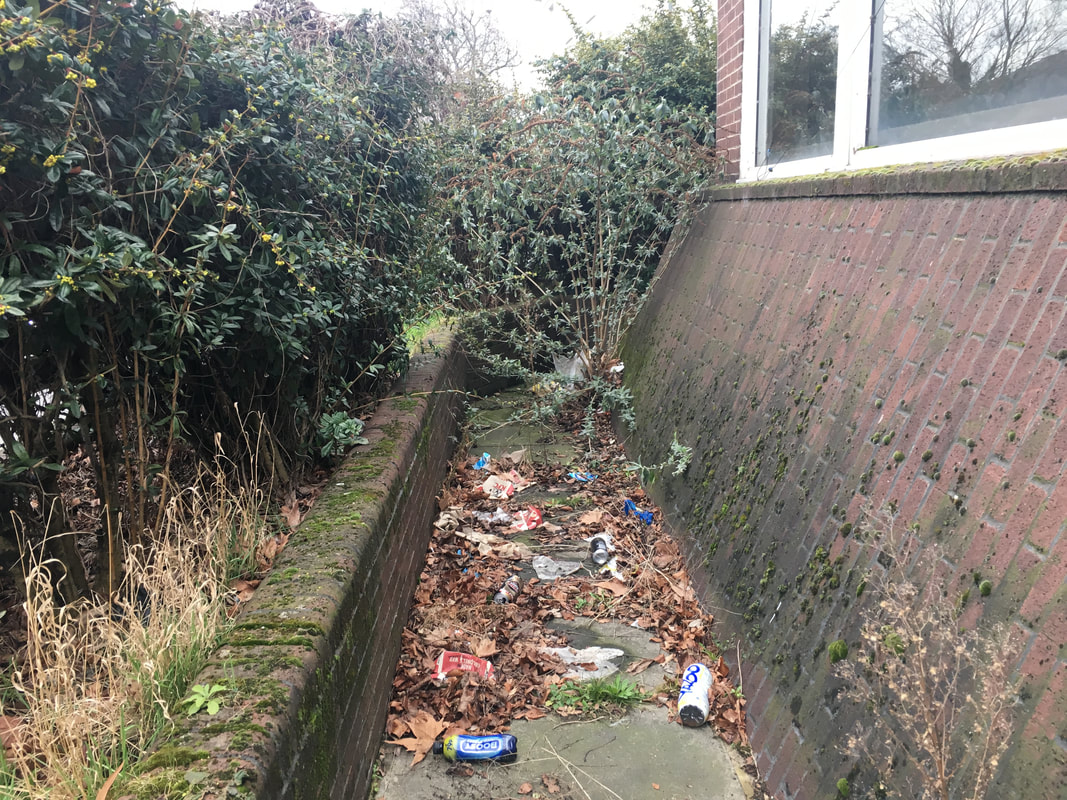
I chose to revolve my video around the issue of homelessness in my local area. I think that this is a prominent issue that seems to be increasing in London especially. I wanted to create a video that would depict the living conditions of homeless people and present a very 'urban' feel. I knew that I would have to take series of images of very grungy and urban environments in order to accurately recreate the feeling that I wanted. I went around my local area and took a series of photos that fully showed the horrors of some of their sleeping conditions :
The video above is the final result of editing the previously filmed raw footage. The process of editing this footage was a very difficult and time consuming but I found it to be quite a fun experience. I started the process by deciding what software I was going to use. I have previously used iMovie and that worked out well with certain simple videos that I edited, but I knew that I would need a more advanced programme, so I chose to use Adobe Premiere CS5.5. This piece of software was completely new to me and there was a massive learning curve that I had to take. I simply started by uploading my filmed footage into the programme and then attempting to learn the basics of the software, which I did through using youtube tutorials and help from teachers. My plan from this point onwards was to utilise the capabilities of the software and make a heavily complex and edited video.
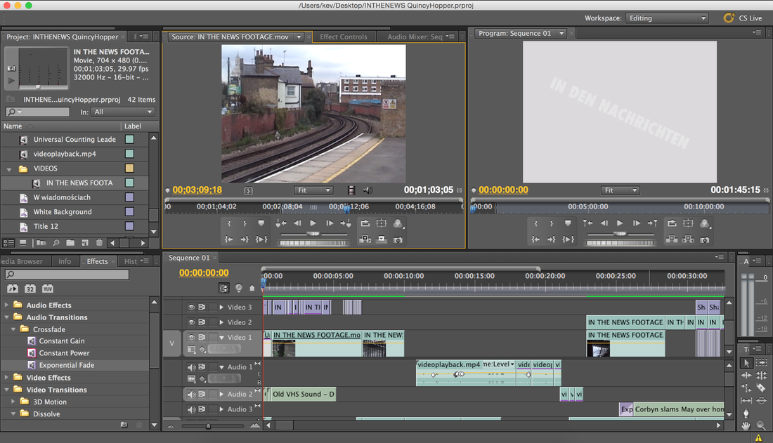
The first minute alone took around three hours to produce. I wanted to introduce the video by having a title above some video footage which displayed the words "In the news". I found out how to create a title and then I experimented with different fonts until I found one that found satisfying. Once I had created this title, I felt that it wasn't quite enough and I wanted to mirror the camcorder-format footage by making some sort of glitch in the title. I then added an Adobe preset, which was a kind of countdown. I then trimmed this piece of footage and sped it up so it became a very rapid and distorted piece of footage. I quite liked the look of this and decided to further distort the text by make it switch very quickly back and forth between a German translation of the phrase "IN THE NEWS", which translates as "IN DEN NACHRICHTEN". I chose to put the text in German as well as English because I simply like the way that it looks. The language itself doesn't look fancy or decorated like French or Spanish, so it conveys a harsh and bold atmosphere. The process of creating the glitch effect with the text took a very long time, as I had to individually measure and drag in the different text boxes. Also, this was the first thing that I edited, so I had to learn the basics.
The next section involved using audio from meetings in Parliament. I got this audio from videos on youtube, and then I dragged it into the desired section of the film. At first I had no video footage to go along with the audio and I just had black screen. After watching the video so far I saw that it didn't work with the black screen and I simply dragged more footage over the audio. The parts of the film where it was a straight video with no editing were the easiest parts to make, because it didn't require any intricate details.
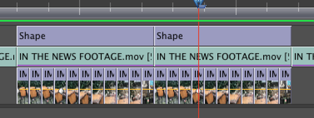
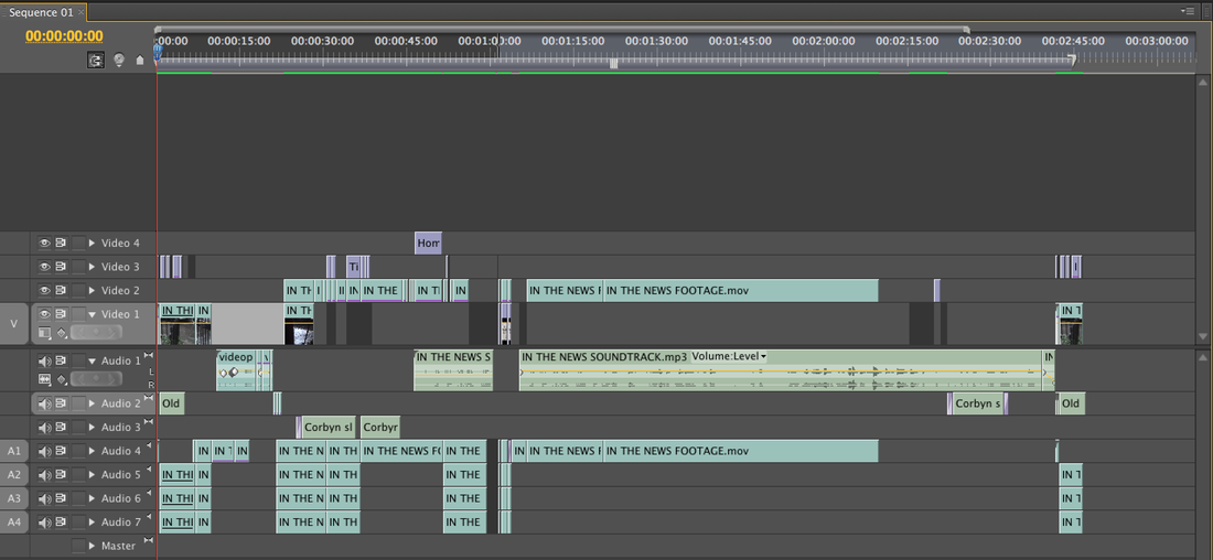
The next part of the video was the part that was the hardest. I had to learn how to incorporate photos and videos in the same piece of footage as well as having them in different shapes. I took a series of images that rotated round a sofa that I found in the street, and I wanted to play them back to back to create a moving image effect. This took a very long time as I had to learn how to cut shapes out of video and fill them with the photos. Below is a screenshot of the timeline of this two second piece of footage :
The first minute alone took around three hours to produce. I wanted to introduce the video by having a title above some video footage which displayed the words "In the news". I found out how to create a title and then I experimented with different fonts until I found one that found satisfying. Once I had created this title, I felt that it wasn't quite enough and I wanted to mirror the camcorder-format footage by making some sort of glitch in the title. I then added an Adobe preset, which was a kind of countdown. I then trimmed this piece of footage and sped it up so it became a very rapid and distorted piece of footage. I quite liked the look of this and decided to further distort the text by make it switch very quickly back and forth between a German translation of the phrase "IN THE NEWS", which translates as "IN DEN NACHRICHTEN". I chose to put the text in German as well as English because I simply like the way that it looks. The language itself doesn't look fancy or decorated like French or Spanish, so it conveys a harsh and bold atmosphere. The process of creating the glitch effect with the text took a very long time, as I had to individually measure and drag in the different text boxes. Also, this was the first thing that I edited, so I had to learn the basics.
The next section involved using audio from meetings in Parliament. I got this audio from videos on youtube, and then I dragged it into the desired section of the film. At first I had no video footage to go along with the audio and I just had black screen. After watching the video so far I saw that it didn't work with the black screen and I simply dragged more footage over the audio. The parts of the film where it was a straight video with no editing were the easiest parts to make, because it didn't require any intricate details.
The next part of the video was the part that was the hardest. I had to learn how to incorporate photos and videos in the same piece of footage as well as having them in different shapes. I took a series of images that rotated round a sofa that I found in the street, and I wanted to play them back to back to create a moving image effect. This took a very long time as I had to learn how to cut shapes out of video and fill them with the photos. Below is a screenshot of the timeline of this two second piece of footage :
|
Although just a very short amount of time, I had to make sure that each frame of the photo was exactly the same length otherwise it wouldn't flow smoothly. I was very pleased with the result that I got as it took a very long time and I loved the way the still images were incorporated within the video footage.
|
|
I continued to use this skill that I had l learnt for the following part of the video; creating rapid scenes of movement that depicted the harshnesss of the living conditions of the homeless. I also added more audio from speaking in the houses of Parliament from Jeremy Corbyn. These sections of audio were specifically directed at the issue of homelessness, which I found to be a relevant problem in my local area. By directly addressing it, I was able to make a link between the video footage the viewer is watching and the topic that it is about : homelessness. Although the most difficult part, I was extremely pleased with how it came out.
In order to further incorporate the 'In the news' theme, I thought that it would be imperative to add photos of newspapers. What I did was look through a large batch of newspapers and cut out stories that I thought were quick to tell the message and also interesting. I cut these using a scalpel and then scanned them onto a USB. Below are a few of the newspaper articles that I chose :
In order to further incorporate the 'In the news' theme, I thought that it would be imperative to add photos of newspapers. What I did was look through a large batch of newspapers and cut out stories that I thought were quick to tell the message and also interesting. I cut these using a scalpel and then scanned them onto a USB. Below are a few of the newspaper articles that I chose :
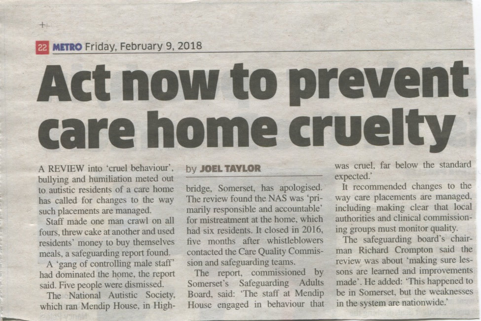
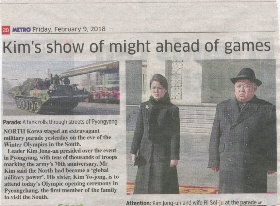
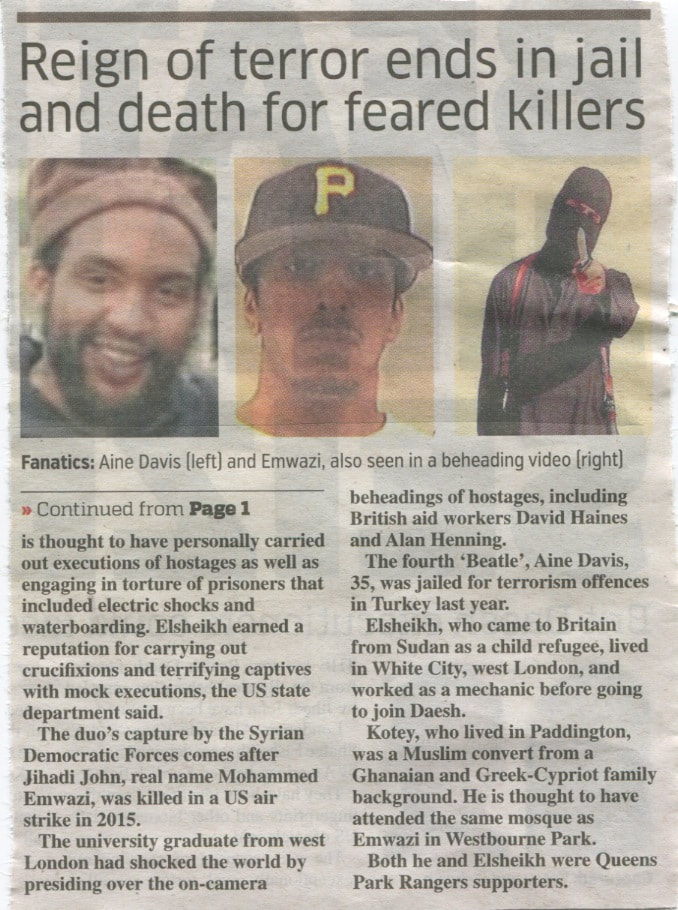
The selection of newspapers weren't exactly related to my local area, but they still were things that affect me and are issues that will be ever present in my life. I didn't want the video to just completely surround homelessness, and instead I wanted there to be links to other stories around London and international relations. This part was mainly inspired by other videos that I watched when I was researching my topic, although adding newspapers seemed like an obvious thing to do.
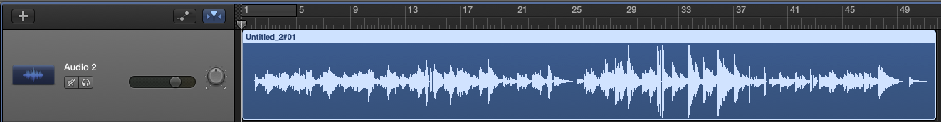
The next part of the video is a lot less intense, and begins to focus on the audio aspect instead of the rapid visual movements seen previously. I wanted there to be a section that was almost like a walk around my area; one that showed possible sleeping spots for homeless people or even just the locations around my area. When I first put this section together, I found it to be very boring, as there was too much of a contrast from the content-packed introduction. That is why I decided to completely branch off from the photography aspect, and I decided to compose a soundtrack that would play over the video in order to make it flow. I composed a track of about 1 minute and 44 seconds, which didn't take very long as it is just simple guitar playing. I added lots of reverb to the guitar sound in order to further convey that 'harsh' reality of things. Below is a screenshot of the audio in GarageBand :
The next part of the video is a lot less intense, and begins to focus on the audio aspect instead of the rapid visual movements seen previously. I wanted there to be a section that was almost like a walk around my area; one that showed possible sleeping spots for homeless people or even just the locations around my area. When I first put this section together, I found it to be very boring, as there was too much of a contrast from the content-packed introduction. That is why I decided to completely branch off from the photography aspect, and I decided to compose a soundtrack that would play over the video in order to make it flow. I composed a track of about 1 minute and 44 seconds, which didn't take very long as it is just simple guitar playing. I added lots of reverb to the guitar sound in order to further convey that 'harsh' reality of things. Below is a screenshot of the audio in GarageBand :
I found that afterwards, the video flowed a lot smoother and it seemed like more of a structured piece, which is what I intended. After this section of the video, I decided to try and round it off and I began to think of a good way to end it. I used a extract from the houses of Parliament again and made sure that it was a very strong and relevant point. It was Jeremy Corbyn saying "Will the prime minister pledge today, that 2018 will be the year when homelessness starts to go down?". I thought it was quite a powerful thing to say at the end of the video and it obviously addresses the issue that I was talking about. After this, I ended the video with the same footage seen in the intro. This was in order to create a 'rounding up' effect, and link the whole video together. Below is a screenshot of the finished product in Adobe Premiere CS5.5 :
In total, this video took around 8 hours to edit. The programme that I used was completely different to anything I had ever used before, and most of the time was take up by experimenting and trying to work out how to do things. At the end of all of this, I was very very pleased with the amount of effort that I put in and the look of the final result. Working with film has always been an interest of mine, as I did it in the 'Abstraction' section of my GCSE, but this time felt like a completely new take on film making. I am glad that I chose to challenge myself by using this editing software as well. However, there area many things that I know I could improve in. For example, next time I make a video about homelessness, I think that instead of taking a very rapid fast-motion approach, I will use very obvious still images in order to show the blatant reality and misery of homelessness.
All in all, this was one of my favourite final outcomes that I have created whilst studying photography. I really enjoyed embarking on a completely new idea, and learning things that have never tried before. The challenge of trying to make a final piece with a programme that I have never used before was at first quite worrying. I wasn't sure if I would be able to create a piece that was satisfying for me, and I wondered if it may be better to stick to elements that I know. However, once I got going with the project, I was completely indulged in the creativity and limitlessness of film making and I began to really enjoy myself. Filming the footage was quite interesting too because it gave me insight into what topic I was dealing with. Obviously I had thought about homelessness before and built up an image of what it must be like, but going out and trying to connect with the living habits of homeless people made things seem quite real, and I think that this helped me when expressing myself in the video. Adobe Premiere CS5.5 is quite a powerful programme, and it really allowed me to achieve my potential and explore concepts of photography and film making that I hadn't really thought about before. The thing that I liked the most was the fact that I could incorporate both film and still images into a final sequence of moving footage, which actually became a theme by the end of the video. I was able to come out with some simple but rewarding effects that made the video more interesting and provided shots that actually draw the viewer in. The skills that I learned whilst making this video really helped me in my final exam and I washable to apply knowledge within a matter of minutes, when it had taken me hours to do so when I started this project. This was a massive learning curve, and definitely the most that I have learned from any subtopic in photography.
