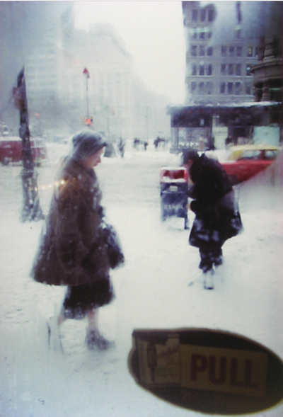
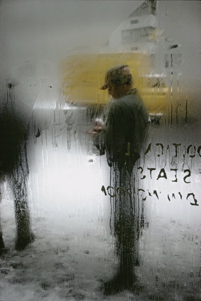

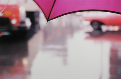
I chose the image of what looks like an out of focus sheet in the background and a pink umbrella very close up to the camera. This photo instantly caught my eye and made me think of the use of bright colours and depth of field. With a fairly dull and grey background, the bright pink really contrasts and stands out. What I think is surprising or unusual about this photo is the use of space. Because of the dull background colours, its almost as if it creates some negative space, This brings out the foreground and makes the viewer focus more on the umbrella. Although there is a sharp focus, there isn't much detail on the umbrella, which makes it slightly irrelevant. I think the most important formal element is the focus, since it is responsible for the way the viewer looks at the photo, and what they choose to pay more attention to. The focus is very soft, which leaves colours and organic shapes. In my opinion, Sauls photos are abstract because of how he uses focus to control how the user per sieves the photos. A lot of his photos have a place that is out of focus; or just out of focus entirely. Ive noticed that he never really has any photos completely in focus. I think focus is one of his favourite things to experiment with, and he knows what he's doing when he uses it.
